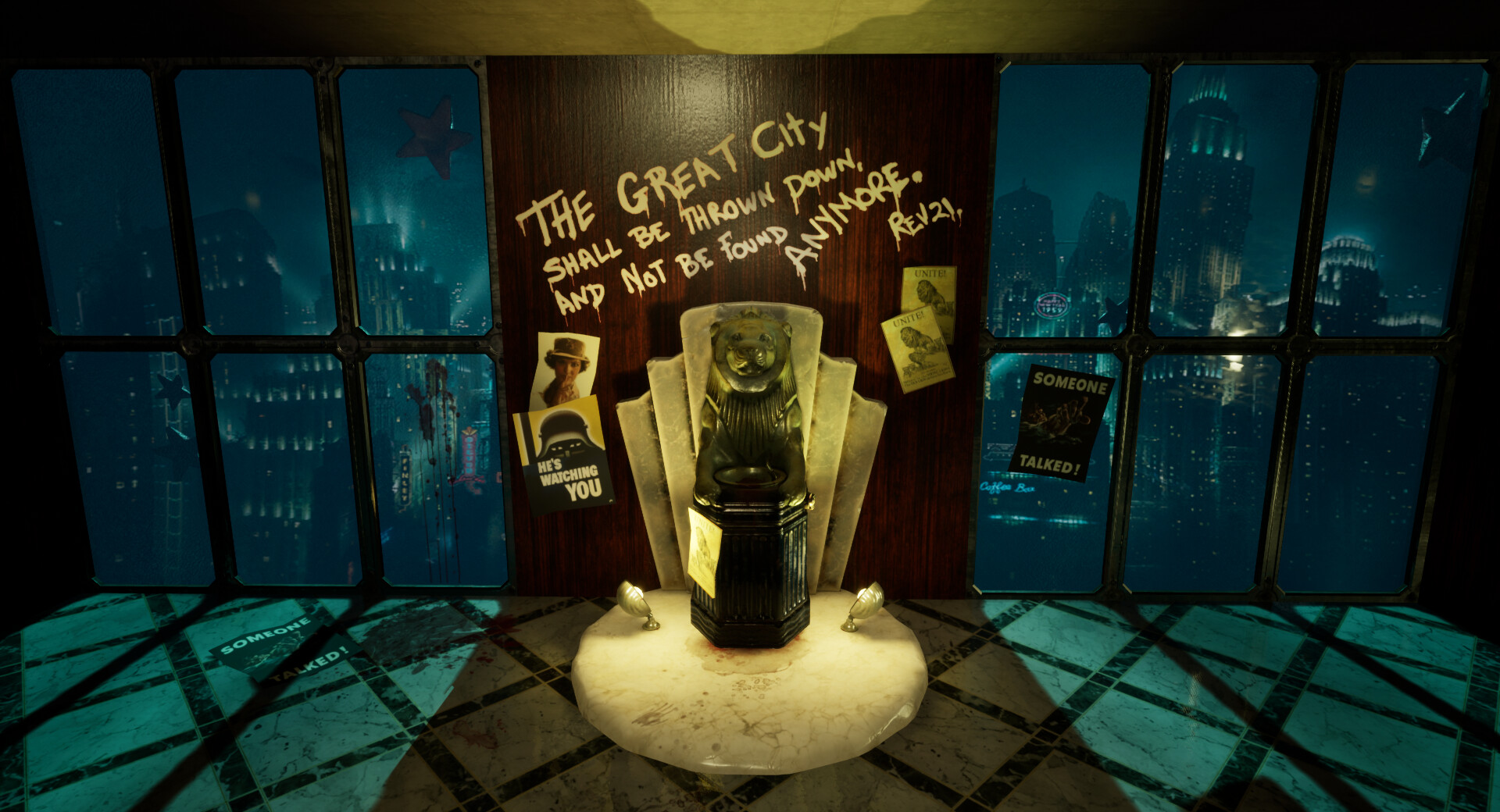
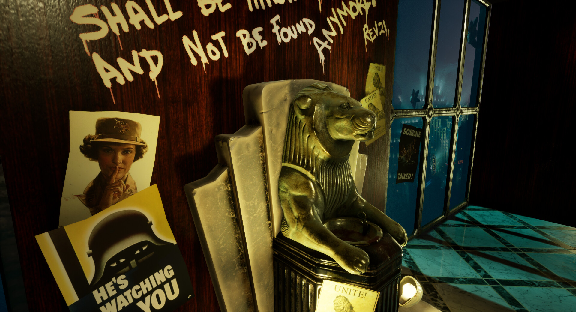
Our next uni project was to create our own brief for a specialism to be completed over 3 weeks and if possible keep to the theme of Bioshock London. My chosen specialism was Environment Art and I really wanted to develop my skills in Zbrush and storytelling in environment art. Knowing that this wasn't a lot of time I decided to keep my scope small so that I could achieve something to a high standard.
Research
I wasn't sure what I wanted to do straight away, keeping within an Art Deco style I did a lot of googling until I could find something I liked the look of.

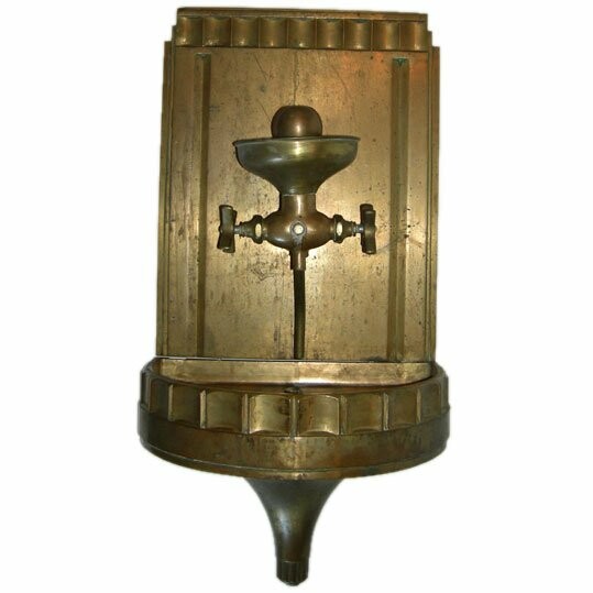
I stumbled across the idea of a water fountain, the Chicago fountain pictured above and thought it was something ornate enough to stretch my muscles in sculpting with zbrush. However it wasn't really London. I later researched the below Diana Fountain from green park.
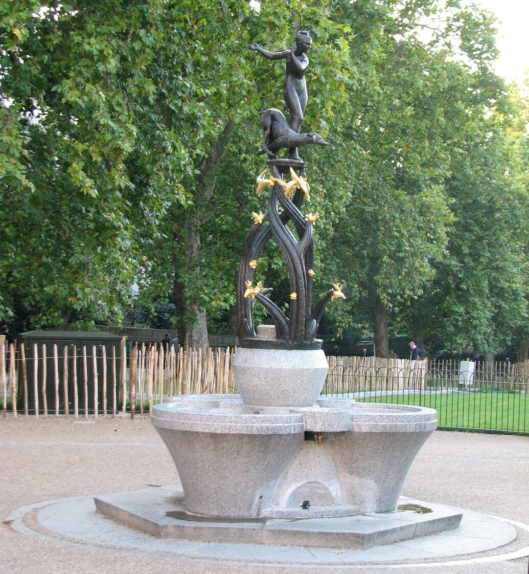
I really loved the materials used in this, a combination of gold and bronze and of course stone. This is a communal drinking fountain and became the spring board for my idea.
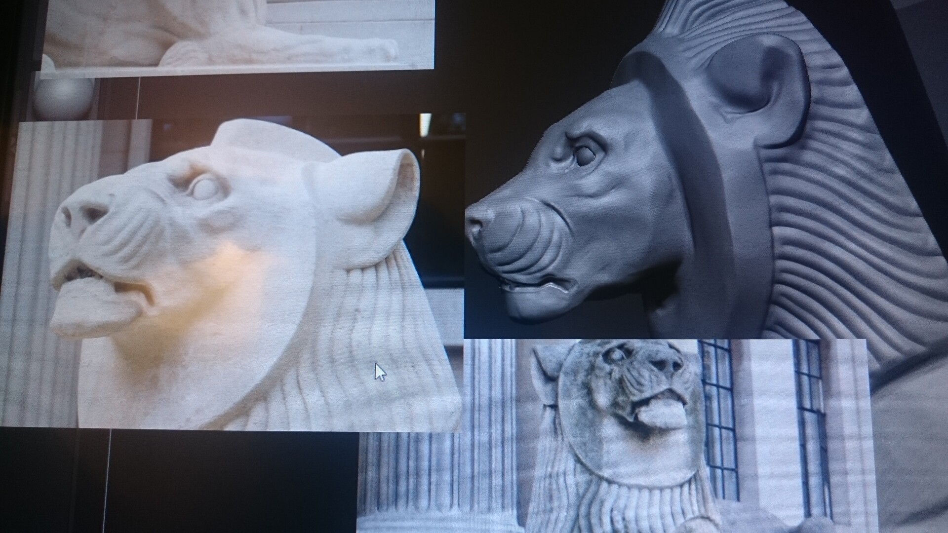
I wanted to take elements that reminded me of London or in general English pride and apply this to a type of communal drinking fountain. Lions were my main draw as this is a symbol of England and there are a lot of lion statues around London! I settled on my my lion inspiration the Marylebone Lions as they are Art Deco already and there are a lot of references available to use of these.
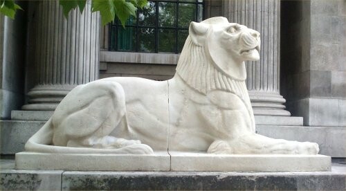
Using these main references for inspiration I created the below concept to start from. I sought out feedback for my idea as I worried it was not enough. I was told that it was quite ambitious, but also doable provided I do the right research. However I may run into scheduling issues if something goes wrong.
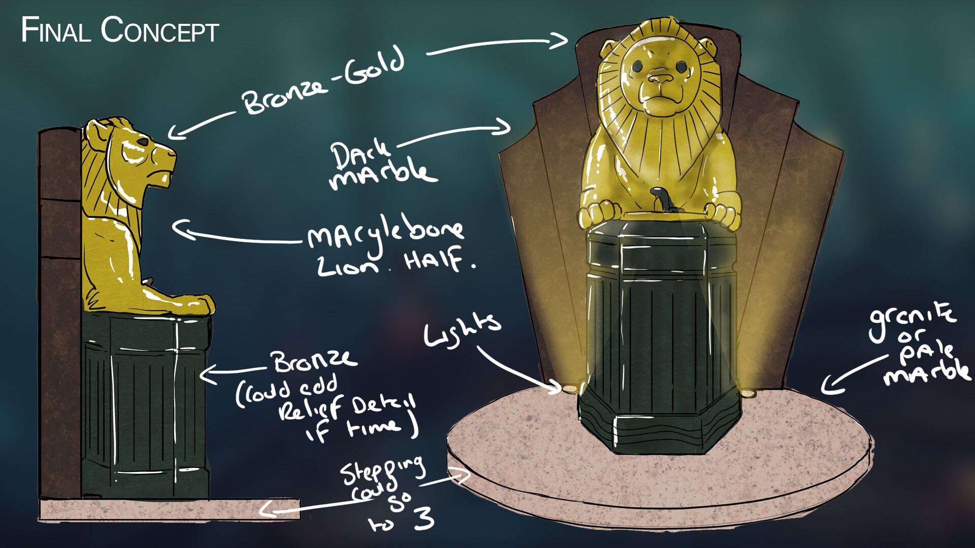
As I want to specialize in Environment Art I really didn't think this alone would be enough to display my abilities in storytelling, it felt like just a prop. I researched a little more on things like propaganda posters from the War as there was a lot of propaganda used in Bioshock, and again the world wars are a big part of London and its history. I hoped that if there was enough time towards the end of the project I could apply some of this to aid in the storytelling which was an important aspect for me.
Concept to Sculpt
I really wanted to get to grips with zbrush in this project, so I spent the majority of the first week and a half to working on the sculpt of my Lion and Fountain. I used the first half of the London Lion reference and tried to mimic this as closely as possible but still fitting into the prop I had created. Considering details such as making it believable and functional.
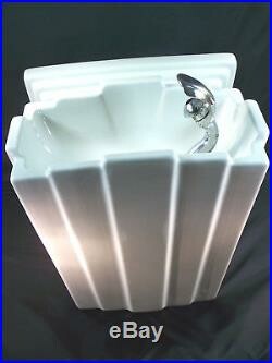
After sculpting more I noticed that the placement of the drinking funnel itself looked wrong. So i researched more art deco drinking fountains and discovered they were more often towards the side so I re positioned this and made sure there was a visible tap to the side. This immediately aided in the design.
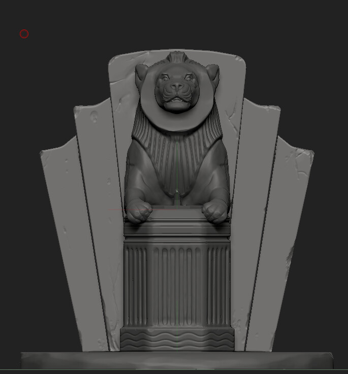
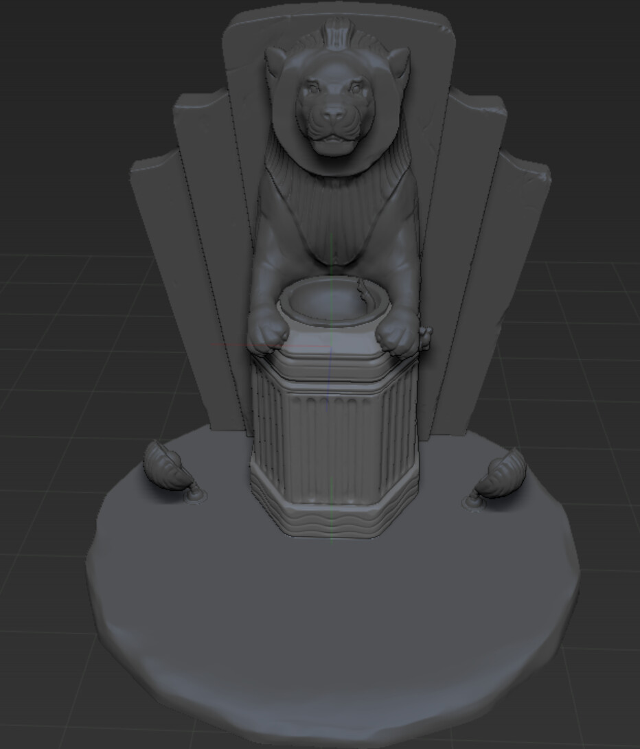
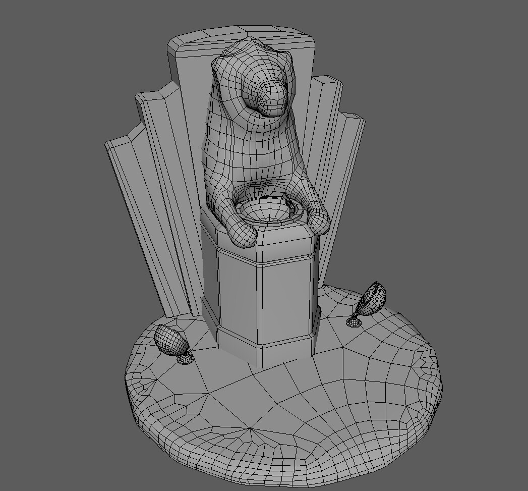
I was really content with the final sculpt and was eager to move onto the next step as I wanted to make sure I had enough time to do a good job in texturing. Initiate quad drawing in Maya. This was exceptionally challenging for me and I had about 3 tries at this before I got my head around it. Unfortunately in hindsight I still did this far too low poly for what I wanted. After this project I intend to go back and give it another shot.
Texturing
I used substance painter to texture and had a lot of struggles with baking. I had a lot of issues with the ambient occlusion from all the different meshes I had used. I looked up exploded baking to help with this. I learnt if I had everything labelled correctly in both Maya and Zbrush scene, and exported them without merging them together I could do this easily through substance painter by baking as individual meshes.
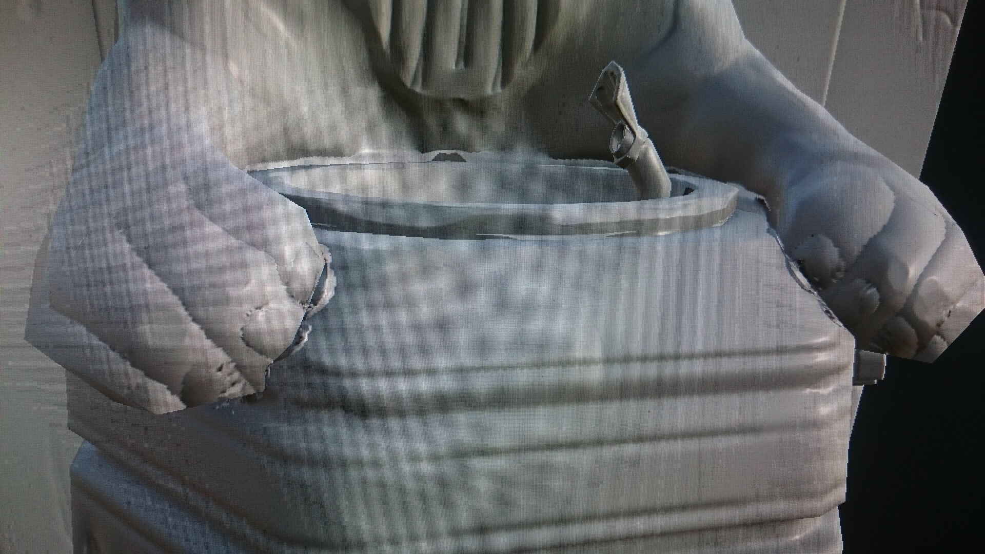
This dramatically increased the look of my texturing.
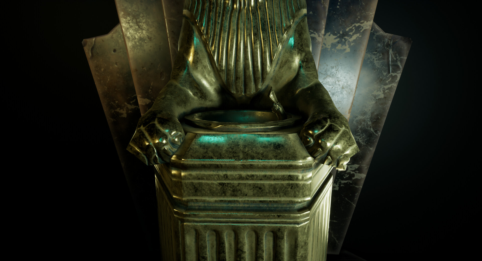
However this was where I realized that my Lion was far too low poly in places. It was here I did re-quad draw once or twice. I was able to adapt the topology around there ears to make them look rounder and give more geometry around the feet which helped a lot. However it wasn't until I had my scene set up towards the end I realized I could have added a lot more geometry. This is a big lesson I learned as I still struggle with making everything too low poly, I'm slowly getting my head around this.
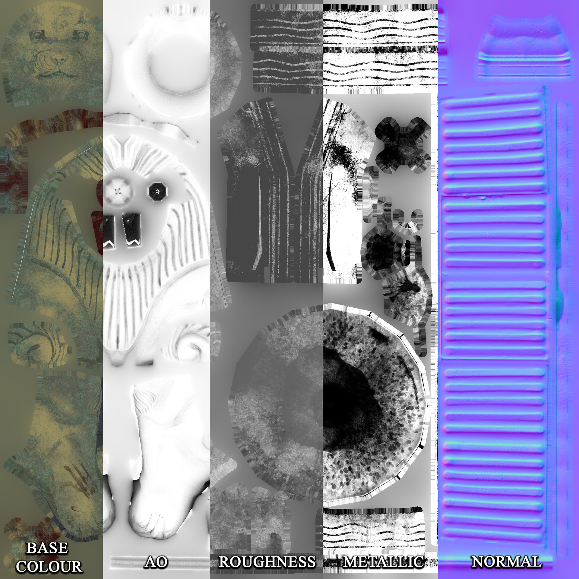
 Setting the Scene
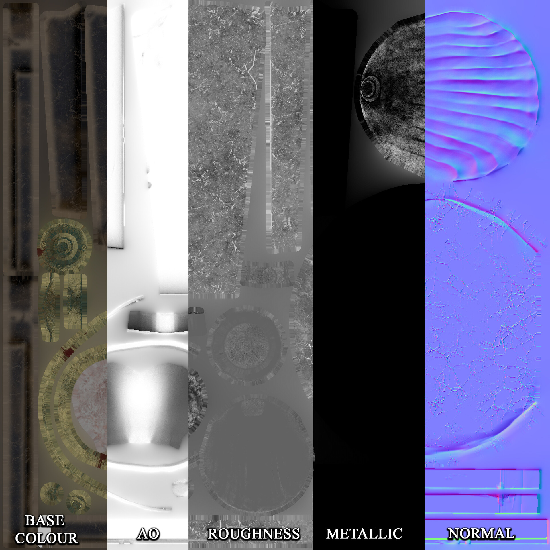
Learning from past mistakes I took a break from texturing to see what this model would look like in unreal. I created a basic lighting set up as I had intended to just display this in a blank scene. However it was at this point I realized the error in thinking this way. Creating a mock lighting set up early like this allowed me the time to re-think how I wanted to display this ahead of the last minute deadline rush.
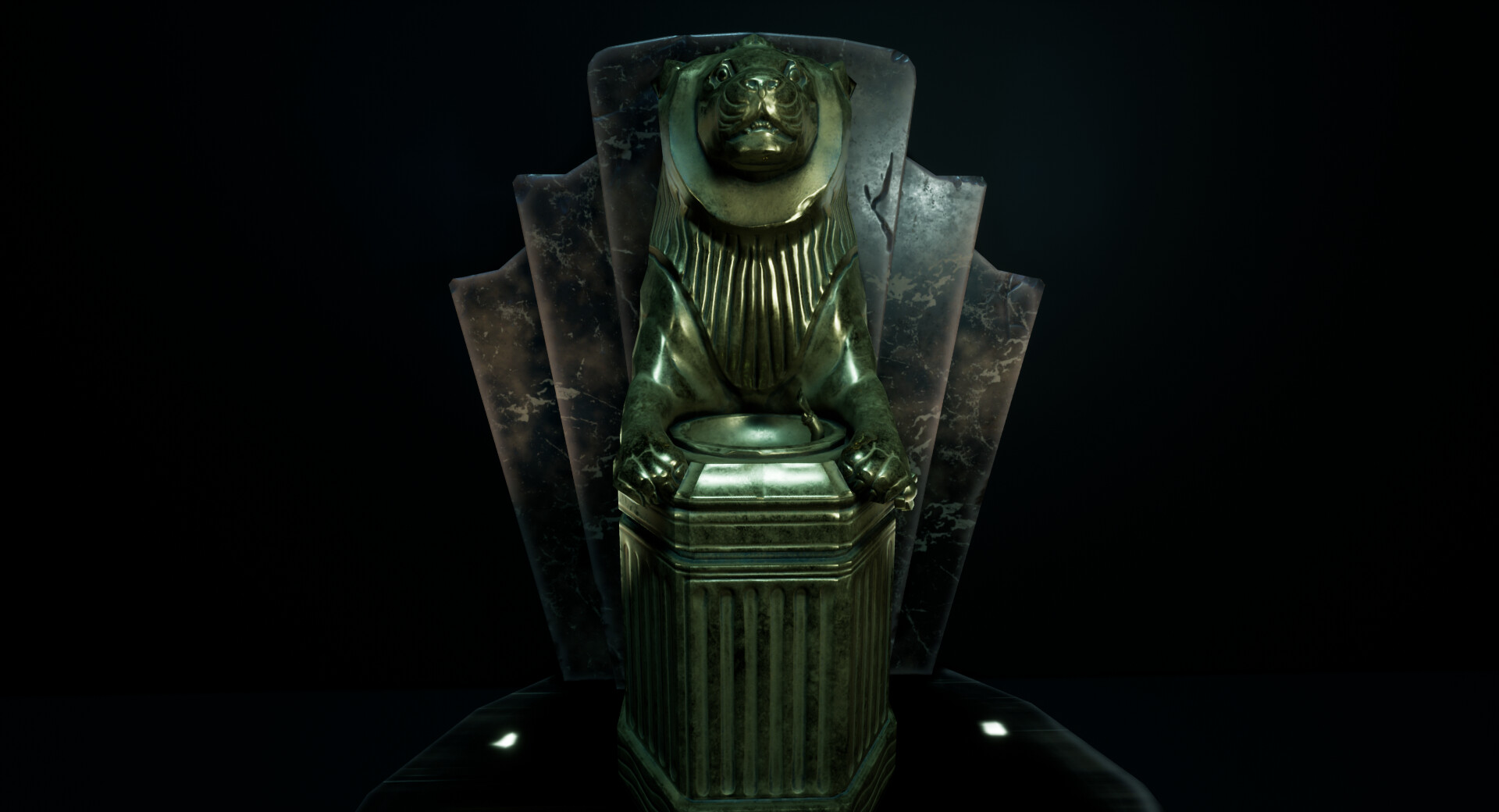
Doing this highlighted that I would need to create some kind of environment around this prop to make it look interesting. It would also give me that ability to do some storytelling. Not only that but because of a lighting artifact in the image above I realized the original lights I had planned would look unimpressive so I decided to model entirely new lights.
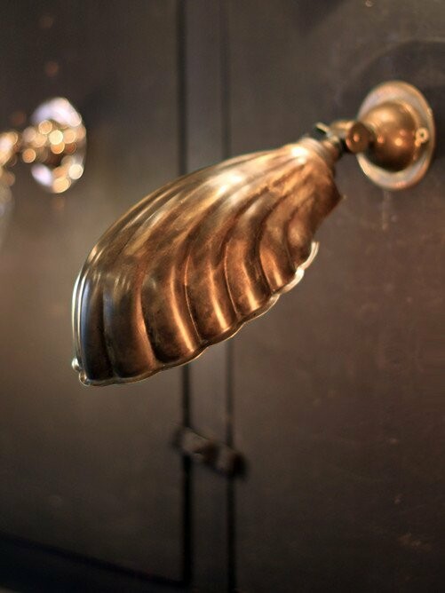
I found the art deco lights above, which matched the shell look of the faucet I created earlier. These I would eventually use to link throughout the scene.
As I didn't have the time to create my own textures from scratch, I found tiling marble tiles, wood, concrete ceiling textures from https://www.textures.com/ however these alone I didn't think would make the scene interesting enough.
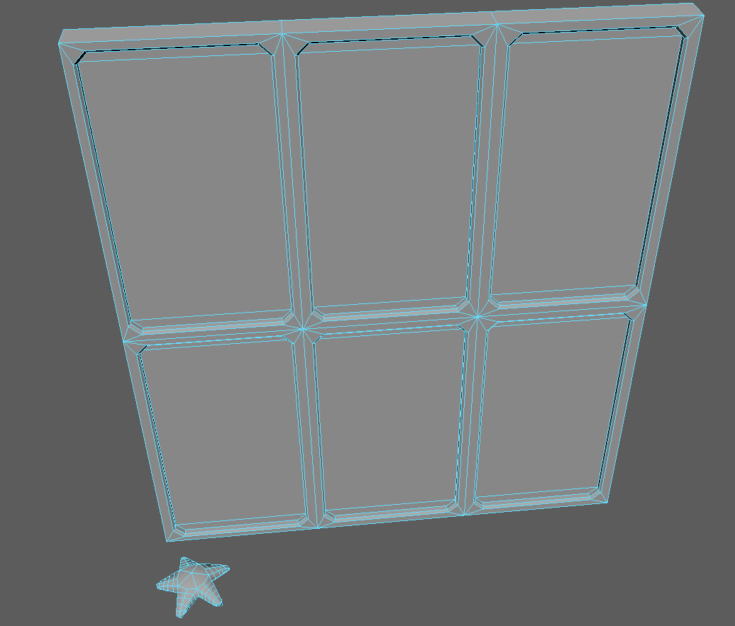
I quickly modeled some windows based on Bioshocks windows which are of a heavy metal material and thick glass. I also remembered that there was always a starfish on the glass in the first game so I quickly mocked one of these up to resize and place throughout the scene, a small nod to the source material.
My original brief included decals and I had not forgot about this. I went back to the propaganda posters and focused on the ones emphasizing silence, some of these were quite sinister and I thought this could aid in the ''secret society'' that Rapture was. As I had a violent bloody texture job on my Fountain I wanted to aid in the belief of a scene in downfall. I created a specific blood decal texture and made these decals lead from a point of action and lead to the fountain, as if someone went to clean up after an attack.
I wasn't quite sure what to do for Graffiti but when I stumbled across a biblical reference to Babylon in Rapture I decided to find the original bible reference and quote a later section of this bible story myself.
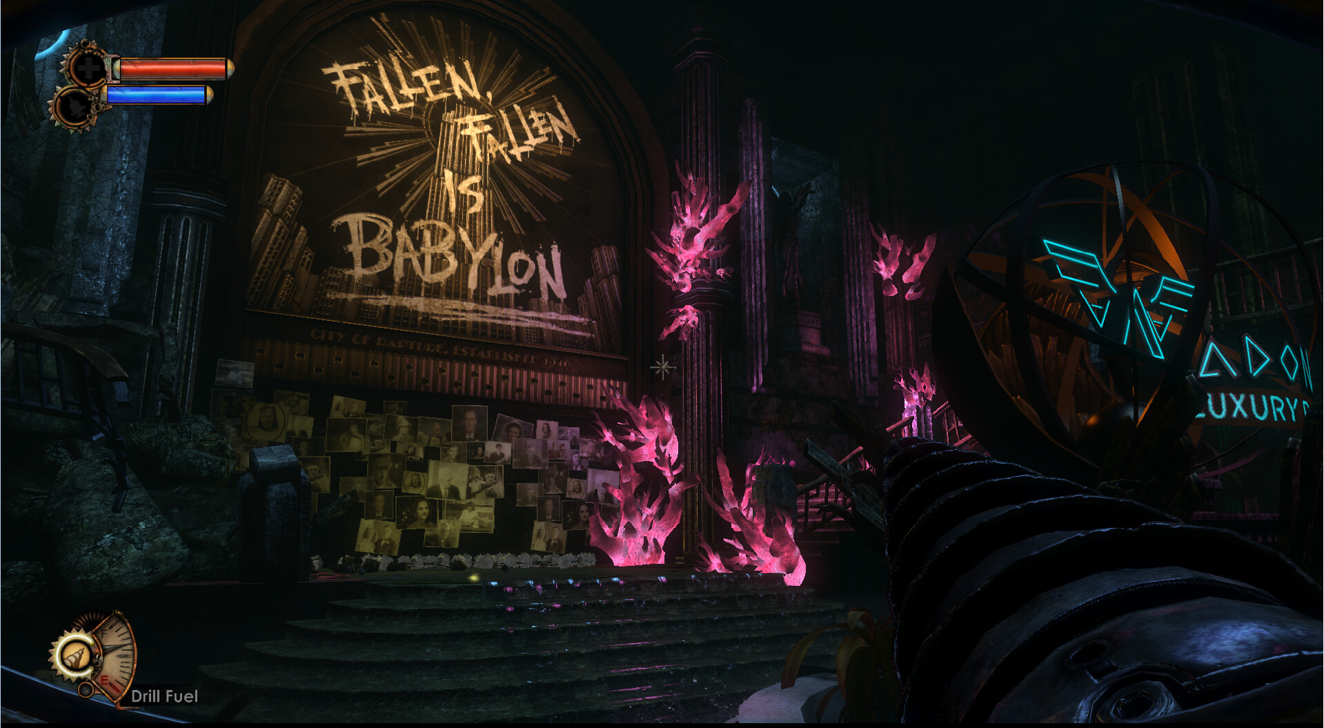
The key part that drew it all together was the view through the window. Unfortunately I did not have the time to make up my own London sky line, so for this university project I found a promotional image used in Bioshock of Rapture. I used this as a background plane and then applied a bump node to this to mimic a small parallax. I set this image to an emission as well and it helped make it look like a live city.
Lighting
I'm really glad that I did a mock lighting set up early on before I had everything in place as it made it easier to make the big decisions later on. I placed the key lights where they would be lighting up the fountain, which was a common lighting set up in Art Deco. I added a few point light to illuminate the details, as well as light up around the space. But the main focus was still the fountain, the white graffiti helped draw focus.
The rapture background helped with some illumination and I set my main directional light to a dark green. Finally I went back and used the same method I used in my diorama to create water caustics. I set them quite large as we would be very deep underwater and this effect would not be very clear if at all visible but it helped the scene feel like it was breathing in the end. It was subtle, but effective.
Below are the screenshots of my final scene.