Website powered by

Search for a Star: Research and Set up

Work In Progress / 07 December 2019

Having attended a few talks now from Aardvark Swift and Grads in Games I thought it about time to try and enter their competition Search for a Star for undergrads wanting to get into games. 

I'v set up a public trello where you can view my progress and how I am keeping track of my work load: Trello Board

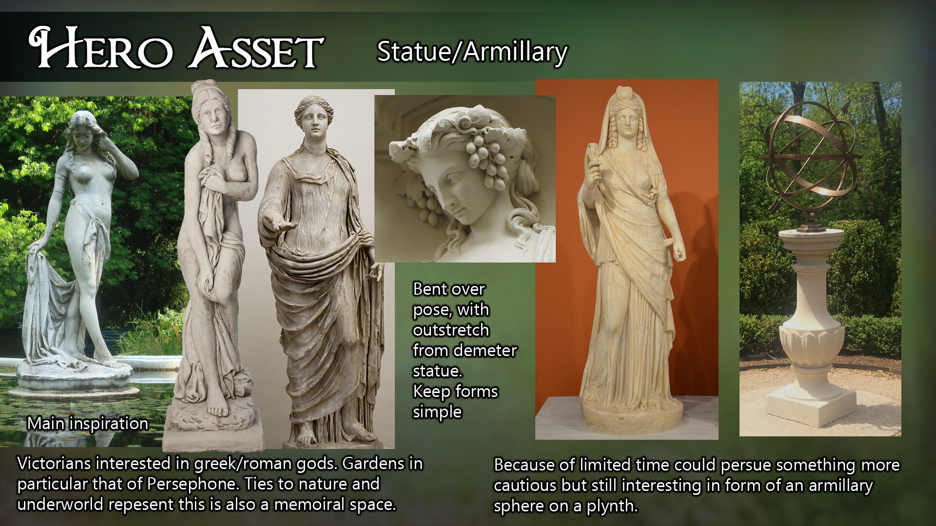
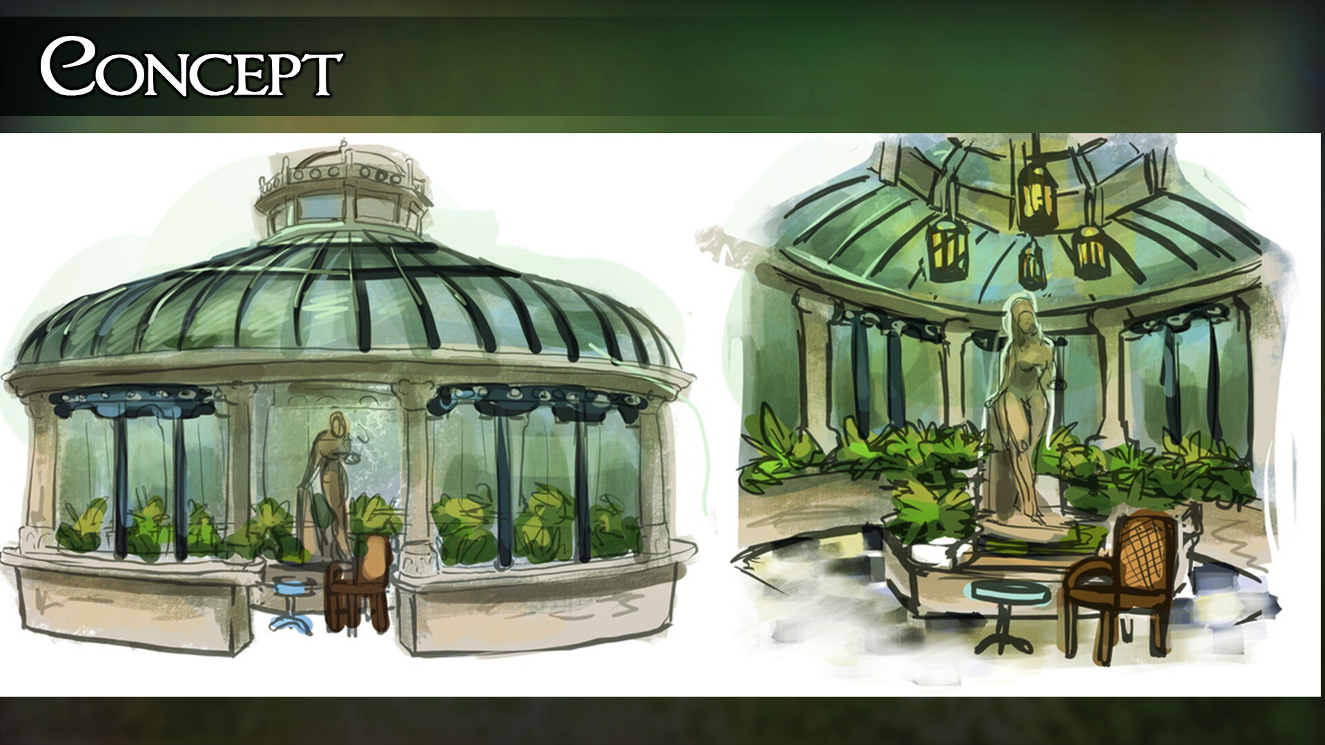
The jist of what I want to achieve, including a murky pond and a statue of Persephone reaching out to the chair and table.

I’ve pretty much settled on the environment theme of a conservatory. It’s a little ambitious (by little I really mean very!) but I think it will be a really good opportunity for me to stretch all these muscles I’ve developed whilst studying and at the same time challenge me further. As usual I've worked in ways to cut back on things to hit the deadline and time frame.

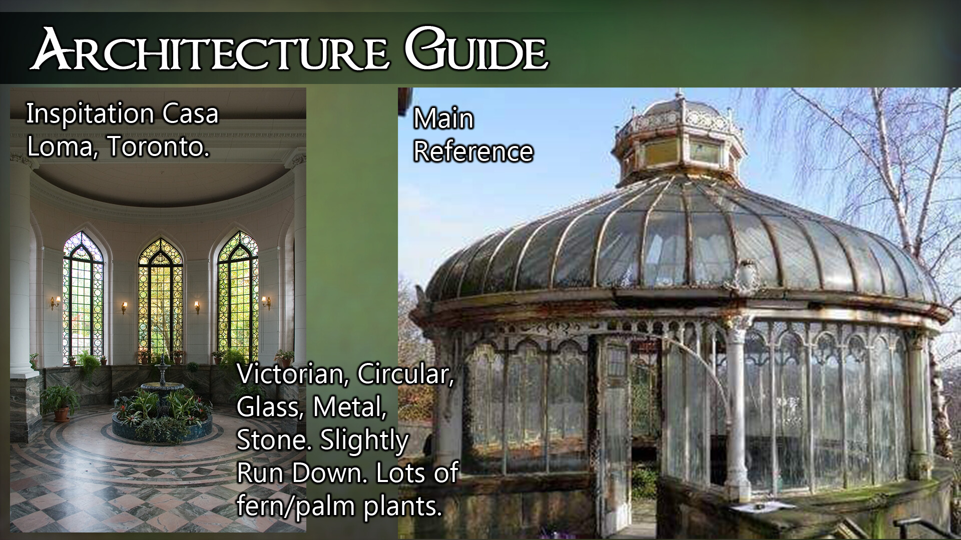
The theme is loosely inspired by the conservatory in Casa Loma, Toronto. I really want to see what I can do with my architectural modularity skills, sculpting via a hero asset statue as well as practice my lighting.  

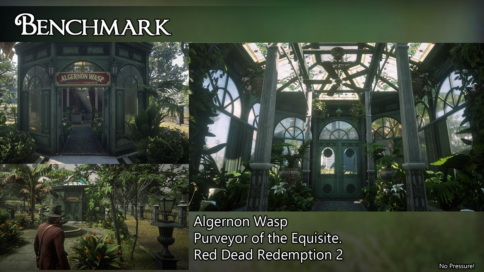
You can see the full art bible on my trello, I’ve researched what I want to try and achieve plus some stretch goals to look into developing the scene further after the competition. I even found a similar environment in game with Red Dead Redemption 2! An ambitious benchmark! Why not!

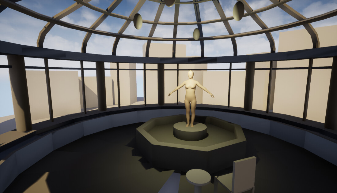
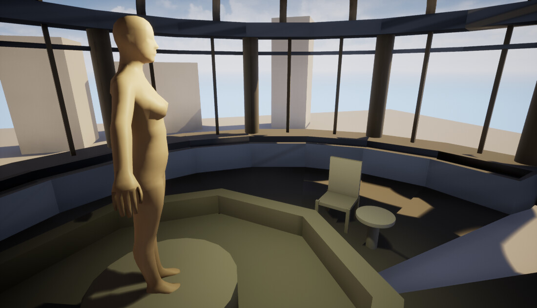
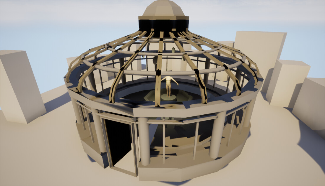
A really crude blockout to help me get started and figure out what assets I might be overlooking. 

Not to mention the super crude lighting pass...

I found it easier to do a block out mesh of the conservatory itself in Maya, of course this means I lack in proper UVs at this very early stage for nice lighting passes! The limitations are 30m2, I definitely don't need all this space and so what you see before you is about 20m2 to leave a little space for a vista.

I'm still attending classes at the moment so a lot of my evenings have just been spent researching. However now that the Christmas break is creeping up I'm hoping to get into full production soon. I'll be starting with the architectural piece and begin chipping away at this next week. Fingers crossed I’ll get to finish!

Advanced Specialism: Rosing to the Occasion

Work In Progress / 21 October 2019

An intense week it has been. With a cold hitting me hard and the final week panic before deadline on Tuesday. Regardless still made huge progress on my plant and even on my tree too, with even more issues uncovered!
It's always an adventure!


Roses

Zbrush and Petals

Having spent a full week on the tree I really wanted a break from it so decided to focus on my rose for a couple of days. The rose I chose is essentially a mini tree as it requires its stem (trunk), leaves and the rose head. 

As something fun I started with the flower head itself, I found this tutorial by Liz Kirby really useful. Although she is creating a high poly rose, the methods used I thought I could apply as a bake down onto planes in Maya. My first attempt can be seen below:

Originally I thought I could sculpt a lot of my details on my rose bush in zbrush but felt like I had a very limited time to achieve this and so instead decided to use curves and planes in maya to create my skeleton for the stem. I went and taper the ends as I needed to get more shape. 

I sculpted extra rose petals in zbrush and to save time used my photo references to get my leaf textures and put them together in Photoshop. I coloured my rose petals in photoshop and added some noises and gradients to break it up and look a bit more natural, similar to how I did my grass. 

Textures and planes

I also created a gradient base colour for my stem, I wasn't convinced in the long run this would would work but I used it as a place holder just so I could focus on creating the right shape and look for the rose. If I ran out of time I would have something, but I did manage to address this later after all.  Taking all of these it was back into maya to create the planes and start creating the over all shape of the plant. 

Using the deform tools I created various petals and leaves to bend into new clumps to create the full shape of the rose. The hardest part was getting the centre piece to work. My initial attempts weren't very convincing....

This first attempt was full of gaps and not nearly enough volume.

Although I adjusted the leaves on my second attempt and made the centre piece deeper it still wasn't enough. 

Fine Tuning

Eventually I was shown a trick by our Foliage Wizard Wiktoria by creating a dome under the centre piece, created the volume I needed plus a nice rounded bottom to cup the petals around to give that authentic rose shape. After a couple rounds of ''IT NEEDS MORE PETALS'' from various sources I was able to create the below fuller shape. 

Immediately my rose went from this.....

To this.... (the rose heads were eventually replaced with the EVEN FULLER ones on the floor)

Further feedback addressed the colour of my flowers and also the texturing of the stem. Taking this into account I went back into photoshop and tweaked my roses so they didn't have any white highlights which is more true to my reference. I also added some thorns and added this to the stem taking it all into substance painter. 

There are some baking issues I'm hoping to go back to and fix later on. This is in part because after I added the thorns and added more petals to the roses I was way over my polycount. I used the reduce tool in maya to help bring this down a little but I am still over. Using the reduce tool, I didn't notice until later, meant my thorn geometry became planes and they behaved oddly in substance painter which I didn't realise. I didn't want to worry too much about this for this project as they are very small when applied to scene.
Being over the polycount is actually very surprising to me as my feedback is usually YOU NEED MORE POLYS! so it's a feat for me to be over my polycount for a change!

Now with the new textures and updated colour on the flowers themselves my roses are looking like this in scene! Just need to fix those vertex normals!

Back to Trees

Rebellion

Our small group of foliage specialists were all struggling to keep on top of our workload and none of us had even touched speed tree yet. We were doing our best to keep up but none of us were happy with what we were producing and felt like we wouldn't finished. Thankfully our tutors heard our desperate pleas and allowed us to drop speed tree from our to do lists so that we could focus on the basic tree and plant making processes. We will have to come back to speed tree during our own time.
This granted us an extra two days of class time to work and receive feedback and this has been a huge help for me. Above you can see the huge leap this had on the production of my rose and below you can see the changes I've been able to make on my tree. 

Making the most of it: Fixing glaring issues

Originally my tree was in this state: 

 I had applied some deformed branches to this but the scale was all wrong, they looked too big and I was struggling to populate them in a quick and efficient manner. I also lacked a lot of geometry which affected the over all shape and didn't help with the volume problem i was encountering. My geometry was also less than desirable.

With the extra time I was given I was able to create new branches, using my old tiling bark material and immediately add more height, realism and interest to the tree:

It's not perfect but it will be ok for now. A lesson I now have learned is to just sculpt everything you think you need and keep a hold of it! You can always trim it down but it is harder to add! Although I didn't think I would have time to retopologise and re texture properly I did use the reduce tool and fix up some areas where I could so I didn't have a huge mass of over the top polys. But this has been all part of the lesson learned.

Adding Leaves

I was able to keep a hold of my old branch planes I created before and with a little more geometry to back up my decision placing the leaves was a lot easier, although still very time consuming. 

From here I was given a neat trick to quickly add volume to my leaves and that was to create a large mass of larger leaves in the centre, which then you can populate with smaller leaves around the outside. 

I started to add the smaller leaves around the outside I also created a seed ''geometry'' which is basically just a cross of my seed planes to make it look like it has more shape. I started adding these more to the bottom of my tree where the player is more likely to encounter them. The seeds start to add a lot more realism to the tree and begin to give the illusion of a fuller tree. 

Shortcuts coming back to haunt you...

However this is where my texture for my bark broke.... remember how I said I used the reduce tool? Yeah that wasn't as awesome as I had hoped. However even though this was done a few days ago it didn't break my textures until the weekend so it was a while before I figured out WHY they broke.
Having the little extra time, and because I had said I would do it in my brief, I did my best to actually retopo my tree in maya. I realise that I could have just re-uved the mesh I had again, but this was something I wanted to practice.

As it was mainly tubes it was a gentle re-introduction to re-topology. I could focus on the more complicated stuff like joining all the pieces together. It's by no means perfect but I think it was better than it was. In hindsight, I should have also added my extra branch geometry as well but I honestly totally forgot until much later! 

New Textures

With the new mesh and UV's I had to re-texture. As it was just my bark material I created before it was reasonably straight forward and I took this time to address a few issues that were bugging me from my previous texture job. So I added more realism to the knots and cut off branches in substance painter which looked more natural. 


Annoyingly my seams are more obvious than they were before. That's down to me not being as careful as I was first time round lining up the UVs. Next time round I think I'll be a bit more prepared and hopefully not cutting corners to rush and save time, breaking them and re-doing everything.... instead of just doing it right the first time!

GET IT IN THE SCENE!!

Getting my tree in scene before I had updated my roses, I checked the shape. It's still not as full as I wanted it to be but it's starting to get there. I am hoping with the next few days I can work on adding a few more branches sticking out and more seeds to really be closer to the original tree reference. I still need to fix my normals here as well.

If I had to hand it in here at this point I am feeling a lot happier than I was earlier in the week before speed tree was dropped from our criteria. The extra class time really helped me push what i could do and gave me the time to learn, fail and apply to make things better.

In hindsight I would definitely make one branch that was less ''twiggy'' on my leaf/branch textures, a more leafy clump that doesn't show the bark would have helped hugely at the end of dressing the tree. 

Tree with updated roses. As you can see I also addressed my unreal scene with a little lighting help from Willow Sorour which is inspired by how Horizon: Zero Dawn showcased their foliage. 
Advanced Specialism: The Root of the Problems....

Work In Progress / 12 October 2019

This week has been more frustrating applying new techniques and pushing textures, although I feel like my experimentation is paying off slowly but surely. Coming down with a cold hasn't really helped my work flow either!
At this point I'm starting to feel the pressure of our time limit and have adjusted my schedule to try and stay on top of everything. There is still so much I want to do!

Scale

This week I immediately realised I had not tested the scale of my tree. Whoops. So I brought both my high and low poly into Maya and gently scaled them up against my mannequin to get them roughly the right size and by doing them together meant my bake would still work. 

The new bark material adds a lot more interest and variation which is closer to its source material.

Detail Textures

I was advised over the weekend to go get a larger section of bark to photograph so i can get a better texture. Although my original bark was ok it lacked a certain something. Now baking a new material from a larger chunk meant I could get less obvious tiling and more variation in the colour and texture. Originally I thought I would need two UV maps to get this extra detail and avoid a low resolution blurry mess, however by looking into Detail Textures by 80lvl using Unreal Engine 4 I only needed the one map and multiplied my new high res textures over my regular ones. The results are worth this extra step. 

Before detail textures

After detail textures

Branches

Next I prepared some branches which will later be used for planes. Again I created these in zpheres, took them into maya for a quick UV and placed my tiling bark material over them. This is a bit crude but it keeps the material the same and they will be baked down onto planes anyways. If I need the branches to flesh out my tree a little bit I do have them on standby to use as well. 

Leaves

The leaves were a lot more fiddly. Luckily I had some scanned and photographed leaves and seeds on a plane background so it was easy to get the base colour and alpha information from them in Photoshop. I made these into a plane and cut around them in Maya, followed by an extrusion to give the leaves some depth so they can be bent and warped into a new shape which will be applied to the branches. 

I had two variations, one rich green healthy leaf bunch and one decaying dryer leaf bunch which I further degraded in the alpha mask. I then separated these out to individual leaves as well as their bundle so I can have as much variety as possible. 

Taking the leaves and seeds I made I placed these around my branches to get a variety to use from. My tree was heavy with seeds when I photographed it, so I have 3 branches with just leaves, 3 branches with just seeds and one seed bundle which could be placed around. I have a feeling I will need an individual seed mesh as well for the lower down parts of the tree. These were a little tricky to figure out as the seeds behave in a different manner of hanging down whilst the leaves will be more splayed out so I hope my way of thinking works when it comes to placing them on the actual tree!

I baked the information above down in Maya, however did not like how maya treated the normals so took this into Quixel and blended the two normal maps together that had a little more detail and a bit more true to the mesh. 

Taking these planes back into Maya I now need to cut out the new branch planes and warp them so that I can create new branch planes and then begin placing them over my tree. 


Advanced Specialism: PhotogrammeTREE !!!

Work In Progress / 03 October 2019

Ok so I really liked the pun for this week but actually I ended up using photogrammetry less than I had hoped. Turns out trees for first photogrammetry experiment is probably a bit too ambitious within the time limit and terrible British weather! 

Feedback on previous week...

I got some feedback on my grass, mainly add more dry grass, thin out the width of some of the leaves, make sure the SSS is more solid with the dry grass, make the dandelions bigger and desaturate the green over all. This seems quite doable and if I just focus on a couple of clumps of dry grass individually, I can then make them look flatter to spread out among the fresher grass as well. I'll try and squeeze this in one weekend before the project is over. 

Back to the Tree

Using reality capture and the photos I took over the weekend I went to render my tree trunk. Ideally I wanted to render out the trunk so I could have this as a solid base and then focus on creating the leaves in a more traditional manner. Having sat in on some talks on how Playground Games create their trees for Forza I knew they did a lot of scans for the base of their tree trunks and wanted to see if I could replicate this method.


However as you can see because I only took close ups of certain parts of the tree, it's rendered the rest of the bark quite blurry. I might give this another go which might combat this, but rendering in reality capture does take a huge chunk of my class time and if I decided it still doesn't work, it does mess with a huge chunk of my schedule.  But I can at least say I tried!

All is not lost though, with the render working on the very close up photos I used this to export information of one section of trunk which I hope to make into a realistic tillable texture at least. 

It's a little blurry than had hoped but I hope I can sharpen this or double check my photos to see if there is something blurry in there throwing off the textures. 

For my third attempt at starting the tree trunk, I went into zbrush. Taking my branch map I mapped out the branches as best I could using Zspheres. I then went back to my photo references and tried to adjust the branches I created to match the layout and negative spaces created in my photo references. This meant I could have a more accurate 360 degree representation of my tree with splayed out branches. 

I focused on the large branches as the smaller interwoven ones will be created using planes. 
I got some feedback from Wiktoria again to help with the positioning of my branches, she also advised that some weren't needed as the very top ones will probably be planes. I think went into more detail with my sculpting in zbrush, adding extra mounds on the trunk and using my photos I took for photogrammetry to go round 360 degrees trying to match the detail to my tree.  

Once getting in most of the larger surface details I did a pass for smaller details and the illusion of bark. I want to use a material for most of the detail but I am hoping this added level of detail will help in the texture baking adding unique features to the tree. 


Material

Using the photogrammetry render I baked the information onto a low poly version of my chunk in Designer. Tweaking the sharpness and saturation a little I was able to get a decent looking bark material to use that did not obviously repeat too often when applied to my tree mesh. 

Initially to make this tile, I tried to tweak this in substance painter by clone tooling the edges. However the effect was not adequate and was really obvious, in generally not really working how I would like. 

Turns out its much easier to do it all in substance designer and took a fraction of the time using the below node set up.   

This is how it looked on my mesh, with a curvature overlay to bring out the details I sculpted in zbrush. 

The seems aren't that obvious however I was advised to experiment with a 1024x512 texture for the bark to add more variety. Although we tried to experiment with this in designer we couldn't get a good looking material that wasn't obviously tiling. This means I am going to have to go back and take more photos of the tree focusing on a larger section of trunk to get a new tiling material. I can then create a tiling UV map and then a Unique UV map with my sculpted details and apply the moss. 


Advanced Specialism: Grass is (not) always greener...

Work In Progress / 29 September 2019

This week I've been quite simply getting stuck in.

We pitched our art bibles and although my research was very solid it was discussed that my original choice of tree was going to be too complicated for the time I have. So I went back out again to find a simpler tree and found this Acer Cissifolium (a type of maple tree). I've updated my art bible to reflect my new tree find!


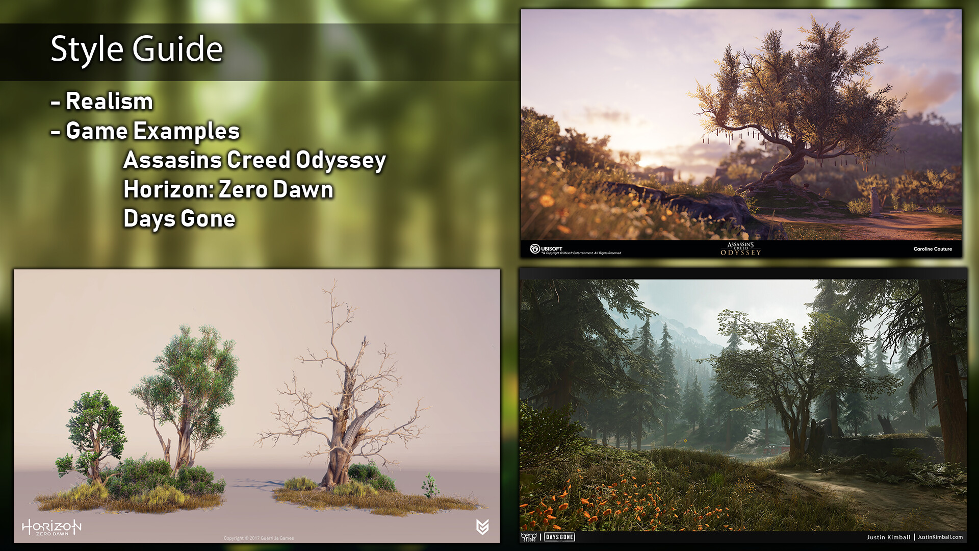
I chose these games for their realism. I also really liked Horizon Zero Dawns way of displaying their assets. 

Using my own reference of grass from the garden and comparing its similar qualities found in Red Dead 2. I'm hoping to get a dandelion leaf in there too!

My rose! Using reference I've taken at Wisley Gardens. Lots of shots of it all over. And similar species down below. 

If I have time I would like to add a material instance so you can change the colour of the flowers.

A rose map so I get an idea of the shape and requirements I want to try and achieve.


The tree!

Branch map and a close up of how they look.


Finally some close up details from the tree. It actually has some really challenging details such as the moss and cut off branches. Not to mention interesting leaves/flowers that dangle down.


I made a start on my grass. Using a technique we learnt in class last year I made an updated version paying closer attention to not making my grass leaves too thick. This is taking individual grass leaves, applying MASH and then arranging them into a random clump.


I then went into zbrush and made grass using the fibermesh tool. This was great and very quick and really helped with believable variety, but it still has it's limitations. I struggled to get textures to work and when I wanted to decimate the mesh to add more geometry, which I could then add more surface detail to, it just made the leaves pretty much non-existent. I have a feeling I know how to get around this but it's a hugely long winded process.

Above was my first proper test in fibermesh. Below shows the texture I later created in photoshop and applied to make it look more realistic. This was created with various gradients, and a couple of different noises applied. A lot of trial and error to get the right saturation throughout, I only had the limitation of a 256 texture size for fibermeshes as well. 

  Finally I took a render of both of my grasses and did a test in Maya to see how they would work together. I wasn't sure these two techniques would combine well so I wanted to make sure before going back to fine tune things. Turns out it worked better than I expected!

The thicker leaves were very distracting so I went back to my MASH mesh and deleted these fat leaves. This is when I also went back into fibermesh and fixed my textures as the default is flat and looks really cartoony. My new texture layouts for the grass can be seen below

Lots of variety and a lot of options to make it work how I need to. Hopefully it all comes together. Next I'm creating a dandelion leaf. 

I'm using this opportunity with grass to essentially experiment with 3 different ways of creating grass and get me back into the swing of things. With the dandelion leaf I was able to explore Peyton Varneys approach to foliage. Something I had tried before but not got that far with. I'm pleased to say this time around I was more successful! My intention was to get the dandelion leaf in place with the above in progress texture map. Using the shadow box tool I brought in a dandelion leaf alpha to get an accurate shape, then sculpted the finer details on top of this. Followed by exporting the renders into Substance Designer, I then proceeded to create my leaf texture. 

However this was a bit of a lost cause as using textures in zbrush for what I wanted to do they needed to tile. Instead I started over and this time used the polypaint tool to enhance the details of my dandelion. 


Although not a lot of normal information is seen on this, the colours are where I wanted it to be, I feel like as this will be quite small, the micro details aren't going to be noticeable enough. If it is I will work on creating some noise to the normal maps later on. 

I went into photoshop to colour grade these a little first, I also used the alpha to tweak my dandelion leaf so I have one full leaf and one chewed up leaf as well. I took my BPR renders from zbrush and put them back into Maya! 


I set myself a limit of 50 tris per grass... Apparently this was a little bit more challenging than I expected. In the end I mixed and matched the above meshes to create 6 clumps of grass all at a maximum of 50 tris each. Adding bend and warp nodes to get some variety. After seeing some industry grass nodes, I was aware that interlacing them in curves or circles (like a yin yang shape)  is common practice to achieve volume and be believable. I tried to keep this in mind with my own clumps, however some of the clumps were too skinny to really be effective. If I get the time I will try and go back and adjust this. 

Once I put them into Unreal engine I wasn't happy with how the polygons stand out on the meshes, but this might be fixed with smoothing. 

They don't look like much on their own so I made a foliage brush and started to paint them around my scene. 

The dandelion still stood out too much so I went back into photoshop and desaturated the colour. 

Over all the jist of the look I wanted to get is there. There is some slight variation in the greens, theres variation in the leaf shapes and types and if I can get a good ground texture to work this could be ok for game. The next test was draw calls...


It's known that foliage can be a PITA with draw calls but honestly, for my first attempt, I was expecting a lot worse than this! If I have time I will get more feedback on this and tweak anything I can to improve the grass. Some of the blades appear pixelated but it didn't seem that noticeable whilst in play mode. Whatever time I have left I will see what I can do to fix this at the end of the project. 

Next week I start on the tree!!


Advanced Specialism: Unbe-LEAF-able!!

Work In Progress / 22 September 2019

It's a pretty crazy thought but I've just started 3rd year of my BA in the Art of Video Games at Escape Studios! It's been a crazy summer, I started projects then failed to finish them due to moving house. Now I'm settled in a new place and its back to the grind! 

What better way to start the final year by dropping us in the deep end with a 6 week specialism project!

After the Bioshock London Project I got a little bit of a taste for the love of creating foliage for games. However I also have heavy interest in the diversity, world and story building of environment art. Starting a couple of projects over the summer made me realise that an environment can be a huge under taking, I know I still have a lot to learn and for college I don't want to leave something unfinished. 

It's taken me most of this week with a lot of back and forth with tutors about what I should specialise in. I know Environment Art keeps me diverse and I need to brush up on my architecture knowledge, prop art allows me to focus on something really highly detailed and also a chance to work on something stylised, and then there's foliage...

Foliage Artist positions don't often come up in the job hunt, whereas environment artist and prop artists do seem to appear everywhere! I was even advised by some recruiters that I should focus more on environment art that leans towards foliage, if that's where I wanted to end up in the long run. This was such a tough decision for me. Eventually I got to the point that maybe I was putting too much thought into this?

It came down to the fact that for this project and for my portfolio I really want something that looks super awesome, realistic and is a challenge. My previous quick experiments in foliage were HARD but also so rewarding. I know I can always come back to modularity, there is a lot of info out there on it and I can practice my prop skills with future projects. Foliage seems a little harder to research, to me at least it feels like a mysterious nymph hiding lots of hidden secrets and knowledge with gorgeous sculpts, textures and fugly UV maps. 

For now I think the best decision for me is to focus on foliage and make use of the awesome resources and people I have access to through the college! My intention is to make these pieces over the next few weeks the very best I have created so far! No pressure. 

Justin Kimball will be my idol for the next few weeks all because of the stunning realistic foliage he created for Days Gone. 

So.... what the heck am I doing?

For the few of us specialising in foliage, our brief requires us to create 3 things... (ok so maybe 4).

  • Grass
  • A Plant
  • A Hero Tree
  • (and then re-create that tree in speed tree!)

 Grass

Here's some deja-vu, a little while back in one of my previous blogs I talked about how I loved the grass in Red Dead Redemption 2. (Here's hoping I can do a better job now than what's seen in that blog!)

The texture is rich, the models are diverse and there's a lot of different colours in this. I now have the opportunity to create my own! 

Using my own references I'm planning to spend the first week of project work getting my head around realistic grass. Check out an awesome reference of my own garden which has a similar vibe to what we see above, albeit with a little less weeds and a bit more tame. 


A Plant - Roses

Right off the bat I had a pretty good idea I wanted to do Roses for my plant. They are my favourite flower and the flower head itself will be a great challenge with the shape and volume. It lends itself to many different breeds, colours and a lot of delicate detail. I think this will be a great addition alongside my grass and tree. 

Squad goals are these beautiful flowers by Yannick Gombart for Dishonored 2.  

This weekend I went to Wisley Gardens to their cottage garden area where it was just chockablock full of all sorts of roses. It rained a lot when I was taking the photos... but apparently rain/dew drops is something we can look into! I was taking consideration not just of the flowers but the leave formation, how the roots connected to the ground and the iconic rose thorns. 

The one thing I really want to achieve with these roses is to create a material instance in unreal 4 where you can change the colour of the flower. There are so many different colours of roses I will be silly to skip this out! So I'll need to be clever with my texture and alpha's for this to keep it looking believable. 

Tree - Chestnut Tree

More specifically the American Chestnut Tree (we think!). Initially I was looking at creating a willow tree as the idea of those big long branches would be a great challenge to create the weight and volume of those shapes. However I was advised against this by our Head of Games department, Simon Fenton! Probably all for the best! I was already concerned the only willow trees I could find were utterly massive in scale. 

Taking an afternoon off to scout for the perfect tree I stumbled across this beauty in a local woods. After double checking with our studio assistant Wiktoria, who is a foliage wizard herself, she seemed to agree that this was a manageable sized tree in scale but also interesting enough to be suitable for a hero tree. I'm glad because I really loved the tree trunk that's been split into 3 and how it seems to lean to one side as it chases the sun! 

The following day I went back in better light to take a lot more photos. I want to experiment with Photogrametry for the trunk base and at the very least this skill could help me create a realistic texture for the bark. However once I got home I didn't have the appropriate graphics card to get a textured high quality render done. I'll have to try again at college. 

In the mean time I'm making a branch map of the tree to get an over all idea of height, and how the branches bend and twist and interact with each other. 

The Wordy Bits

Along side the hardcore decision making and research gathering, we also had to write a detailed individual brief going into our technical restrictions, poly counts etc. I'm still not very confident that I've calculated these all correctly but I'll have someone check through these with me on Monday!

Tasked with job hunting our chosen specialism we were to create a skill audit to see where we were lacking and implement a way for us to conquer these pit falls during this project. I decided to rate myself out of 3, 1 being poor, 2 being good and 3 being excellent. All 3d modelling knowledge is new to me so I haven't rated myself over a 2 in most instances, where I've marked a 1 is usually just because I'm not very confident in the software or my skill set, I am aiming to change that. The whole point of this is to get better!!

+     = Extra skill bonus to application

Finally a schedule! This was a bit of a tough one as I know there is a lot of back and forth in foliage creation. I know I personally went through a lot of trial and error to get things to work.... I'm not 100% happy with the below schedule but it's a start and there are areas where I'm pretty sure it will take me less time than I've planned and others that will take more time... they will balance out!

The asset list next to the schedule was a rough guide for me to figure out if I was taking on too much.... probably! But I'll figure things out!


Pet Cemetery - Mausoleum

Work In Progress / 18 June 2019

I'm actually changing focus for this summer and not working to a deadline anymore for this stylised project. This is mainly because I totally forgot about the King Arthur challenge I want to enter! But also because I ran into a lot of hurdles I did not anticipate with stylised so want to allow myself more time to explore this better! Below you can see my progress from last week!

A little daunted by the idea of going straight into my witch tree sculpt I started with my Mausoleum, I foolishly believed that this would be one of the easier tasks! What I had not anticipated was that to create a stylised building, the edges tended to be curved and over exaggerated. 

Originally I was going to use a tiling texture for the roof tiles, however after researching some advice lead me to change my mind. Because a lot of stylised games are in 3rd person view, having things more detailed at the top is more desirable. So I sculpted the tiles instead of relying on a tiling texture this lead to a more chunky and satisfying appearance.  

The final Mausoleum sculpt. Here's hoping I can pull it all together in the texturing!

I was worried about my tiles being too uniform and not having enough variety in them. After watching Polygon Academy and how he constructed his feudal japan themed roof pieces I went back to the drawing board and applied a similar tactic. I sculpted 4 variants of tiles for my mausoleum and baked them as a texture and applied this in Maya and pieced a new roof together. It was time consuming but I'll have a more authentic and varied look because of it.

As you can see I also made a tillable material for my wall texture. In the past I've always just UV'd everything as a unique asset so using a tillable material like this was brand new for me. Having my corner pillars will cover up any unsightly seams.

I have to say though, I found creating a stylised material very difficult. I tried various ways including sculpting a texture in zbrush, but  I just couldn't get it to work how I wanted. I'm hoping my attempts in designer will do for now and maybe this is something I revisit.


Next I took my extra pieces into substance painter to texture.  In Maya it appears a lot darker than intended but i'm hoping now I've got these rough colour textures in place these are all things I could come back to in Photoshop to clean up and generally get it to be prettier.


Stylised Diorama

Work In Progress / 07 June 2019

Last summer before I started second year of university I started on a small mini diorama project based on an old game idea of mine. 

The idea was essentially a small pet cemetery turn table diorama which I modelled in Maya.

But this was last summer, with everything I have learnt now I couldn't possibly go back to this. My skill level has greatly increased in just a year and now I have a better understanding of using Zbrush I really feel like I could make a better scene to show off what I have learnt now. 

I had all my base low poly meshes in place including foliage cards but I didn't really know how to go about doing these in the long run. 

I did get around to doing some hand painted textures though which were really fun to create. 

So to start my summer off I'm doing a new take on a similar theme of a Pet Cemetery. Below you can see my art bible research for the new project plus some screen grabs of my initial block out. Things are likely to change and evolve as I work on this, but essentially I want to create a small stylised environment within 6 weeks. 


Note: I'm likely to be more lenient on my poly count in order to get a really nice finish without going crazy as well!


Bioshock Foliage: You had me at Hydrangea

Work In Progress / 30 March 2019

What would Jerry McGuire have said if he was a flower?

You had me at hydrangea.

We have just begun our first major group project over at Escape Studios for our second year. We have 12 weeks to create an environment with the theme Bioshock - London.

You can see my groups progress over the weeks at Big Daddios - London Blogger

We've got 7 weeks left!

One of the things we must include in our project is foliage, I think out of the group I was the only one who had done more foliage than grass. Which to say wasn't much more than ''a tree that wasn't made in speed tree''. I nominated myself to create a couple of foliage pieces as I am quite curious about learning more about this specialism. 

Ferns

My first attempt actually wasn't that bad. I started with the humble yet effective fern. I selected leaves that were similar to what you'd find around the British countryside. My main change was that as the environment we were creating was abandoned that these ferns would be part surviving part dying so it was important to have a range that represented this. My main tutorial to get me on the right track was Creating real-time game foliage

This shows my work flow of creating a base colour plane and then deforming each leaf before putting them into bunches. 

These are my final bushes of ferns with the Bioshock treatment.  I applied a gradient to my leaves base colour and it helps them all come together. All textures were created in Photoshop and Quixel suite, but if I were to do this again I'd really like to try sculpting these in zbrush and using that method. Overall I received some positive noises from peers at college. 

And thus the false confidence began! 

Research

I did research into gardens and in particular shade gardens knowing I wanted one more flowers to go with the ferns and also a climbing plant we could use throughout the scene. Below you can see explanations of why I chose them as well as how we could use them.

Hydrangea: Attempt 1

I decided the more difficult plant (minus the clematis spline) would be the Hydrangea and this would go underneath our hero asset so that's what I started with. The snow drop is a stretch goal and if there's space on the UV, eventually I want these extra flowers on the same UV space. 

I decided to follow more in line with the tutorials provided by Peyton Varney and tips and tricks by Jacob Norris. The more I researched the more I found that a lot of tutorials were for jungle foliage, big leafy green things which weren't too different to my fern leaves. Not much is around for actual flowers especially something as unique and complicated as a hydrangea. 

I started out with just creating meshes so I could zbrush textures and bake them later. However even low poly in maya this was ineffective as the poly count was over 1k and it didn't even look that great. I needed to re-think. 

Hydrangea: Attempt 2

I managed to lose my save files of my first attempt using Peyton Varneys method. Yay! A bud omen indeed! Losing about 2 days of work. However I gave it another go. This time I was thinking I should try making planes for everything including the stems as I have seen this be used effectively elsewhere. 

I started with a simple zbrush sculpt of the stems I would use. One with lots of leaves and one more as a single stem. I left space for flower heads and petals as needed. I exported this into a normal map. 


My first attempt at the hydrangea at 1.1k poly and second attempt at around 700 polys. 

Starting to look promising. Not great but I wanted to see if I could get this method to work first! I made more low poly mesh cards and bent them around to look more real and organic and tested it in my drinking fountain scene. 

bare in mind this is just the base colour and not polished.... it looked like I could do something with this.... and it was still nice and low poly. I had little flowers sticking out randomly to try and make it look less like a sphere for the flower head but it wasn't really that great. 

Until I realised all the stems disappeared when you turned it around because ...its a plane! Duh!

Hydrangea: Attempt 3

It was clear geometry was really needed for the stem/stalks of this plant. I wasn't sure how to make the flower heads that convincing either. I was desperately searching for more specific tutorials that might show me how to tackle a plant like this but still only big leafy jungle plants or a foxglove in speed tree.... 

I stumbled across a video of this Flowers and Plants pack unfortunately no tutorial near by however I thought this was a beautiful pack. Within I even spotted a few hydrangeas and this reignited my be-leaf that I could achieve this! I spotted them and with the few frames they are on screen could see I was roughly on the right track. 

I admit by this point I was feeling less that confident and Maya has a funny view-port that kept showing loads of clipping on the textures even though the meshes themselves were fine. Above you can see my 3 attempts at this foliage. The final one on the end is the final mesh at just under 1k. It's still higher than I would like but I reason this out in that this plant will only be used sparingly around our fountain hero asset. I really needed to see this in scene. 

Conclusion

Using my personal specialism scene again which has similar lighting to our large project, and in amongst the ferns I was pleasantly surprised by the end results. I think I immediately handicapped myself by picking such a challenging plant to do. But this has been a very intense learning experience because of it. I now feel more confident about approaching the final foliage: the Clematis. 

To make this better I definitely want to go back and change the colour to make these flowers look dead as they are in the reference. I think its quite a striking and haunting visual. Since this will mainly be with colour it shouldn't be a problem. I think shrivelling the leaves will make this another epic mole hill to mountain fiasco but the least I can do is de-saturate and brown up the colour more. 

The foliage has been the most challenging part of learning for me so far, a lot of work goes into something that on screen is actually very small. Despite this once you finally complete it to a decent standard it is very satisfying!
  

Bioshock - Fountain

Making Of / 15 February 2019

Our next uni project was to create our own brief for a specialism to be completed over 3 weeks and if possible keep to the theme of Bioshock London. My chosen specialism was Environment Art and I really wanted to develop my skills in Zbrush and storytelling in environment art. Knowing that this wasn't a lot of time I decided to keep my scope small so that I could achieve something to a high standard.

Research

 I wasn't sure what I wanted to do straight away, keeping within an Art Deco style I did a lot of googling until I could find something I liked the look of. 

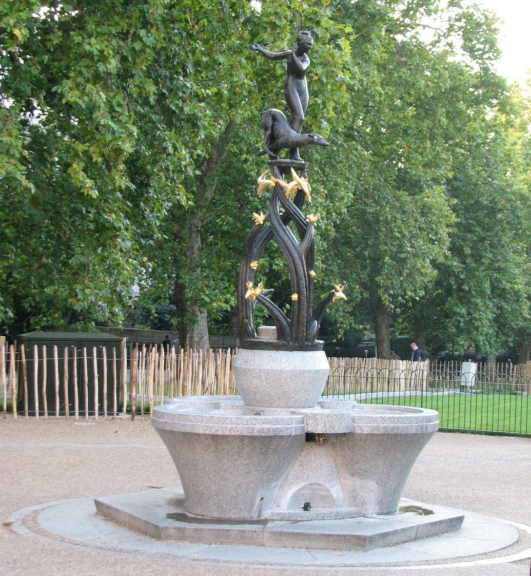
I stumbled across the idea of a water fountain, the Chicago fountain pictured above and thought it was something ornate enough to stretch my muscles in sculpting with zbrush. However it wasn't really London. I later researched the below Diana Fountain from green park. 

I really loved the materials used in this, a combination of gold and bronze and of course stone. This is a communal drinking fountain and became the spring board for my idea. 

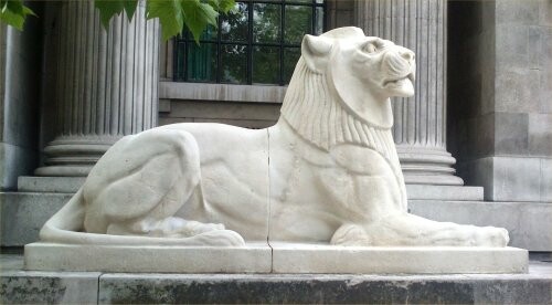
I wanted to take elements that reminded me of London or in general English pride and apply this to a type of communal drinking fountain. Lions were my main draw as this is a symbol of England and there are a lot of lion statues around London! I settled on my my lion inspiration the Marylebone Lions as they are Art Deco already and there are a lot of references available to use of these. 

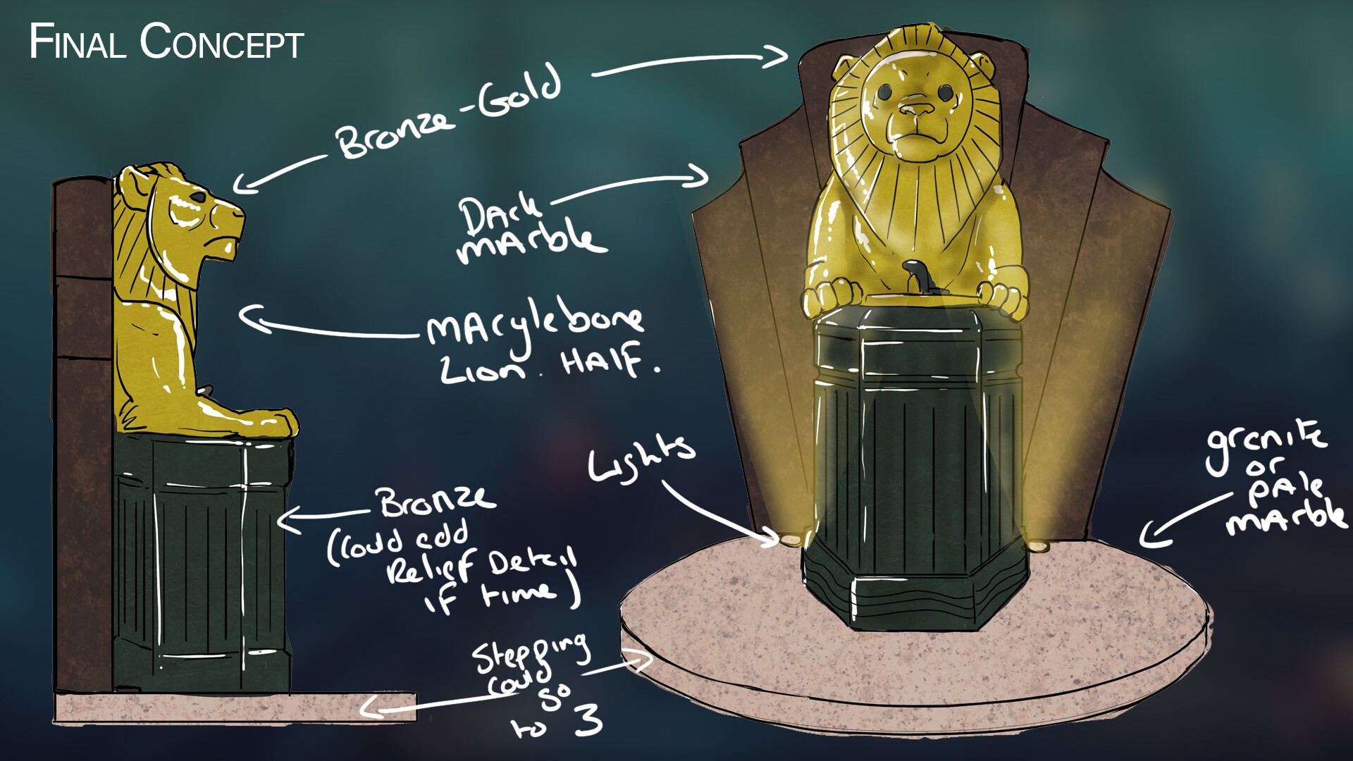
Using these main references for inspiration I created the below concept to start from. I sought out feedback for my idea as I worried it was not enough. I was told that it was quite ambitious, but also doable provided I do the right research. However I may run into scheduling issues if something goes wrong. 

As I want to specialize in Environment Art I really didn't think this alone would be enough to display my abilities in storytelling, it felt like just a prop. I researched a little more on things like propaganda posters from the War as there was a lot of propaganda used in Bioshock, and again the world wars are a big part of London and its history. I hoped that if there was enough time towards the end of the project I could apply some of this to aid in the storytelling which was an important aspect for me. 

Concept to Sculpt

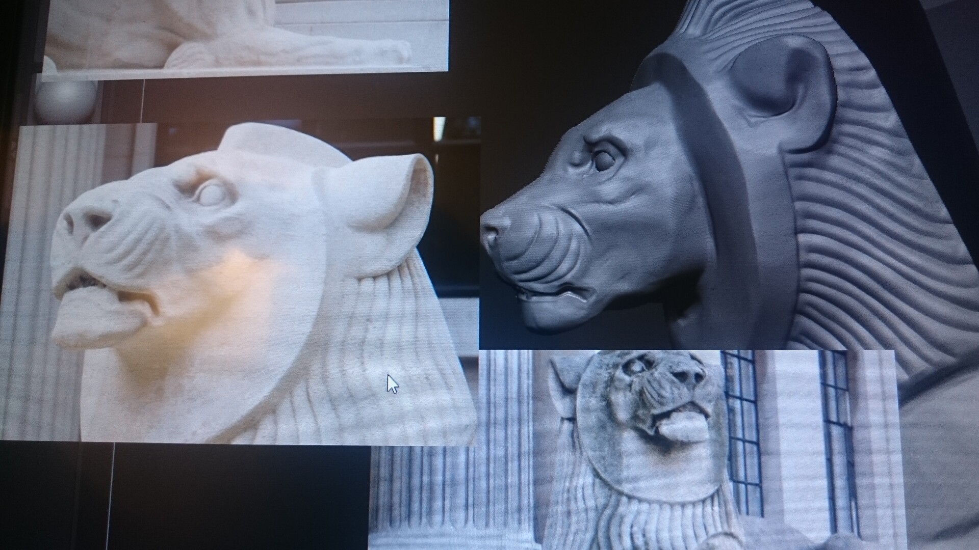
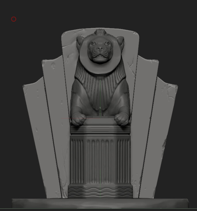
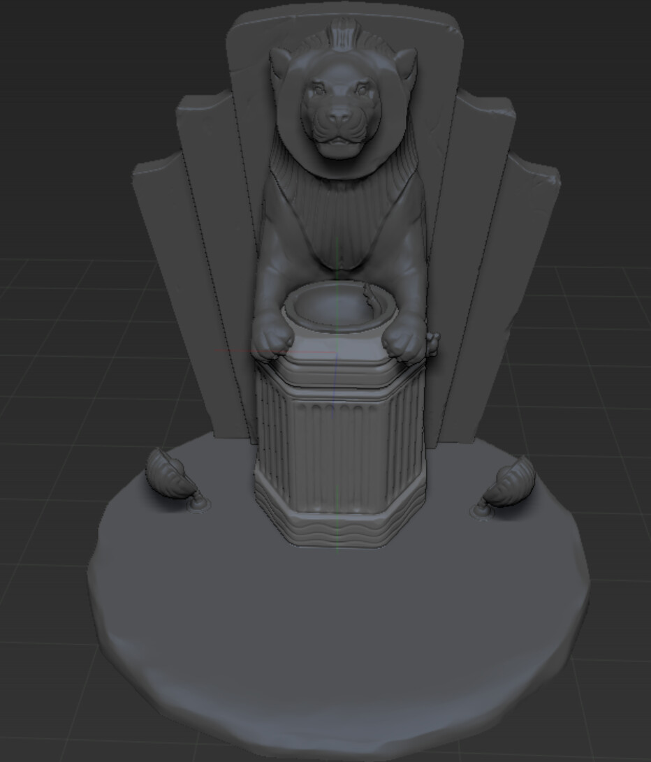
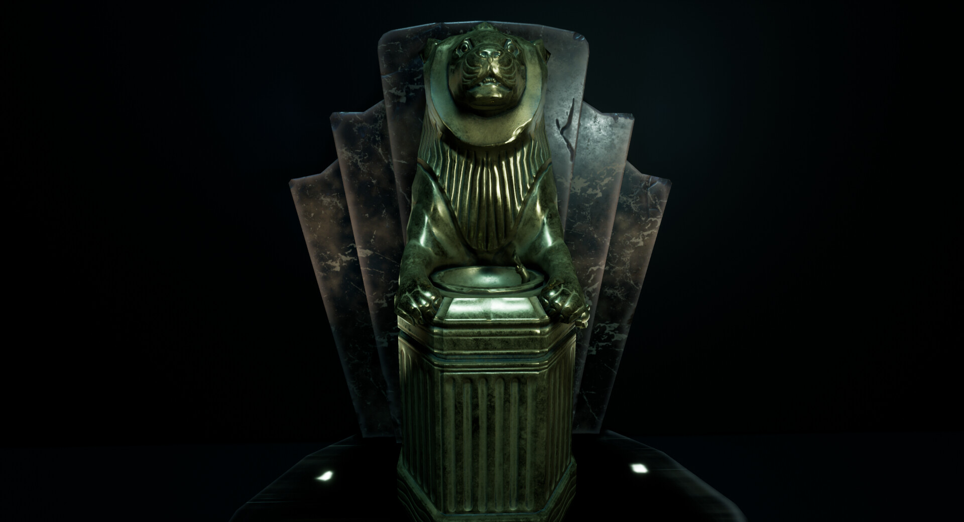
I really wanted to get to grips with zbrush in this project, so I spent the majority of the first week and a half to working on the sculpt of my Lion and Fountain. I used the first half of the London Lion reference and tried to mimic this as closely as possible but still fitting into the prop I had created. Considering details such as making it believable and functional. 

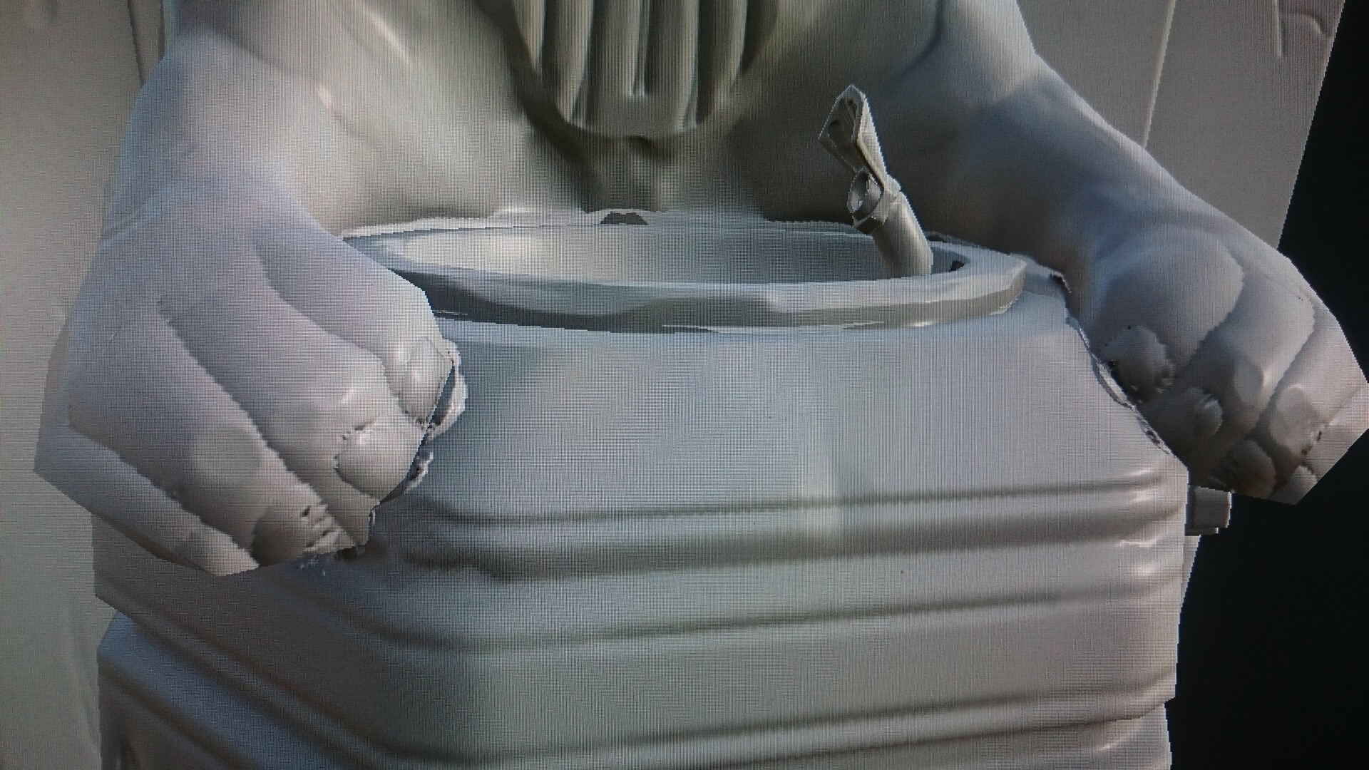
After sculpting more I noticed that the placement of the drinking funnel itself looked wrong. So i researched more art deco drinking fountains and discovered they were more often towards the side so I re positioned this and made sure there was a visible tap to the side. This immediately aided in the design.

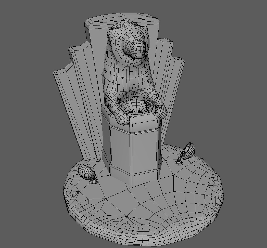
I was really content with the final sculpt and was eager to move onto the next step as I wanted to make sure I had enough time to do a good job in texturing. Initiate quad drawing in Maya. This was exceptionally challenging for me and I had about 3 tries at this before I got my head around it. Unfortunately in hindsight I still did this far too low poly for what I wanted. After this project I intend to go back and give it another shot. 

Texturing

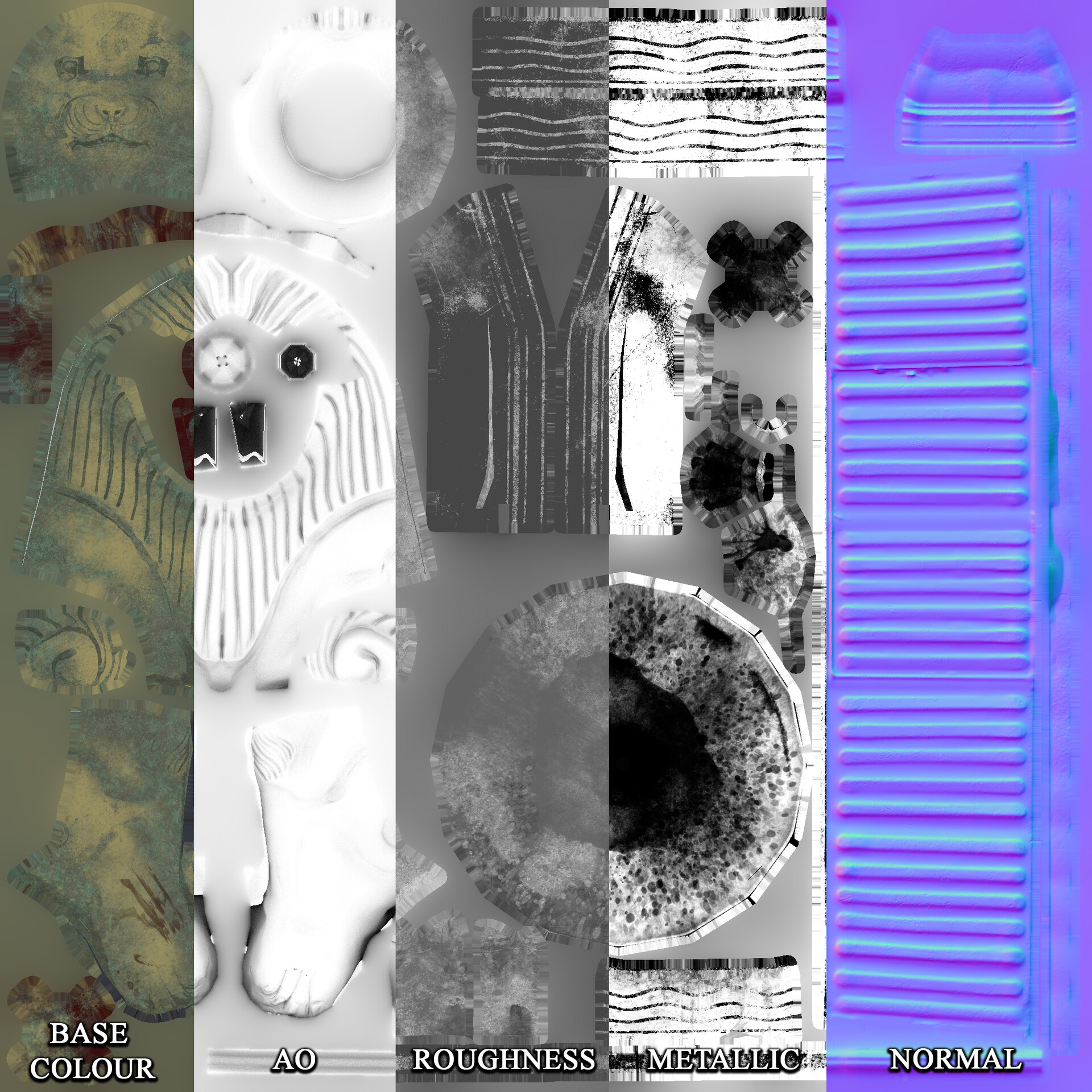
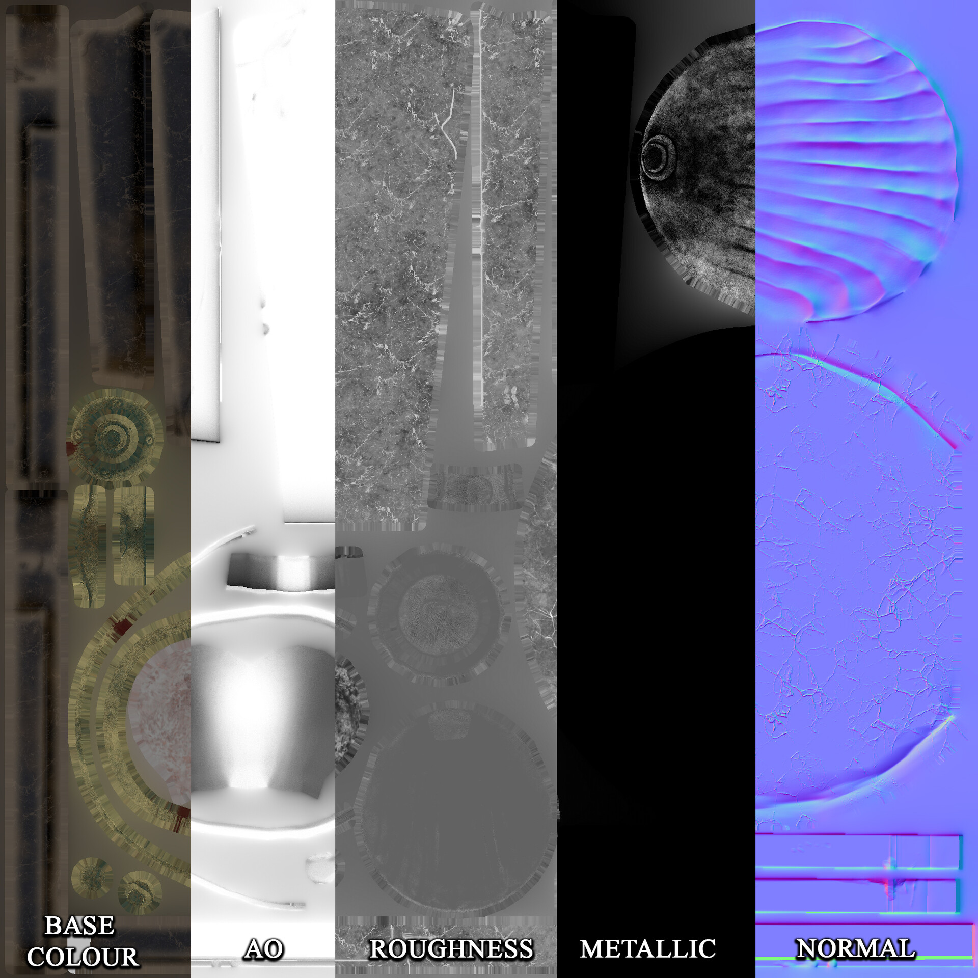
I used substance painter to texture and had a lot of struggles with baking. I had a lot of issues with the ambient occlusion from all the different meshes I had used. I looked up exploded baking to help with this. I learnt if I had everything labelled correctly in both Maya and Zbrush scene, and exported them without merging them together I could do this easily through substance painter by baking as individual meshes. 

This dramatically increased the look of my texturing. 

However this was where I realized that my Lion was far too low poly in places. It was here I did re-quad draw once or twice. I was able to adapt the topology around there ears to make them look rounder and give more geometry around the feet which helped a lot. However it wasn't until I had my scene set up towards the end I realized I could have added a lot more geometry. This is a big lesson I learned as I still struggle with making everything too low poly, I'm slowly getting my head around this.

Setting the Scene

Learning from past mistakes I took a break from texturing to see what this model would look like in unreal. I created a basic lighting set up as I had intended to just display this in a blank scene. However it was at this point I realized the error in thinking this way. Creating a mock lighting set up early like this allowed me the time to re-think how I wanted to display this ahead of the last minute deadline rush. 

Doing this highlighted that I would need to create some kind of environment around this prop to make it look interesting. It would also give me that ability to do some storytelling. Not only that but because of a lighting artifact in the image above I realized the original lights I had planned would look unimpressive so I decided to model entirely new lights. 

I found the art deco lights above, which matched the shell look of the faucet I created earlier. These I would eventually use to link throughout the scene. 

As I didn't have the time to create my own textures from scratch, I found tiling marble tiles, wood, concrete ceiling textures from https://www.textures.com/ however these alone I didn't think would make the scene interesting enough. 

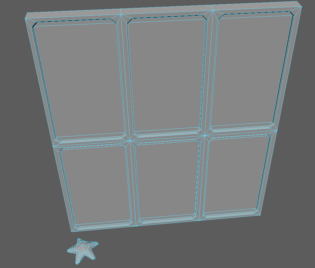
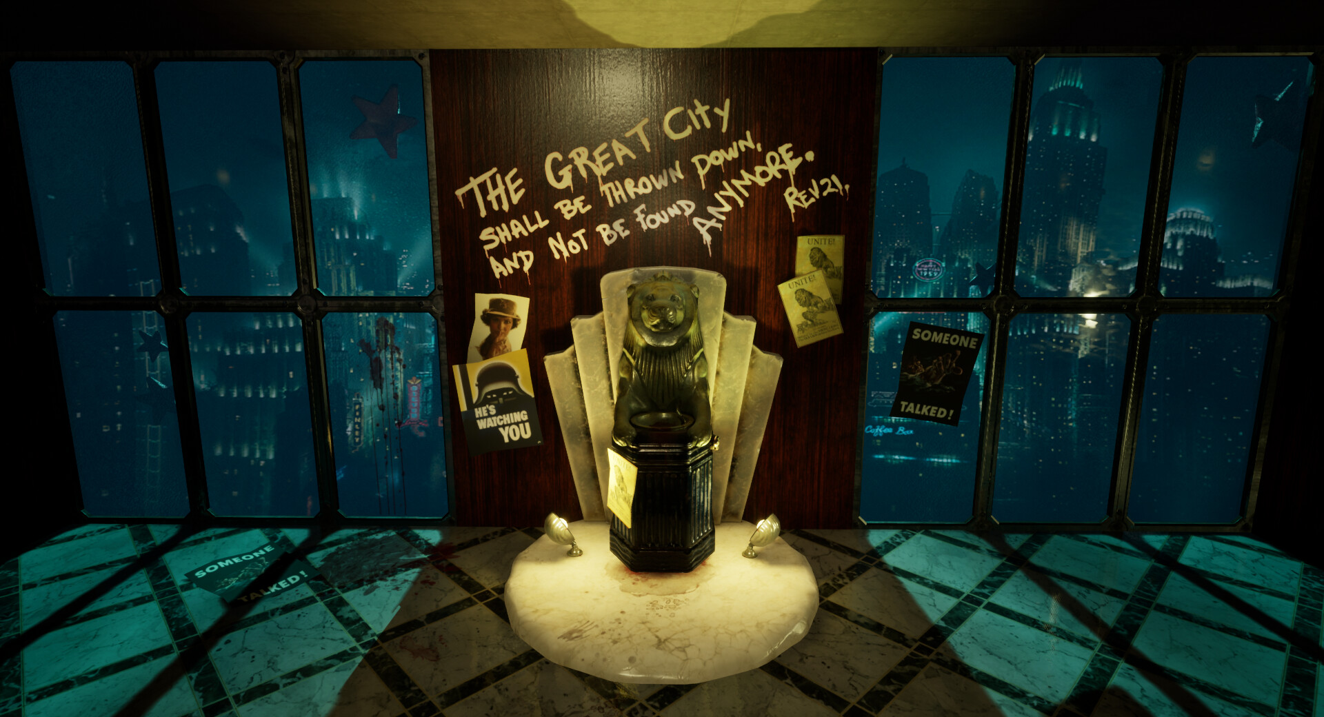
I quickly modeled some windows based on Bioshocks windows which are of a heavy metal material and thick glass. I also remembered that there was always a starfish on the glass in the first game so I quickly mocked one of these up to resize and place throughout the scene, a small nod to the source material.

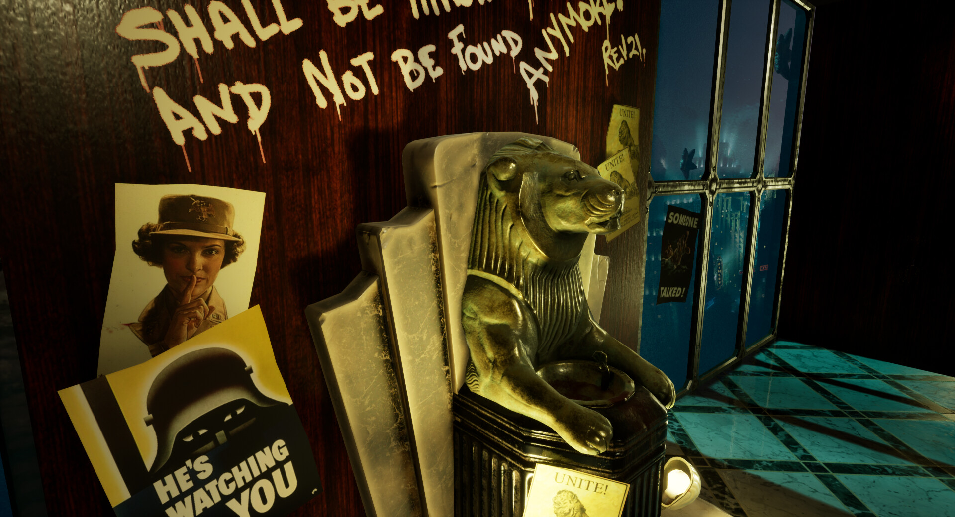
My original brief included decals and I had not forgot about this. I went back to the propaganda posters and focused on the ones emphasizing silence, some of these were quite sinister and I thought this could aid in the ''secret society'' that Rapture was. As I had a violent bloody texture job on my Fountain I wanted to aid in the belief of a scene in downfall. I created a specific blood decal texture and made these decals lead from a point of action and lead to the fountain, as if someone went to clean up after an attack. 

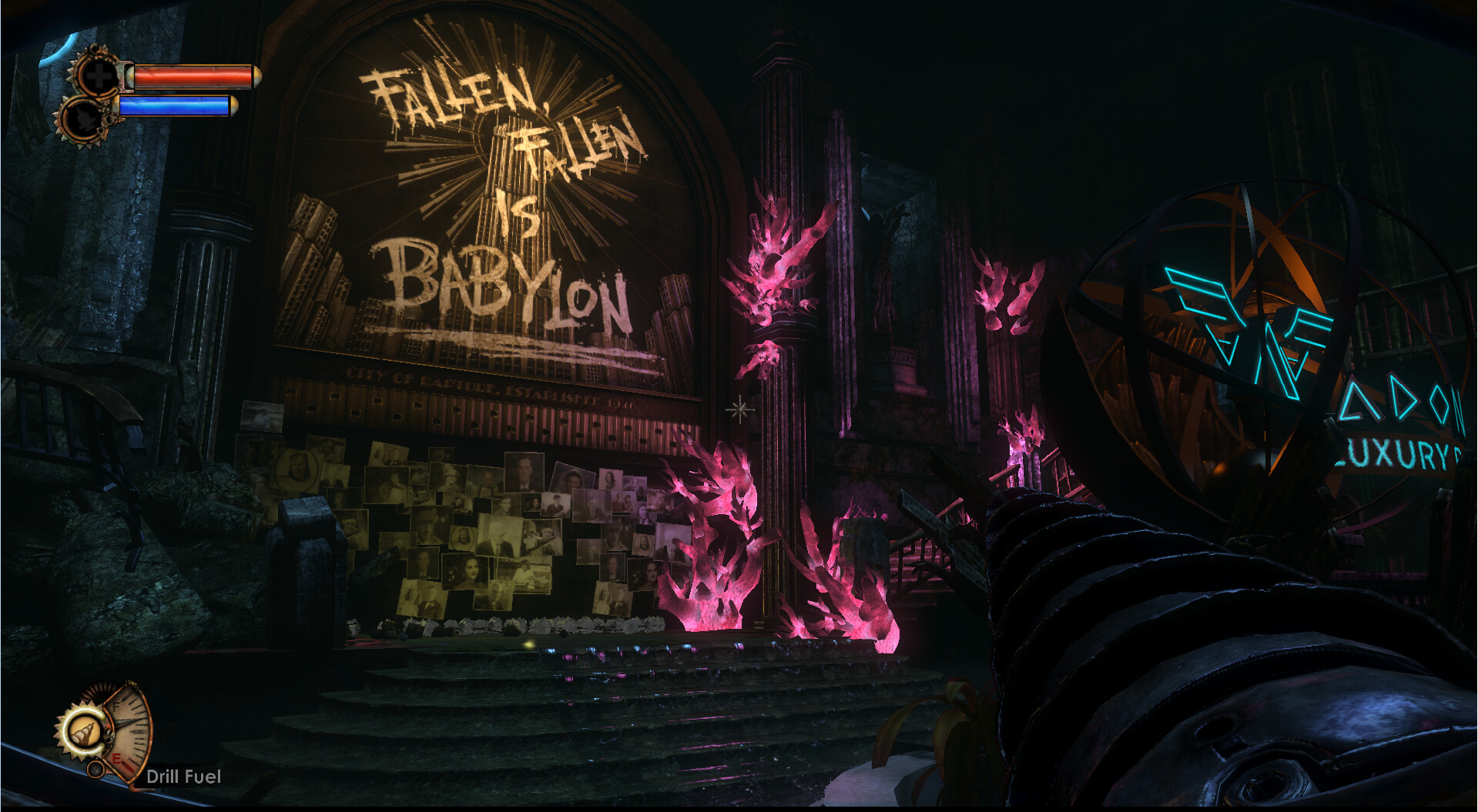
I wasn't quite sure what to do for Graffiti but when I stumbled across a biblical reference to Babylon in Rapture I decided to find the original bible reference and quote a later section of this bible story myself. 

The key part that drew it all together was the view through the window. Unfortunately I did not have the time to make up my own London sky line, so for this university project I found a promotional image used in Bioshock of Rapture. I used this as a background plane and then applied a bump node to this to mimic a small parallax.  I set this image to an emission as well and it helped make it look like a live city. 

Lighting

I'm really glad that I did a mock lighting set up early on before I had everything in place as it made it easier to make the big decisions later on. I placed the key lights where they would be lighting up the fountain, which was a common lighting set up in Art Deco. I added a few point light to illuminate the details, as well as light up around the space. But the main focus was still the fountain, the white graffiti helped draw focus. 

The rapture background helped with some illumination and I set my main directional light to a dark green. Finally I went back and used the same method I used in my diorama to create water caustics. I set them quite large as we would be very deep underwater and this effect would not be very clear if at all visible but it helped the scene feel like it was breathing in the end. It was subtle, but effective. 

Below are the screenshots of my final scene.