Website powered by

Gravity Falls: Ink Outlines

Work In Progress / 23 June 2021

It's been a crazy year so this project got put on the bench! But now I'm slowly carving out some free time to start working on this again!

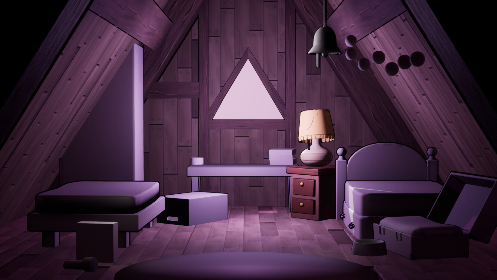
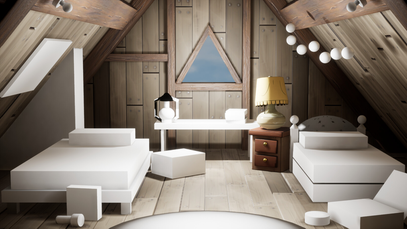
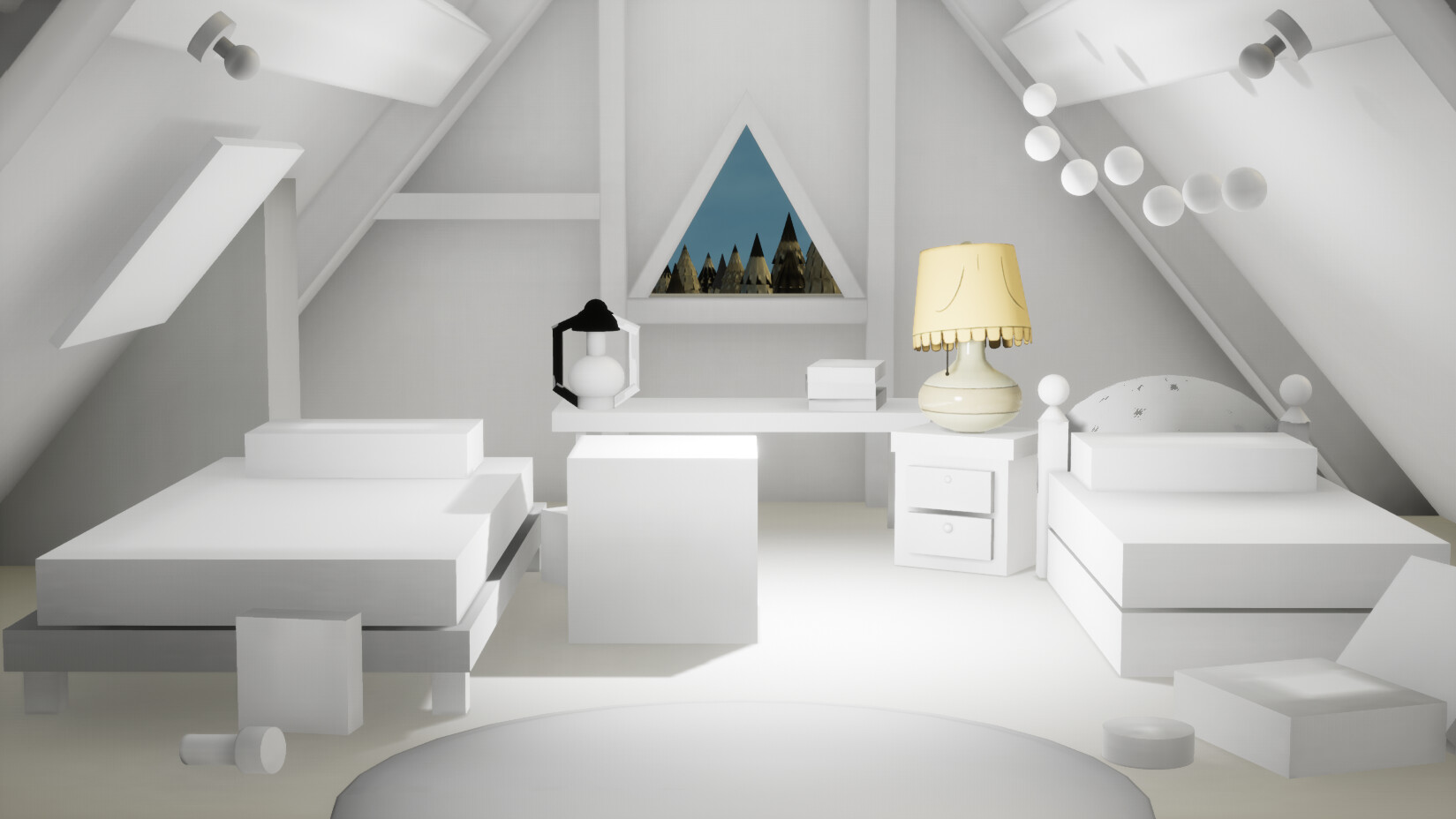
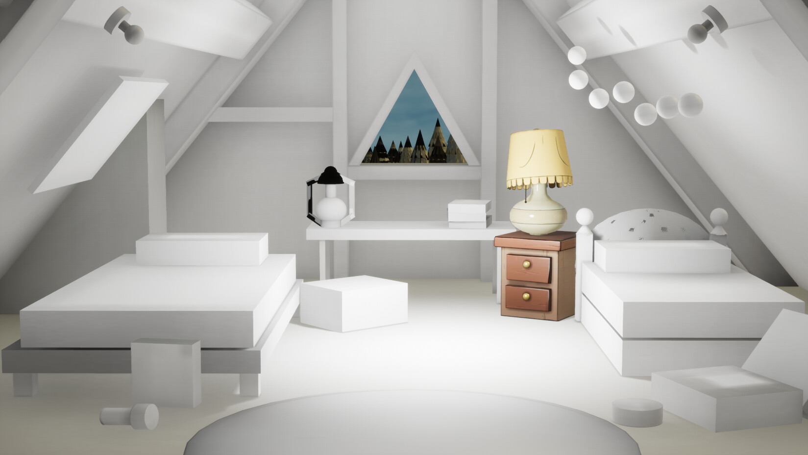
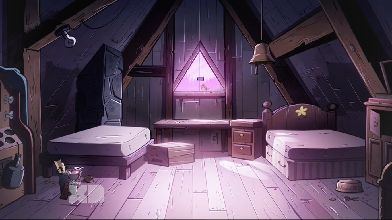
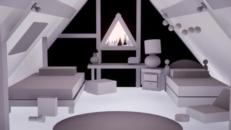
Hopefully most notably you can see I've had a bit of a lighting update. My goal is to focus on the nighttime feel first. It has the minimum amount of assets to focus on and will give me a good practice start for mood and atmosphere in lighting. 

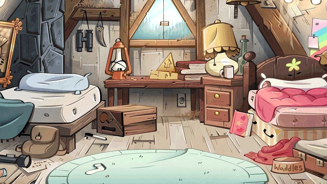
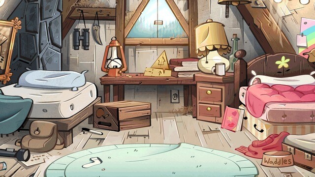
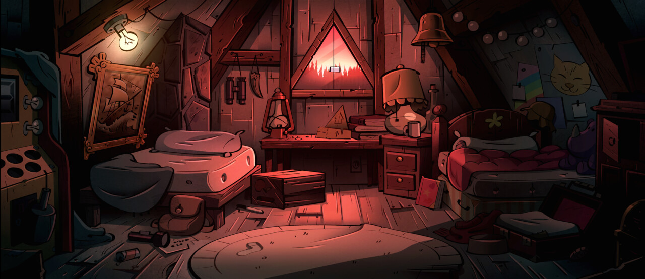
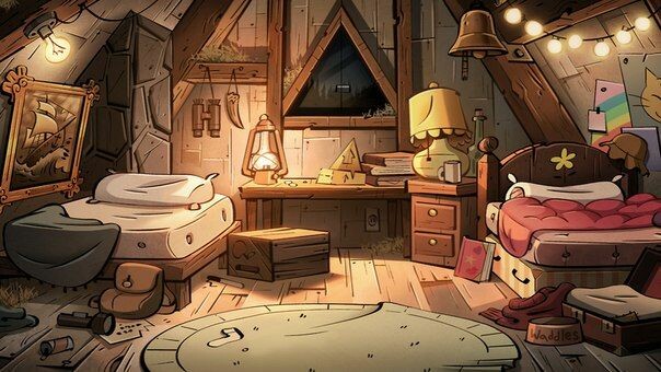
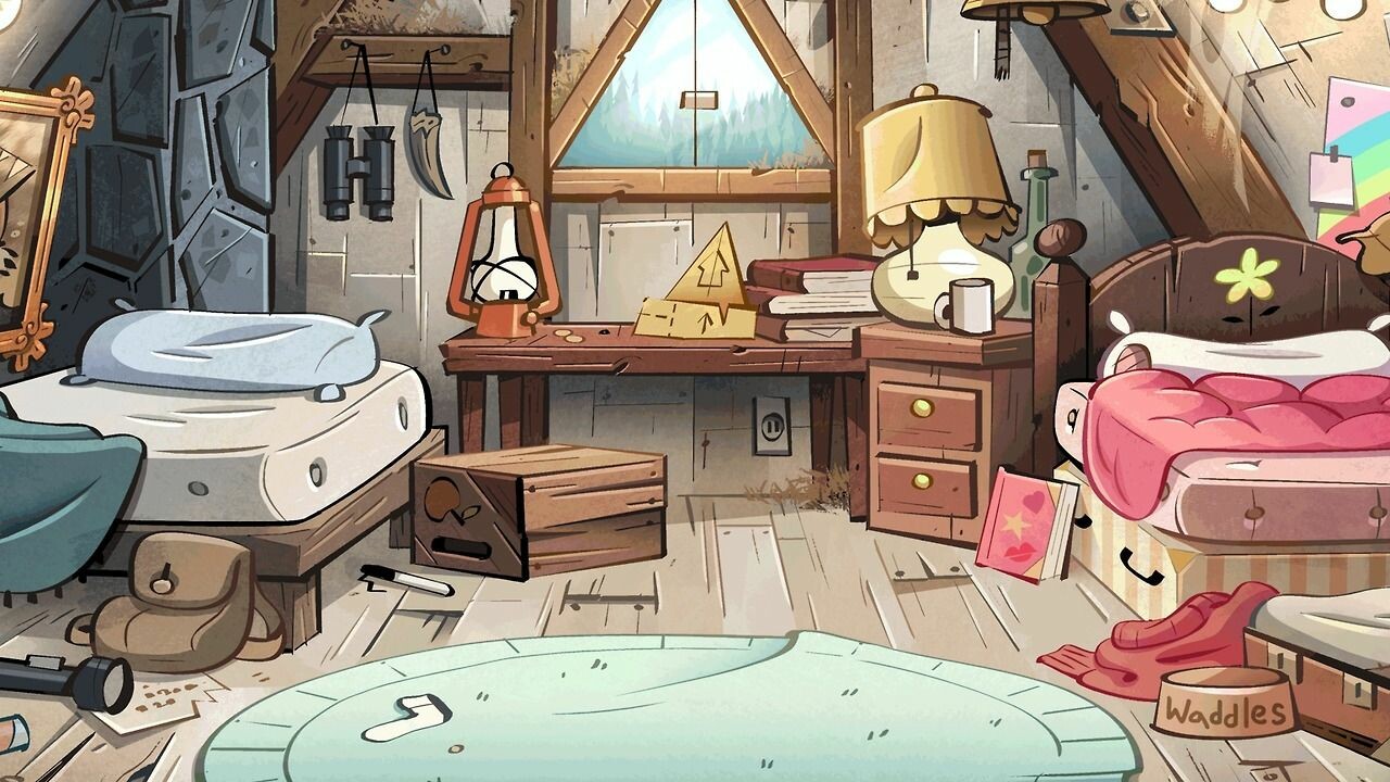
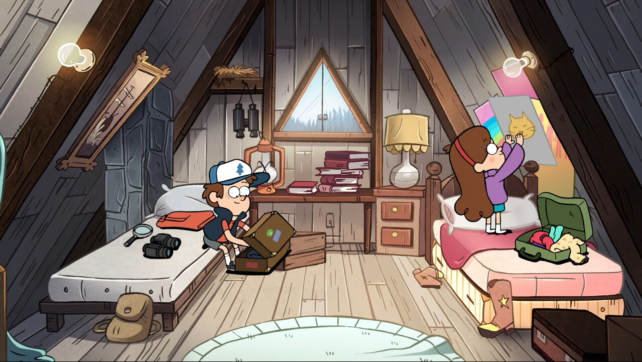
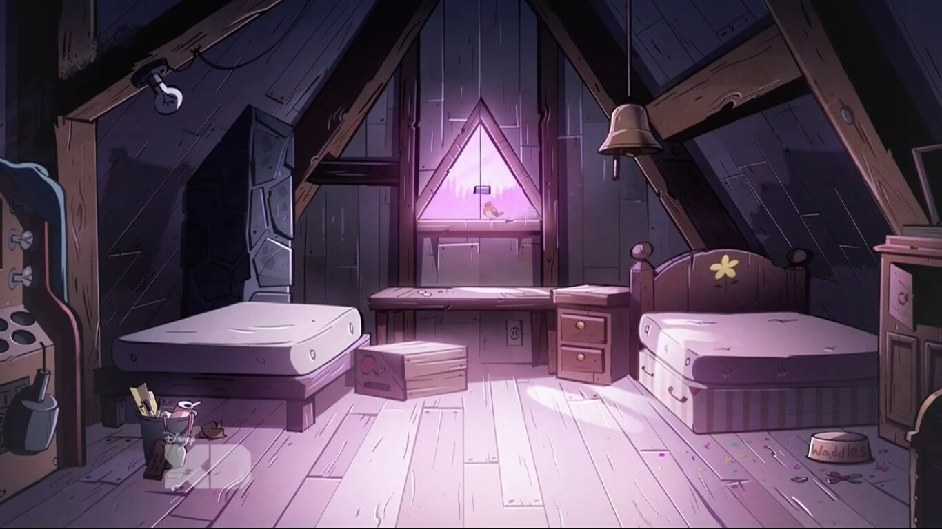
Here's the two refs to start with. It'll be a bit of a hybrid between the two rooms!

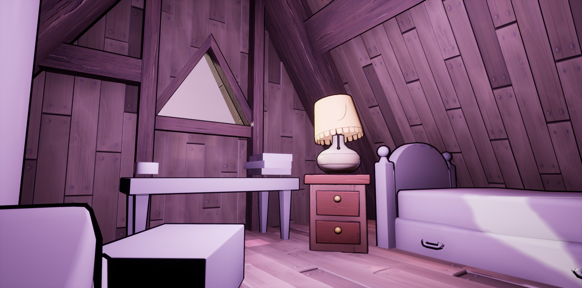
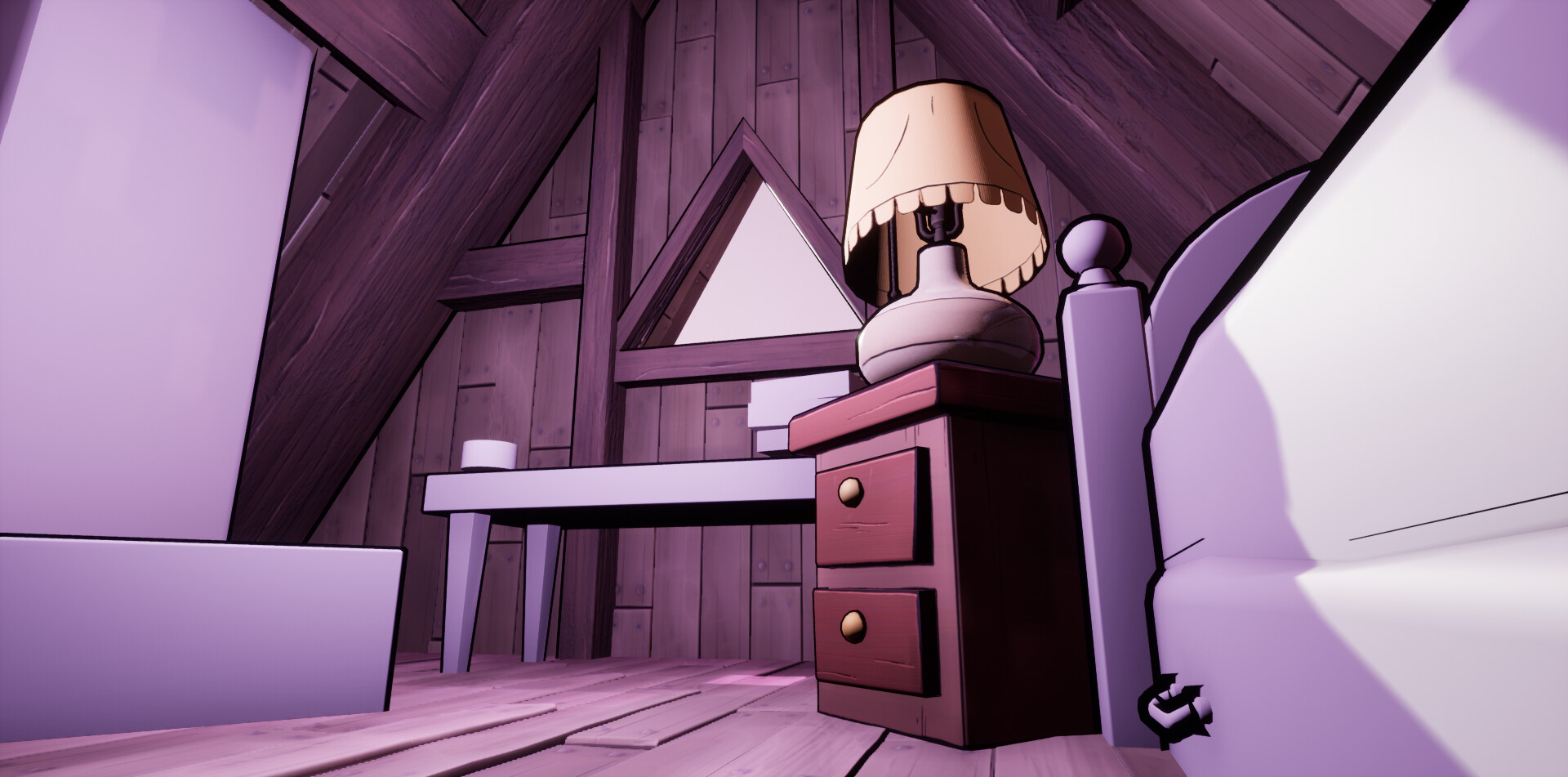
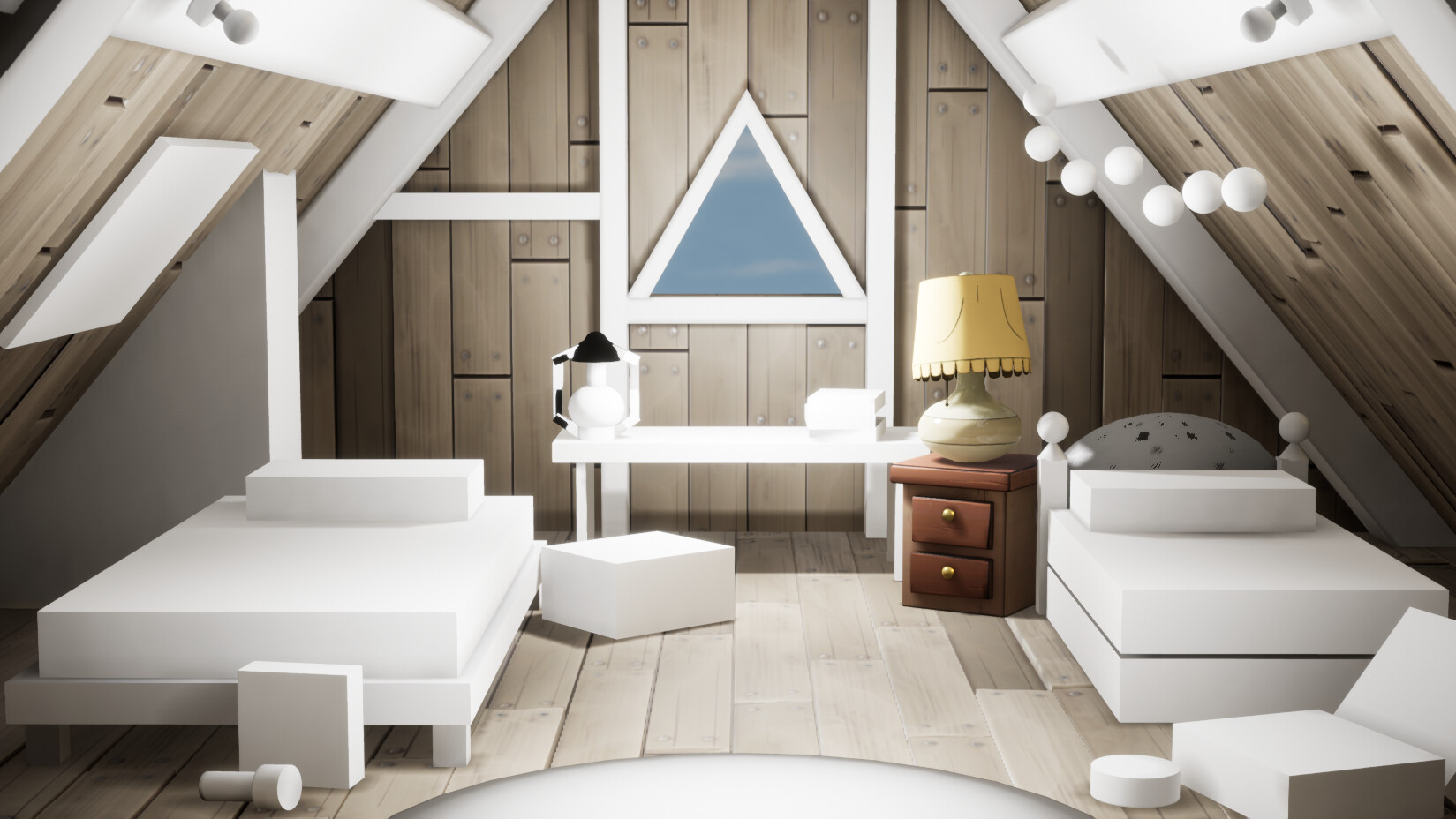
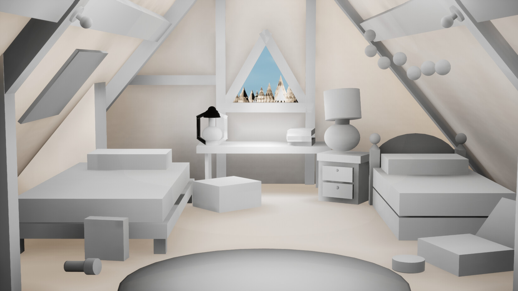
Secondly I experimented with some thick outlines! I'm not a shader pro nor do I have one on hand. But a handy trick I've seen a few people use is duplicating the mesh and then reversing the faces followed by applying a black material.  It does the job for the main outlines but I will still have to add some hand drawn elements to the textures! That's fine though, I can handle that :)

As you can see this is all very blockout still as I am experimenting :) But I am looking forward to getting some assets textured over the next few days now I know this works in theory!


Gravity Falls: Tiling Materials

Work In Progress / 27 July 2020

If you are curious about the reference material check out the first blog!

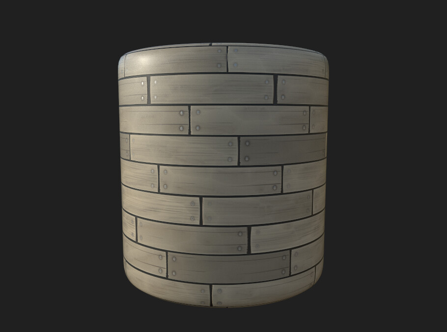
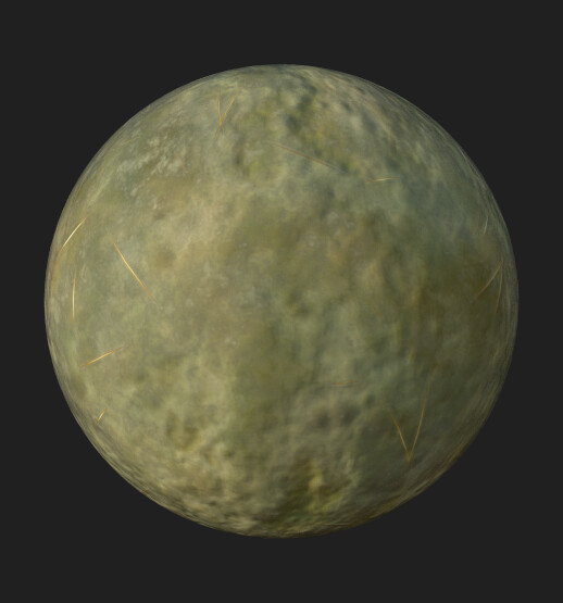
As there's a lot of tiling wood in this scene my gut instinct is to create these by hand. However I really wanted to see what it was like to create stylised materials in designer. This would mean that if something didn't look quite right I can easily go back and tweak nodes to adjust, or even open up parameters to do it in engine. 

I found this material break down on youtube by 2dEx. Although this is a more detailed material than I need for this scene it was really useful nonetheless! I learnt about a few more nodes and how they work specifically when it came to shape manipulation. How they address colour was really interesting as this was something i really struggled with in the past. Using the normal map and a bunch of nodes to break down different low and high lights to get that stylised look was very clever!

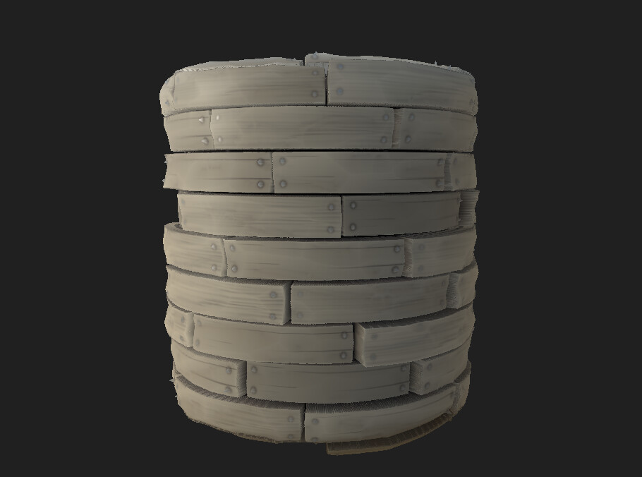
I was also working with tessellation. In unreal a lot of my textures were just driven by the normal map. I thought for this scene it would really help save me some time and get some fun variation in the wooden planks.

With and without tessellation.

I've deliberately made the wood more desaturated than normal. Since I want to experiment with different lighting scenarios  once all the assets are done the lighting plays a key role in how it changed colour of the wood. For example if I recreated the twilight scene it would make the floor look too saturated and purple if I went with the default rich warm browns and oranges.

After being directed towards this tutorial I was introduced to the Parallax Occlusion node in unreal! This was really handy in applying the tessellation through my height map created in designer into unreal. Giving my floor and walls a little bit for variation.  

To contrast the designer method I tried making a basic wood beam tiling texture in Photoshop. Taking this into designer to create the normal, roughness, AO and height information. The result is a little noisy so the normals will need to be turned down. I also feel like I need to add decals to the beams to add line art and edges, or treat them as individual assets.

However the scene is slowly coming together and I am having to tweak some lighting as I go along. I want to focus on some meshes that are bugging me the most and also bring in some colour! So It'll be the lantern and Mabels bed next!

Gravity Falls: I Love Lamp

Work In Progress / 23 July 2020

Some great advice I got at the start of the year was "just finish something". I have a habit of trying to do things "the right way" which isn't always the most rewarding way of staying motivated. Initially for this project I wanted to just mesh out everything properly in maya and then go through and texture everything. However because it's been a really long time since I attempted anything stylised it was important to make at least one asset start to finish.

My eye is drawn to the lamp in the scenes it appears in from my previous blog post. As it is also going to be something I'll have to play about with for lighting as well it just seemed an important asset in the scene but still relatively simple to start with.

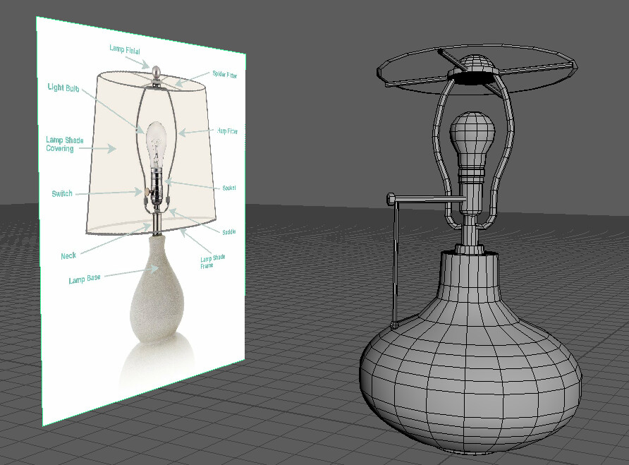
I modelled this in Maya. It was a simple shape and although I could have left it as the base shape and the lampshade with no interior, I am not sure if I will want to do a fly around the scene or not at a later point. I therefore took the opportunity to model the inside of the light just in case. Any excuse to keep practicing!

Using reference to make sure I get it to look somewhat believable when up close!

As a final asset it's not terribly complicated. It is also arguably a bit high poly for the scene at 2.2k tris, but again I would like it to look nice up close if I chose to do this. If I wanted to make a still scene all the insides wouldn’t be necessary and would cut this down a lot. Additionally I wanted the round shapes to be as smooth as possible to contrast the really blocky forms that are found elsewhere through the scene and therefore probably lower poly.

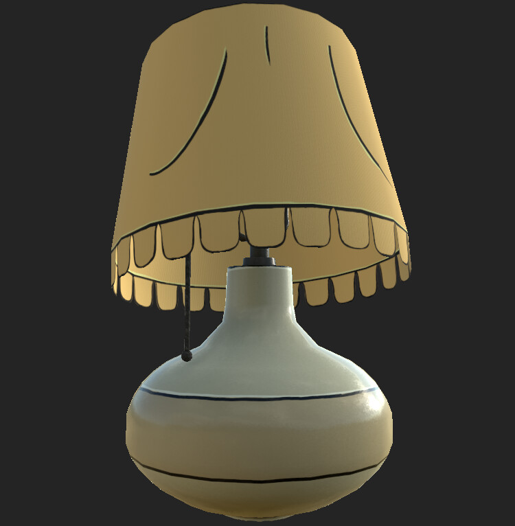
The next step was texturing! Using substance painter I created some base colours and base roughness values for the lamp shade and lamp base. Although this is stylised I wanted a little bit of texture to be there In the normal and roughness map if I got up close in a fly by so I used what was built in substance painter and played around with those values a bit to get something subtle. Creating an opacity layer and a mask layer I used the bell alpha shape to cut out the round fringe on the lamp shade.
It still wasn't looking quite right so I went back to the source reference and decided to delve in with some line work. Originally I wanted to try and use the curvature map to do this however I just couldn't get it to be a crisp line. I therefore did it by hand in key edge points and for some extra details. I also took a risk with some small hand painted highlights. After remembering reading from a stylised tutorial to pick a light source and stick with it, I will need to make sure other assets have the same light direction (above from the triangle window).

It turned out a lot better than I had imagined it would! Although still a bit rough around the edges. I've also given it a low roughness value to make it look more like porcelain but this may end up being too shiny and might not work with the rest of the scene when I start making the other assets. Although the line art is a bit shaky (Which would make my old comic tutors heads spin!) it doesn’t look too bad in the scene and adds to the hand drawn background feel.

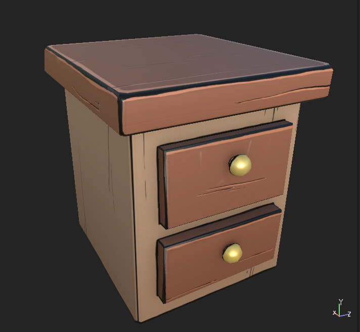
I gave the lampshade and the light bulb an emissive channel as well which I will be able to play with later on when i get to polishing my lighting. It wasn't enough to have the whole thing by itself so I gave the side table the same treatment to see how they worked together.  

The main difference with the side table is that I've applied a gradient overlay layer. It's very subtle but it helps ground the object. I will be using this going forward and it might mean a quick revisit to the lamp as well. 

Honestly these are working really well together and it's hitting home the look I wanted based on the reference. I might need to make some of the wood grain lines a bit more obvious as from far away you just don't see them. It's almost got a borderlines vibe about it! Next I am planning to work on making a material for the floorboards and walls in designer. As it's such a bit part of the scene it's important I get to nail this down as well.


Gravity Falls: Bedroom Block Out

Work In Progress / 22 July 2020

After finishing college and a short break it's time to get back into  a fun personal project! Most of my portfolio currently sports a lot of realism but my background is from cartooning and illustration, therefore I really want to experiment with a stylised environment!

I've decided to pick a pre-existing scene and what better than Dipper and Mabel's bedroom from Gravity Falls! I know it will be challenge but as a starting point this is great, especially for lighting! Throughout the show there is dramatic atmosphere and lighting changes which will be a great excuse for me to practice this skill set. Below you can see some examples of this from the show.


To start with I will be focusing on this view point and lighting. Keep it simple. You may also notice there are some inconsistencies across the images in regards to what props look like. I will be doing my best to give the general overall feeling which might be deviating from one image to go more with the others.

The aim for this project is to re-create this scene and then mimic the lighting examples found above. Even though this is more of a showcase portfolio piece I do want to stick to game ready assets as much as possible as well! 

Starting with a blockout in Unreal, using the tools in the engine to create basic shapes of key set pieces. This was more of a proof of concept, could this be modelled and still look similar to the source? So far it seems completely plausible! Hopefully the texturing will bring it all together. There is also a simple lighting pass just to get me started. 

When I began making meshes for the walls, beams and floor in Maya I started to encounter a lighting error in Unreal. Whenever I imported my new meshes into the scene they would read completely black. 

Testing a lot of things to see what the heck was happening, including making sure I was using the right light map channel, light map density, scrapping the lights and rebuilding, even remaking the meshes and other wizardry tricks that was troubleshooted with lighting friend Willow.... I copy and pasted the scene into a new level....and it worked fine... even the original level... Yay! Technology! I'm still not sure what the problem was other than "it's busted".
After a few more days of fiddling about I think it might of had something to do with the blockout meshes still casting shadows despite them being hidden. I went through and switched shadows off on all the blockout meshes and now it seems ok again. I will be deleting them when i get further along in the scene.


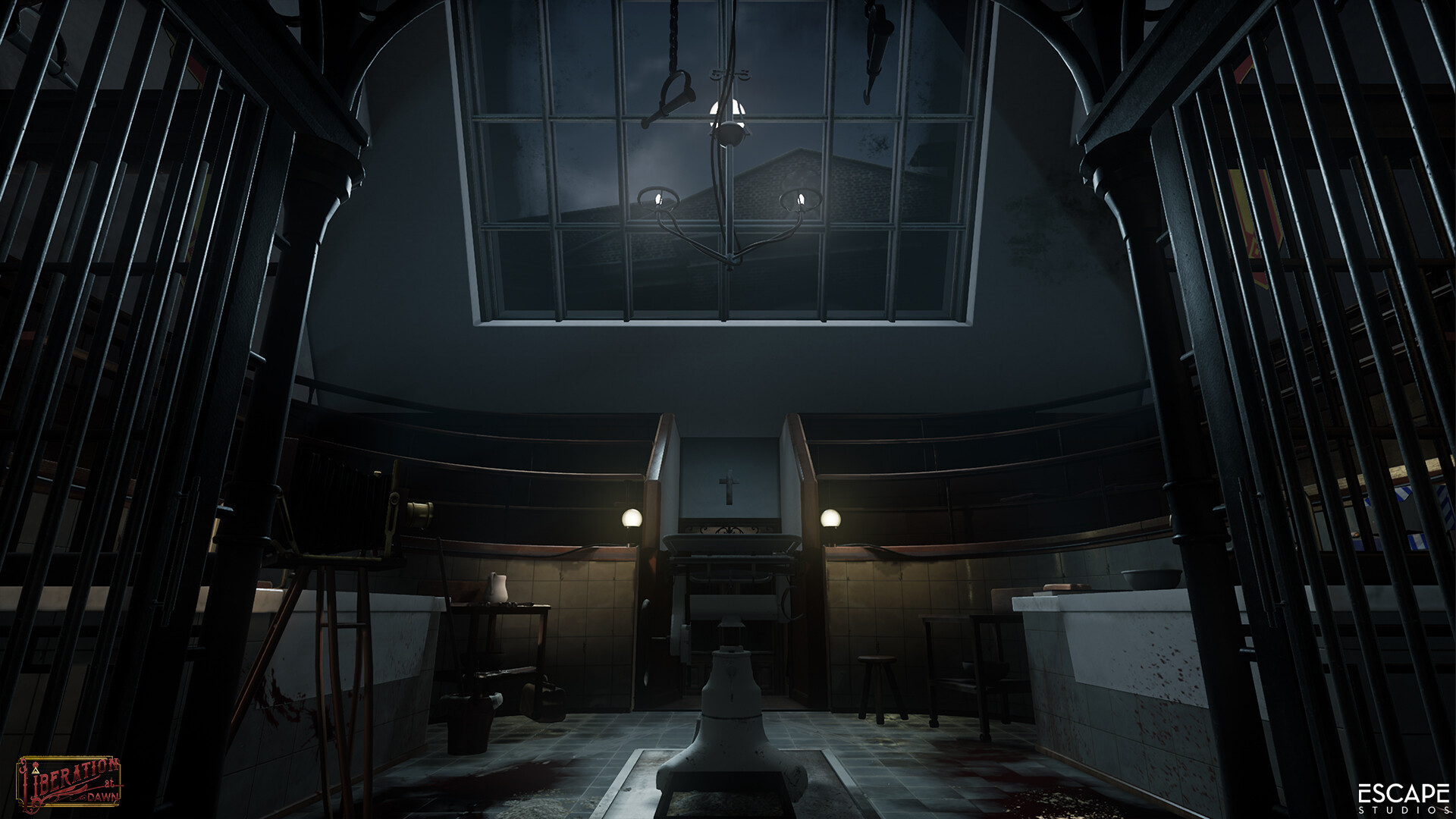
Liberation at Dawn! Download and The Rookies Submission!

General / 25 March 2020


Hey all,

I am very excited to share with you not only our entry into The Rookies for Liberation at Dawn but also a download link to play the game!

https://www.therookies.co/entries/4441 

If you have a PC VR headset you can download the game file from our Rookies entry and play straight away for free. Let us know what you think and give a high five!

Our team worked so hard on this over 12 weeks and we are all really excited by our end result!  Please show your support and vote for us and share the project on the rookies website.

All the best,
H


Search for a Star: Lighting

Work In Progress / 25 January 2020

You can see how I progressed through the project on my Trello.

Today is the day before submission date and despite my best intentions I have not been able to complete this project to where I want it to be. Despite that I am really pleased with what I have put into it so far especially when reflecting on my hours logged and how much I have learnt over the project.

Last week there was no blog update due to some personal circumstances however I will document below what I achieved! 


Vista

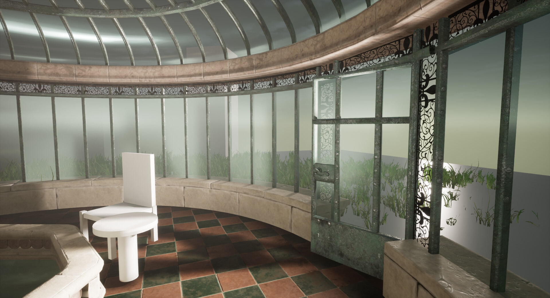
My first point of call was to get my Vista in place. Aware time was running out and now being back at college and focusing on a group project and presentations to Sony, I was needless to say a bit scatter brained and exhausted. I wanted to make sure my projected had the jist of my original intention. Already cutting back on my statue, I really didn't want to cut back on my chair and table as well, but I felt more importantly the space looked weird and empty without some sort of vista.

Before Vista

I went back to my grass and tweaked the settings of the foliage paint brush in Unreal to get more of a variation in the size and density. I painted this all over, however it still looked barren. I knew I needed a ground material. Revisiting an old ground material I made during my first year of college where I had followed the Trench Mud Tutorial on Get Learnt, I changed a lot of these base values so that it wasn't water logged, looked a little more like algae covered ground, reduced the roughness, removed the rocks and general tweaked the overall appearance so it looked a little more suitable for my scene. I also adjusted the Heigh map so it was a bit cleaner and not as noisy.
It's very crude but as I don't intend for the player to go outside I thought I might get away with it. 

As you can see I also did some crude hedges. I found some base photos of shrub branches and a big square hedge bush on textures.com, took this into Maya and moulded them into crude shapes to use as blocky hedges in my environment. I'm far from happy with these and I will definitely be doing proper hedges in the future. So they are just place holders, but again it's more to get the jist of my environment together. I am hoping with final lighting I can maybe hide them a bit. 


Lighting

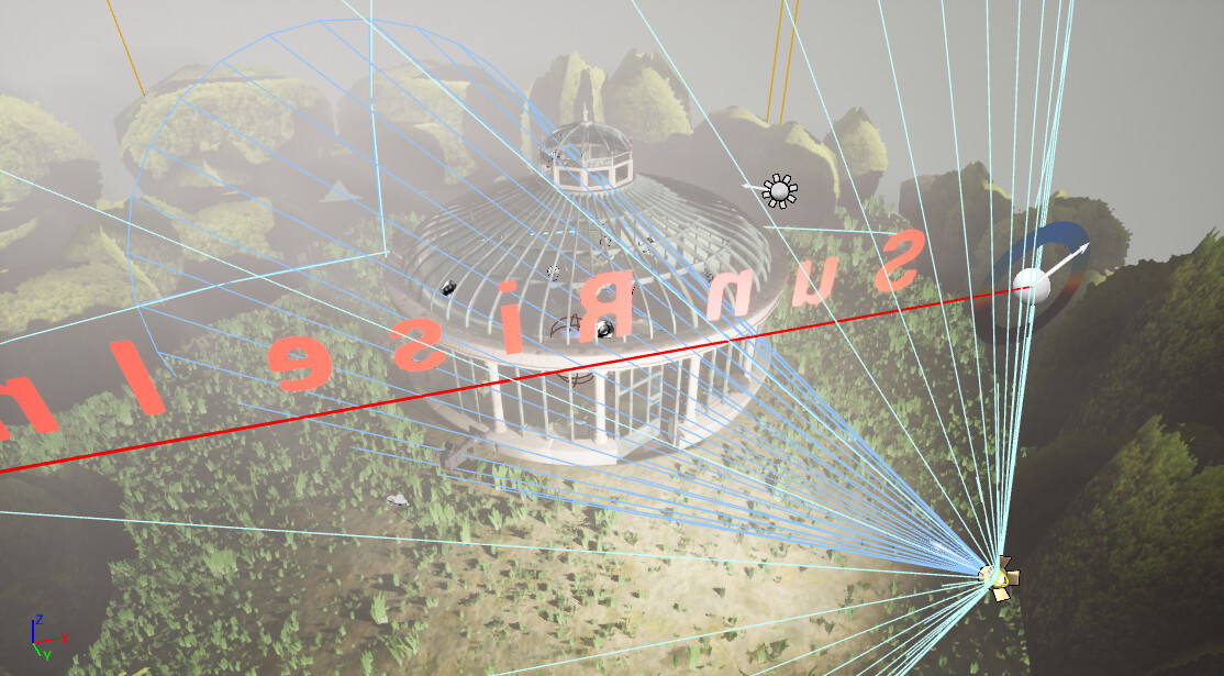
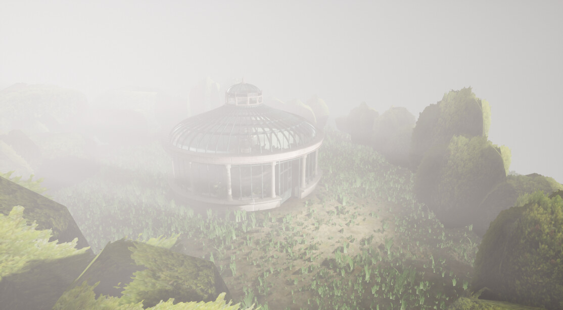
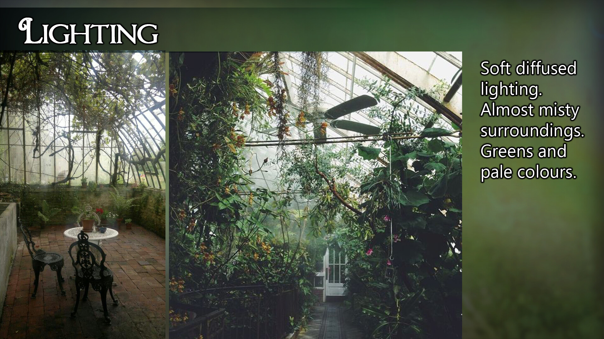
Now things were more or less in place I really needed to fix that lighting. Above you can see where I started to strip everything I had done previously back and start to focus on that main point light for the shadows. However I was struggling that the interior of my conservatory would always remain black even though my exterior was very bright.

Tediously I worked at tweaking the distance of my lights, the atmosphere fog and how the lights reacted to that and the intensity of them as well. It was quite a long afternoon of fiddling with tiny minute settings but I was still struggling with my interior being too dark. I even removed all my walls to make sure it wasn't a strange shadow going on but the conservatory still remained dark.

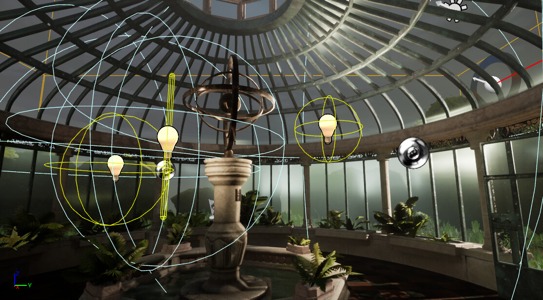
It was deduced that maybe one of my lights was being too strong and therefore wasn't working with the others. So I went about working on the interior lights once I had the exterior looking how I wanted. It was suggested that maybe I use a large emmisive sphere to help. I do have this in place but I don't think it plays a huge part in my lighting. Eventually after tweaking the intensity, fall off and placement of my interior lights I finally got something that started to work. 


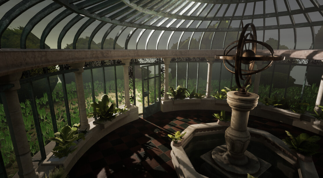
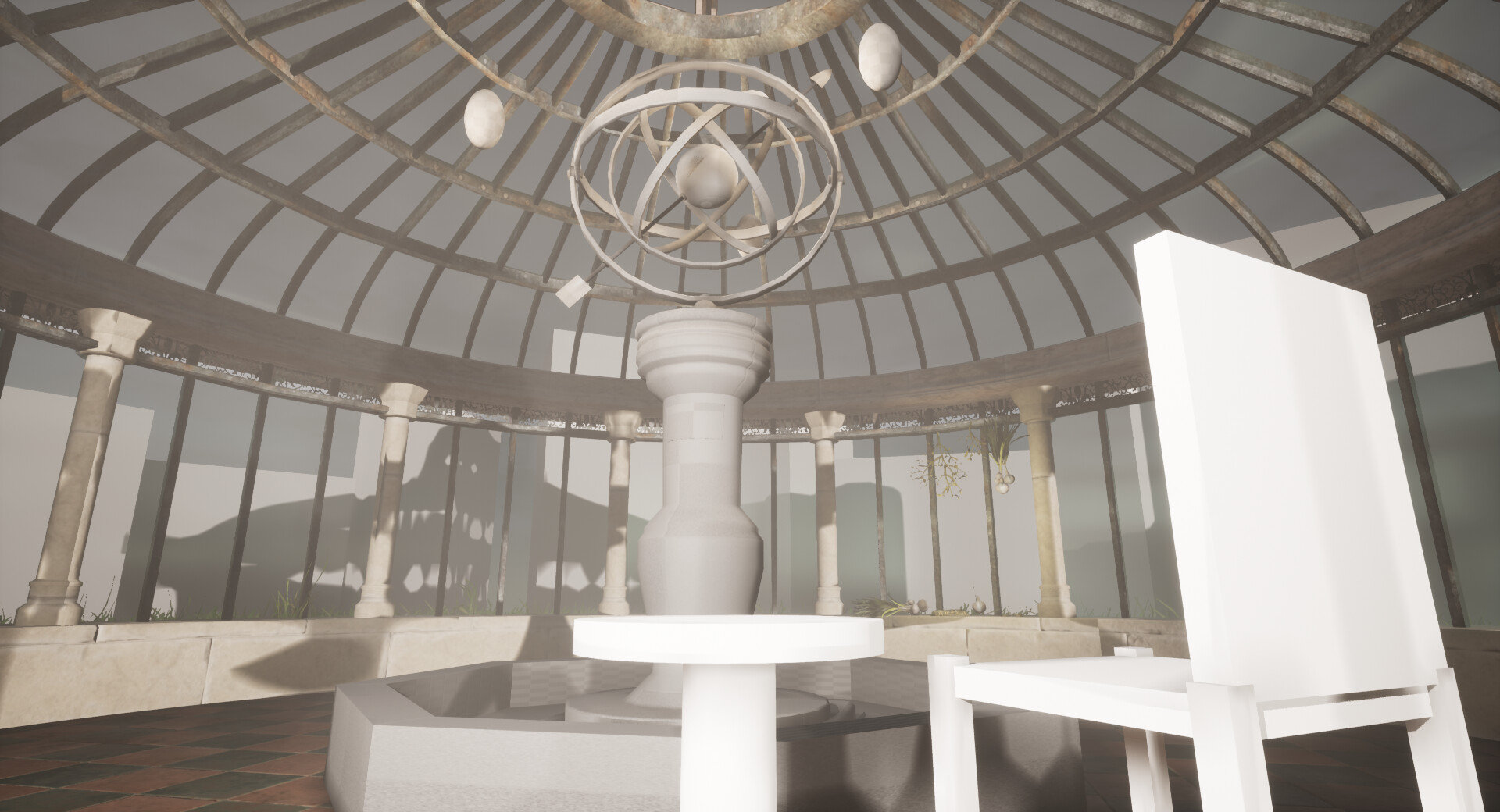
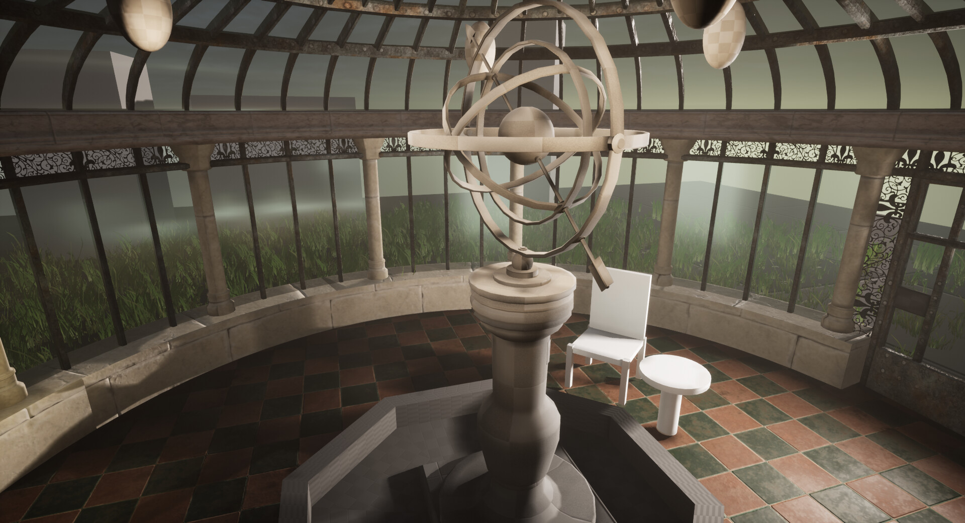
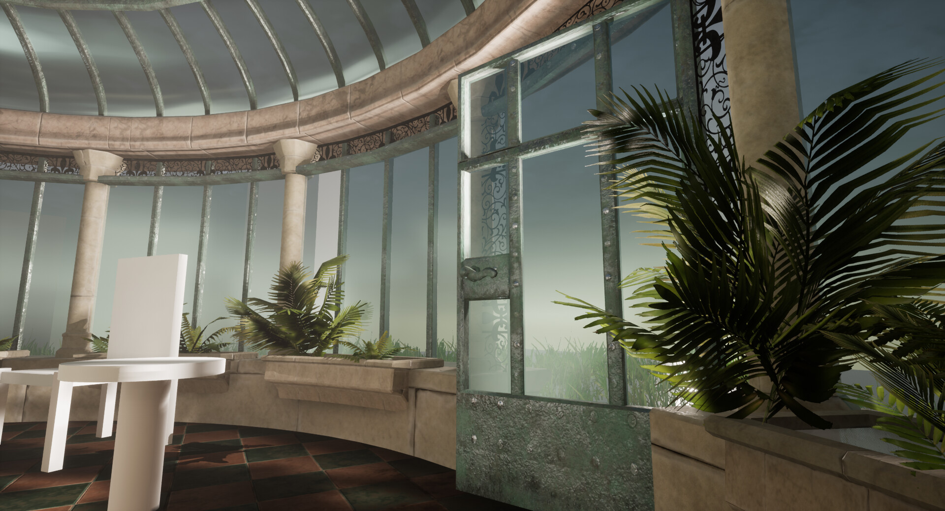
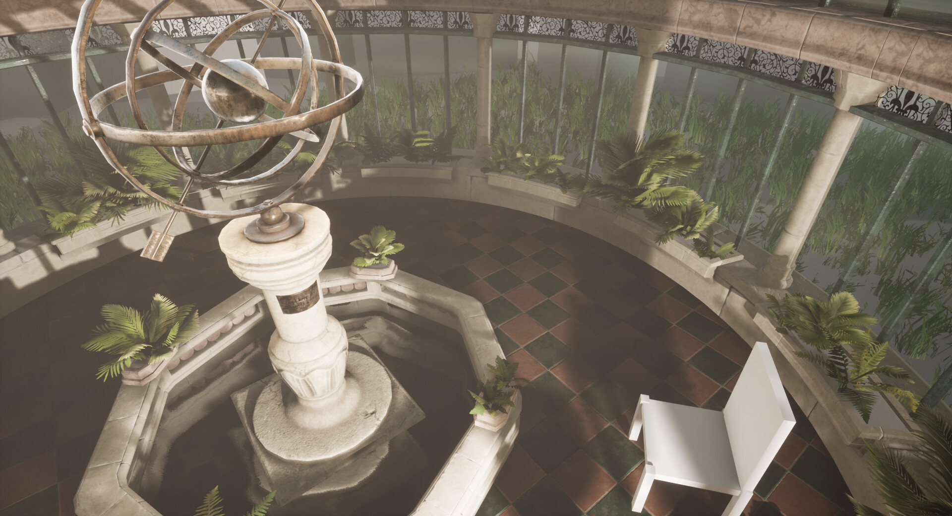
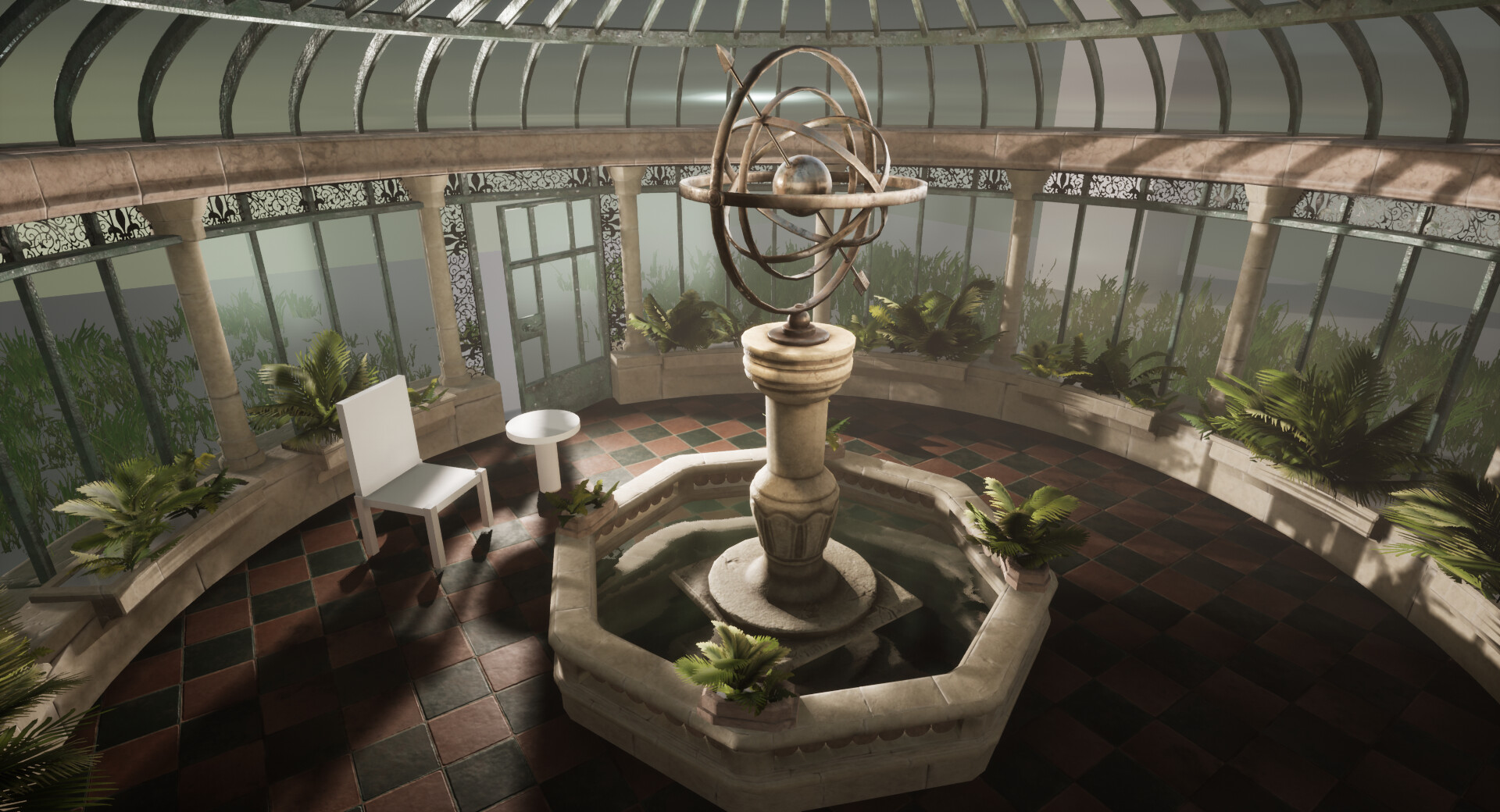
When looking back at my original art bible it is actually not too far off what I want to achieve. But in order for it to be a more compelling environment I need to work on bringing back some of those shadows. But I am glad I got this close at least in the final week!

Reflecting on my work the day before submission I am sad that I did not get to achieve all that I wanted and that I had to cut so many corners. However despite that from some angles even my crude bushes don't look as horrendous as I thought they would - although still pretty bad!

I believe I got across my general intention and the quiet, melancholy mood I wanted to capture. Most importantly I have learnt a hell of a lot. 

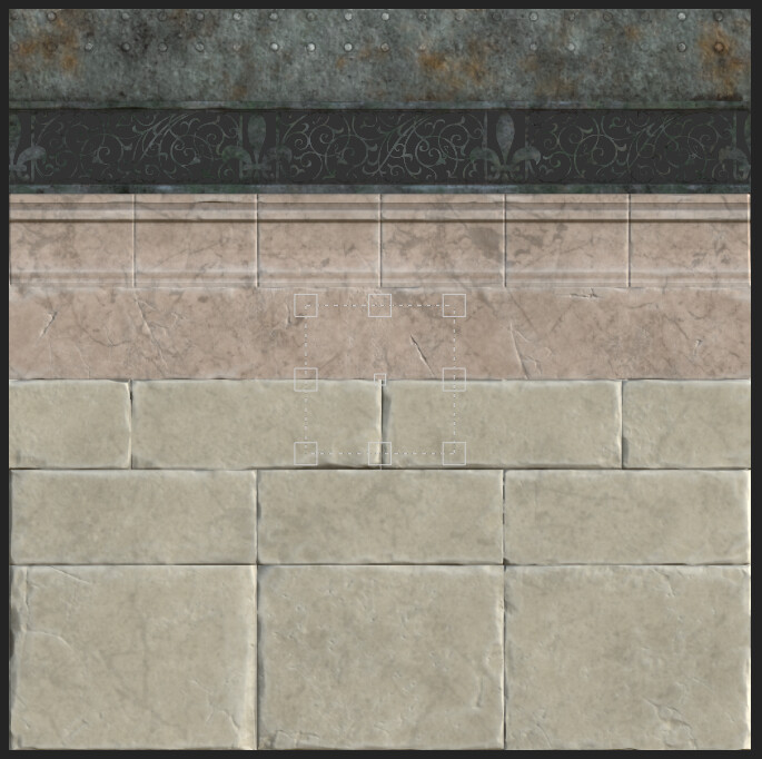
New for me was the trim sheet method which I relied on so heavily throughout this project. Without it I would not have got this far at all. I am happy to say that when I continue working on this project I can go back and refine and perfect that trim sheet more and it will immediately update the whole thing. 

I didn't get to achieve what I wanted with my glass shader and my water, but I am confident now that I can think of a method that will make this work. I am also sad that I didn't get round to all the sculpting I wanted to do as well. But again I am excited to see how this will look when I do get around to doing this in my spare time leading up to the end of my final year of college.

There are plenty of things wrong with this environment but I am so pleased with my progress. I do 100% intend to add and improve on this scene, there are more personal details I want to add and new methods I want to try such as applying detail normals.  I'm so excited to see what my final result will be.

When getting concerned about not finishing or not standing up to the quality of other entries I reflected back to my trello board where I was logging my hours. In total I have invested 59 hours over 9 weeks of production, which totals to about 1.5 weeks.... when I think about it that way I'm really impressed with what I have achieved.

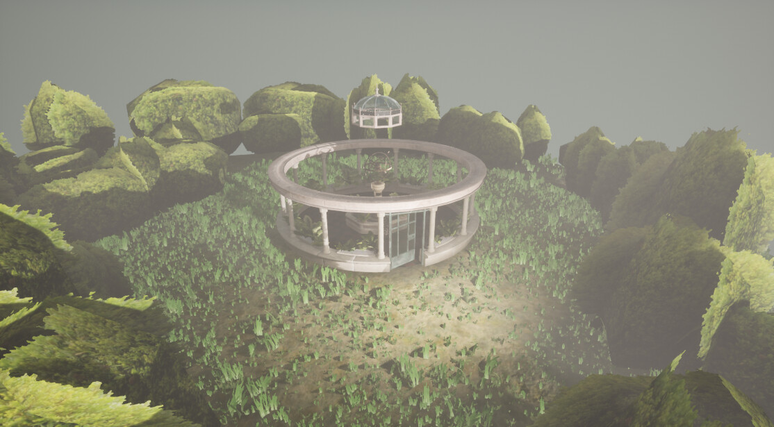
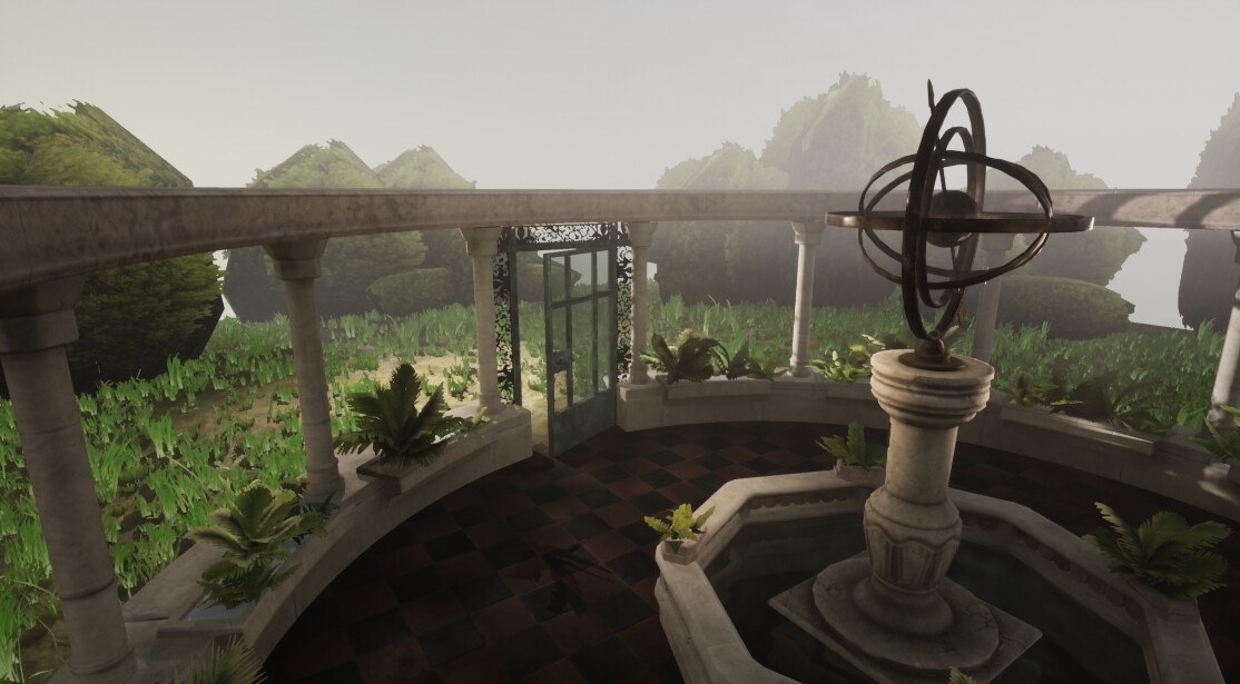
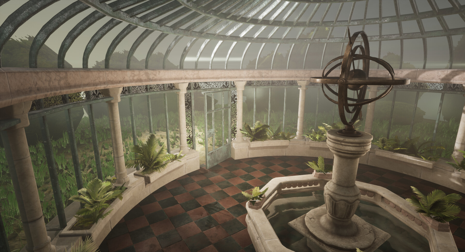
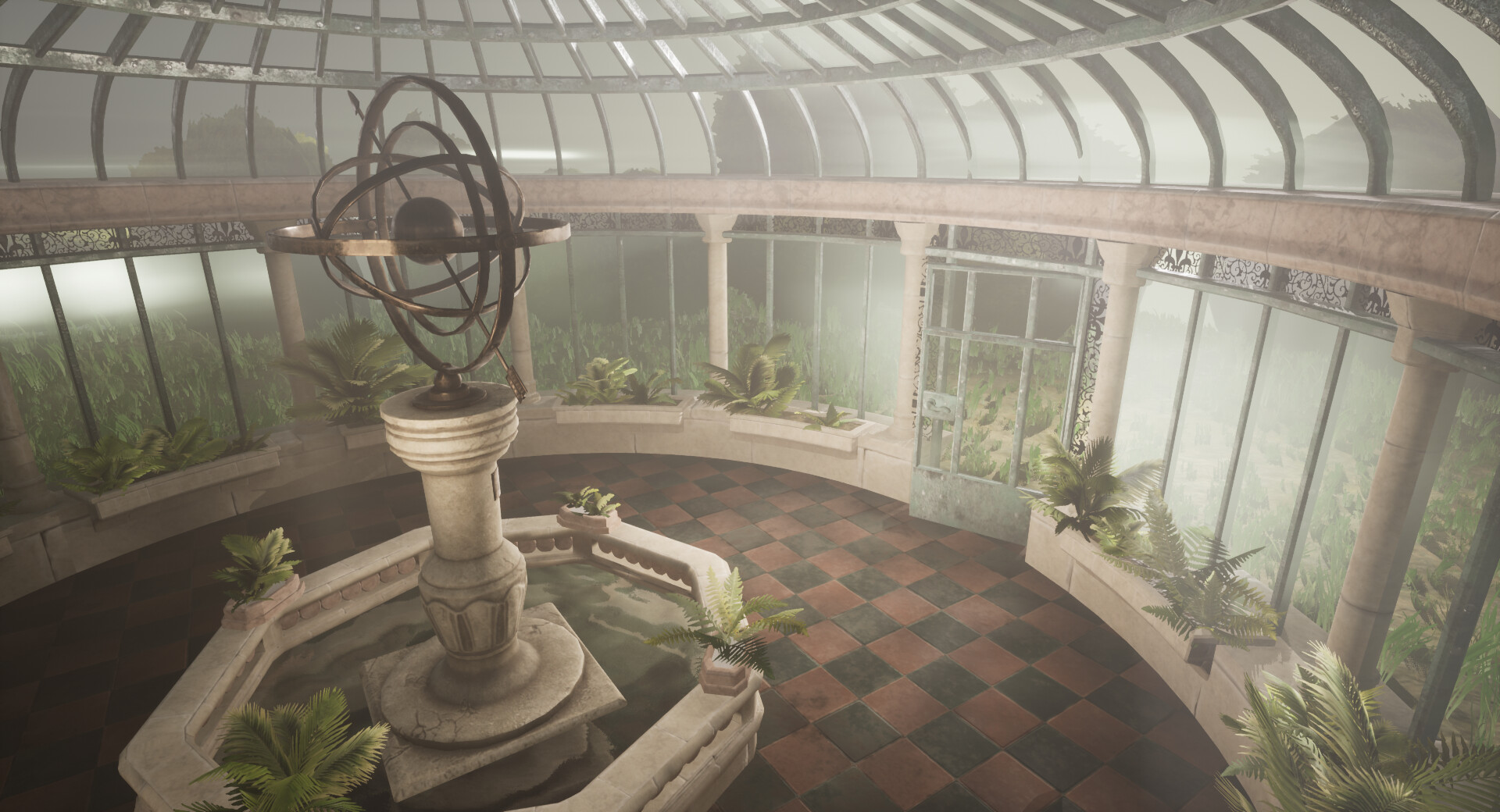
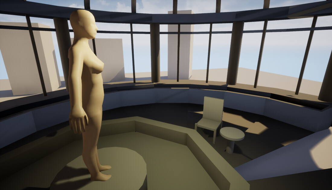
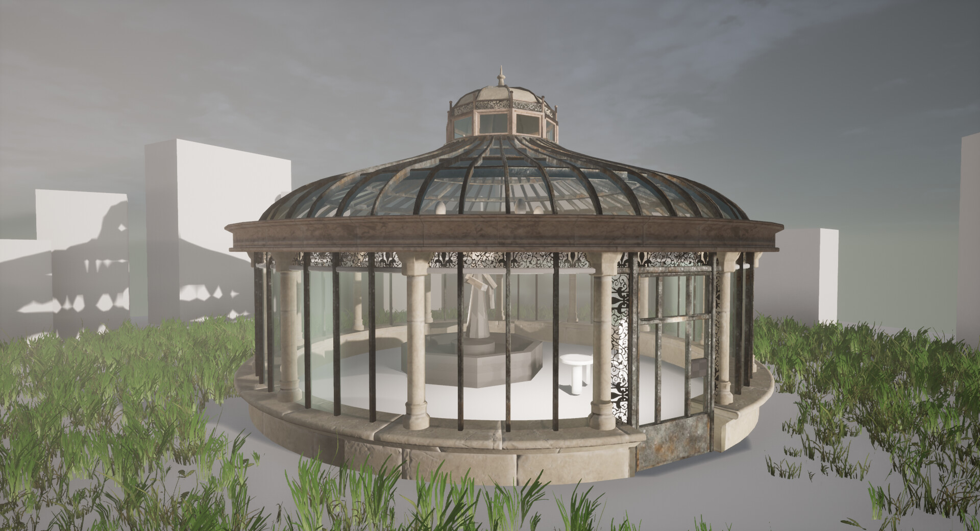
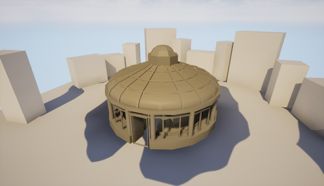
Blockout

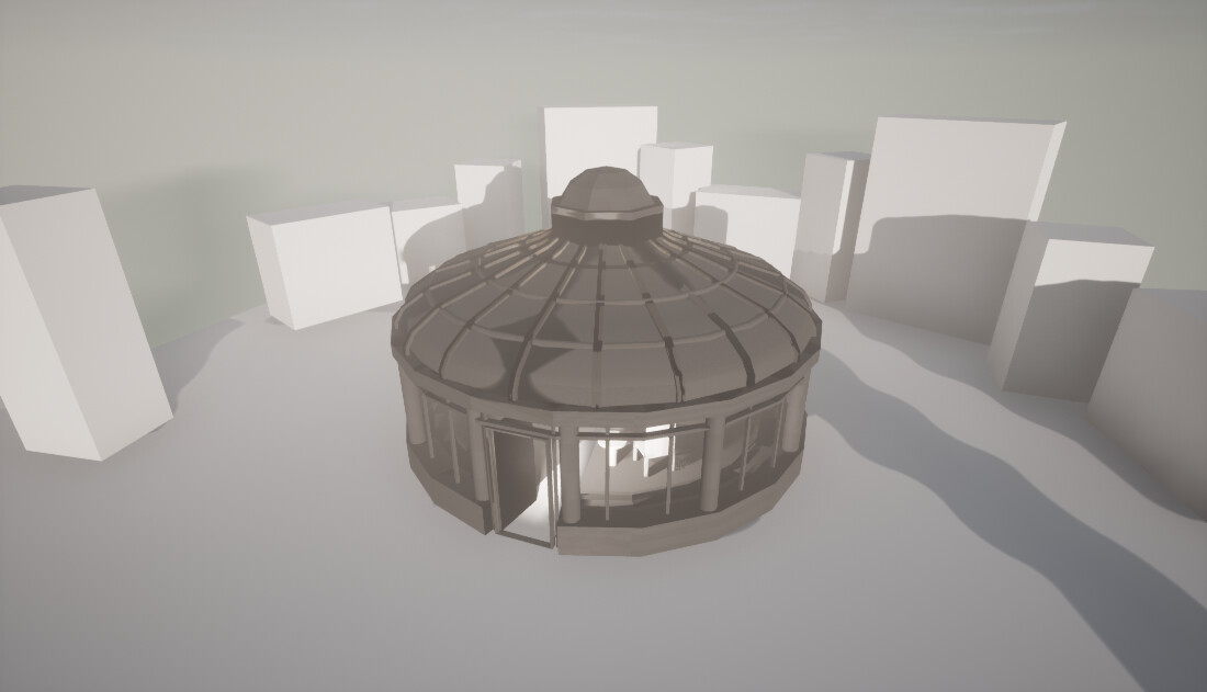
Initial Lighting Pass

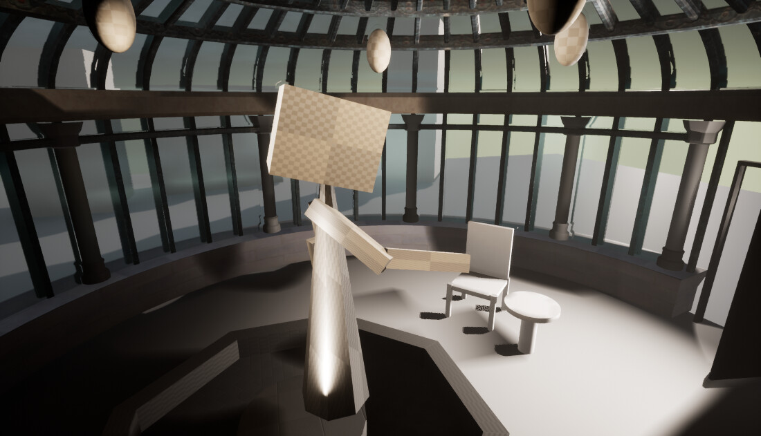
Final Render


Search for a Star: Armillarys and Materials

Work In Progress / 12 January 2020

Guess what. Still sick. At least I was for most of the week.
Despite this I've been able to catch up a lot, but still lots to do. Making a big decision to scale down my statue to an Armillary was a smart move for my production time and I am insanely grateful for my trim sheet. I'm really getting excited to see how it all comes together.

You can check out my progress on Trello.

Armillary

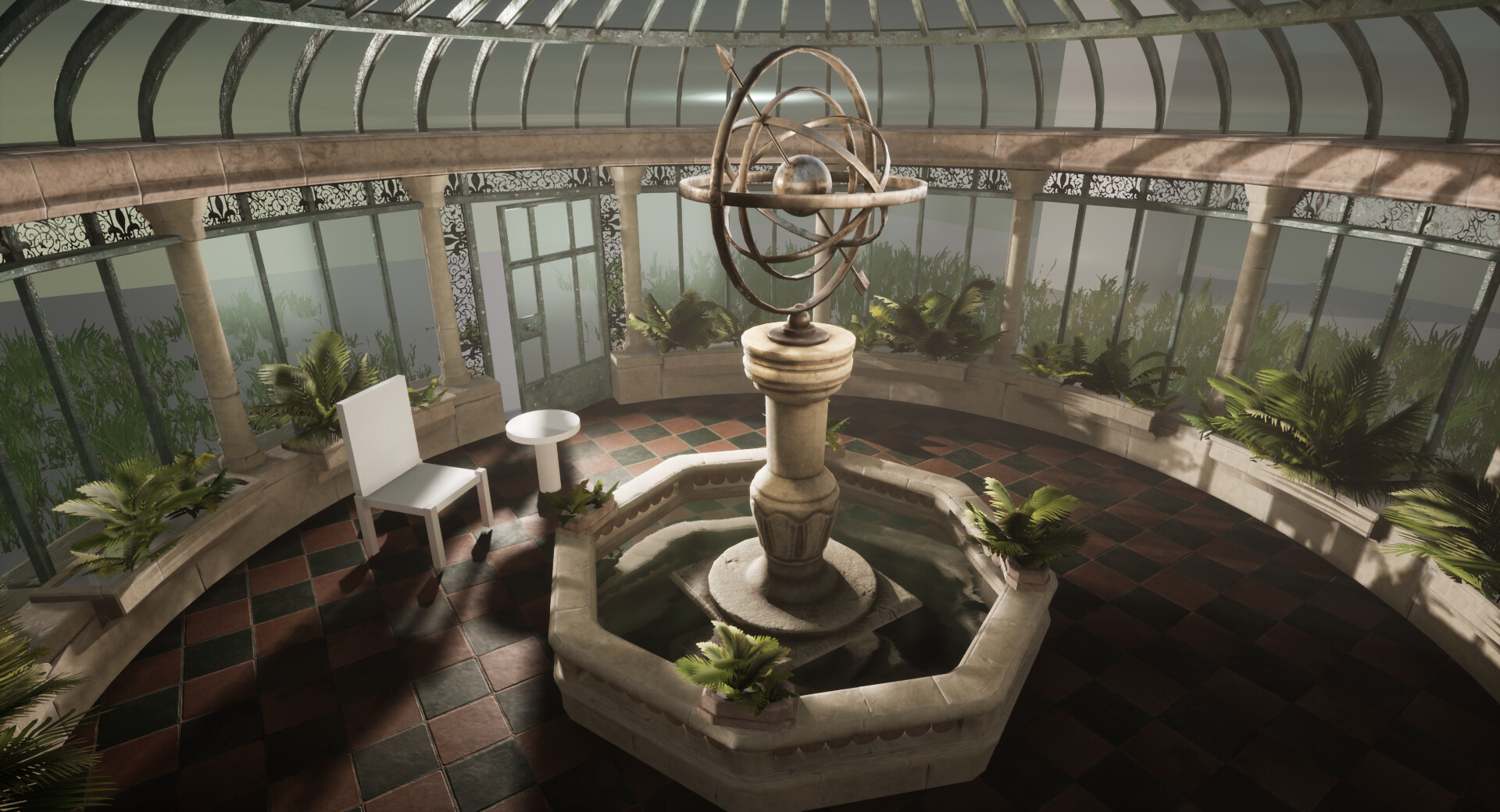
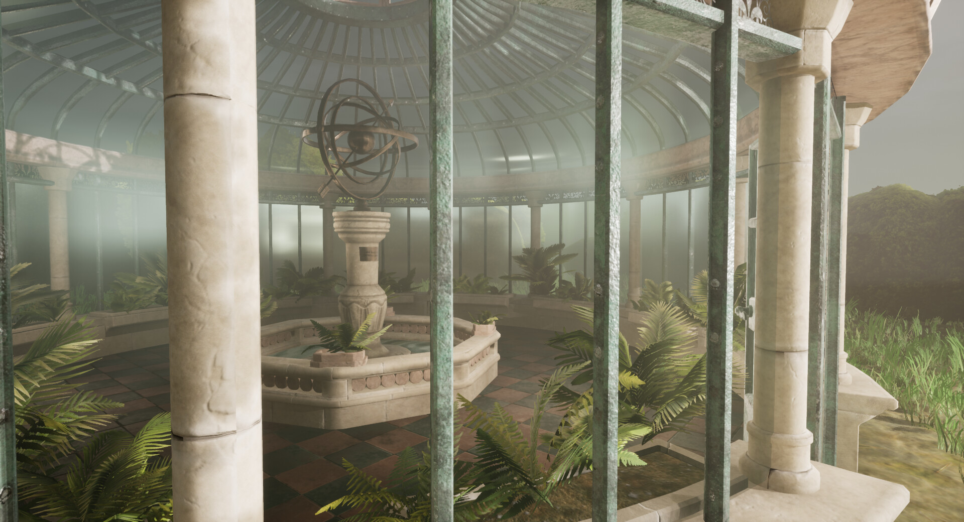
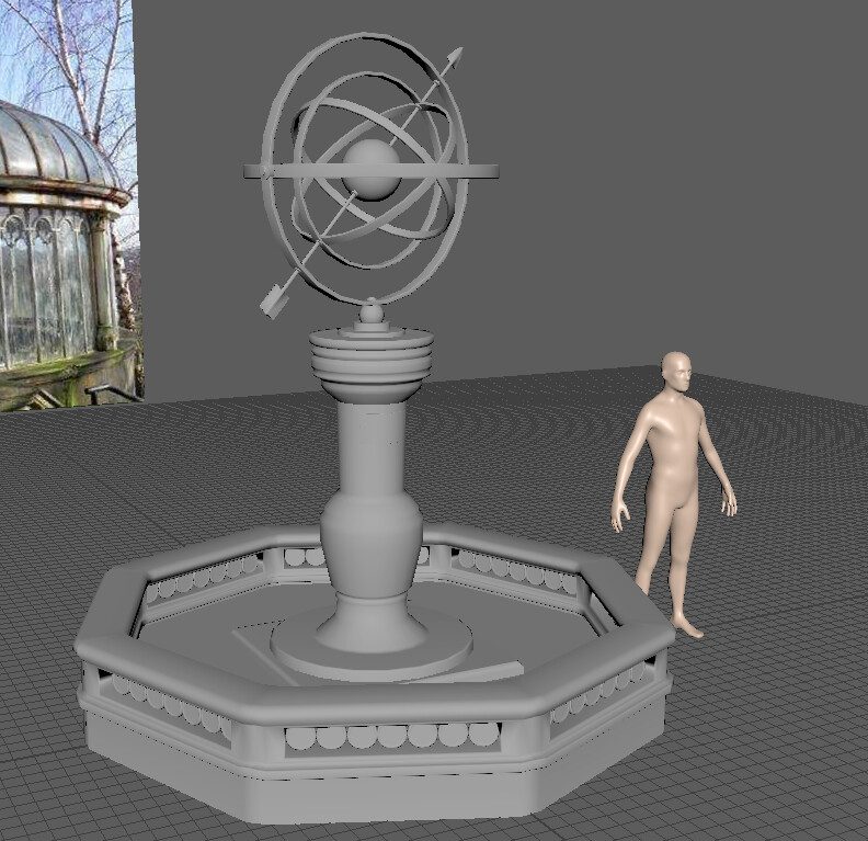
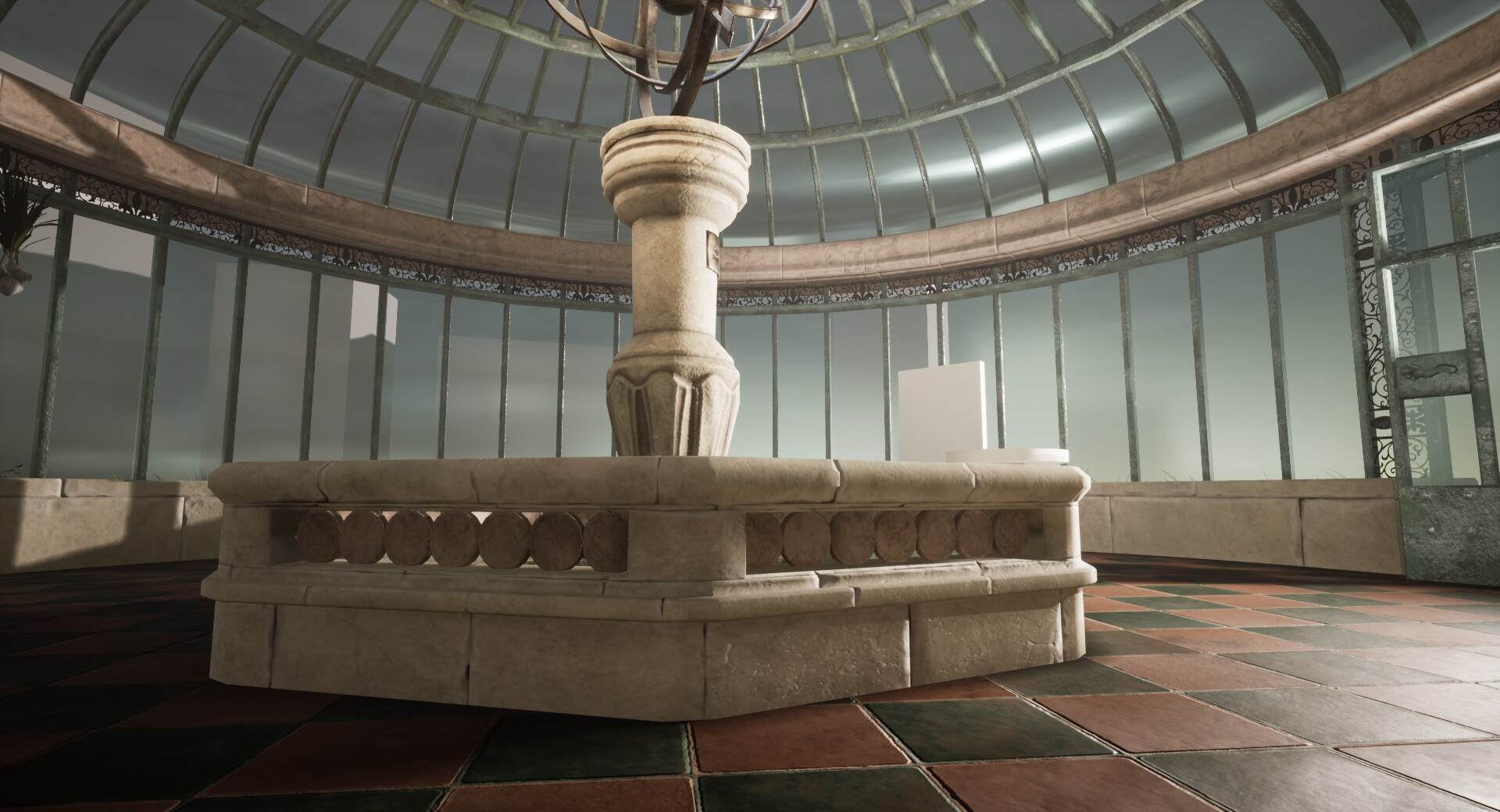
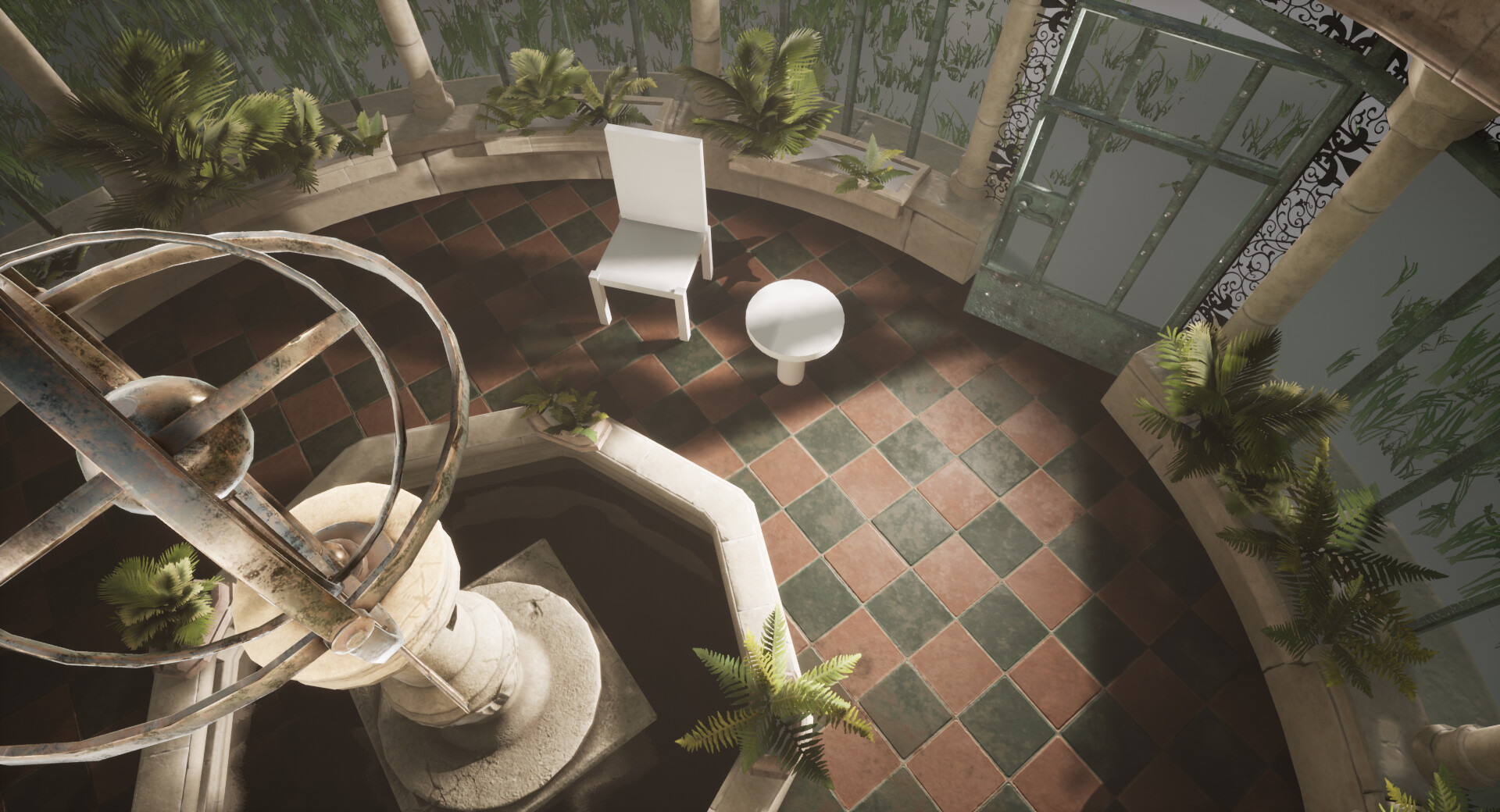
Representing celestial things in the sky, it still has the whimsical dreamer tone I want for my scene and I think with all the glass, water and bronze glittering it'll be very pretty. Even though I had my base reference for one, it wasn't quite having the punch I wanted.

After a little more research I tweaked the design to make it more interesting to look, much happier with this design. 

I also got to work on my Pond. I really wanted to have some pretty sculpts on the rings, but the way I had set it up was proving too faffy for Zbrush. I will go back and revisit this, but for the time being I used my trim sheet to texture the pond. 


Textures + Materials

Last year I spent 2 weeks in designer on a tile material that I thought was going to take me 2 days! I learnt a lot from that experience and I think I'm pretty confident making tiles now! This new material I started from scratch and I am impressed how much I remembered! Originally I didn't want any broken tiles but I might go back and add a couple if I can't achieve the look I want with decals. 


I've also gone back and adjusted the oxidisation of the metal on my trim sheet. I'm hoping this helps push those green values I want and looks less noisy. I had orange rust spots on the texture referenced in my art bible, but i find them way too distracting in the scene so I removed them too. Apart from some minor UV tweaks to help the tiling the Architecture, it's done! 

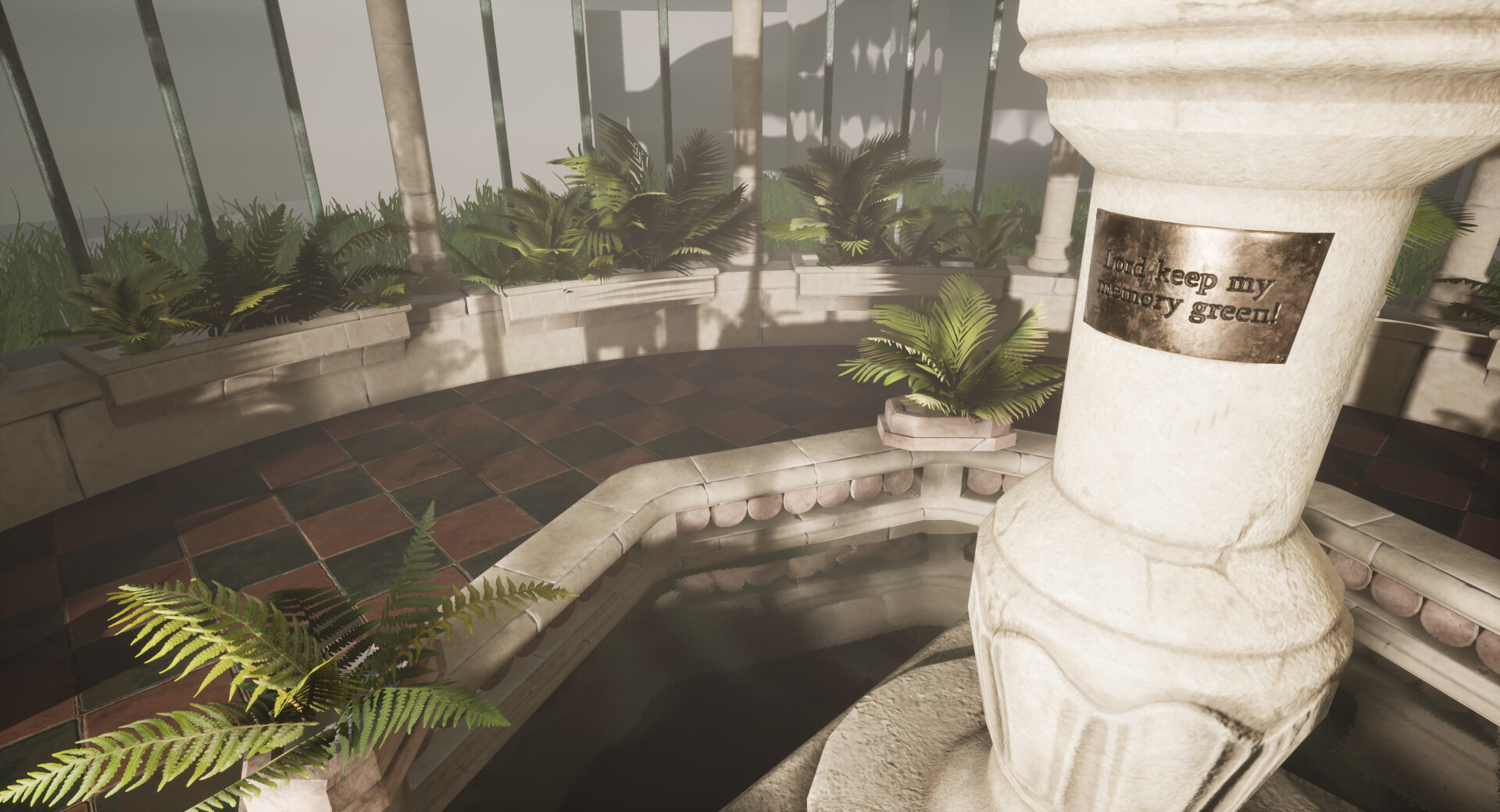
I have also managed to texture the Armillary. I did a sculpt in Zbrush adding some more decorative detail to the base and banging up a bit the Armillary itself. The bake came out really clean and I am happy with the end result. 

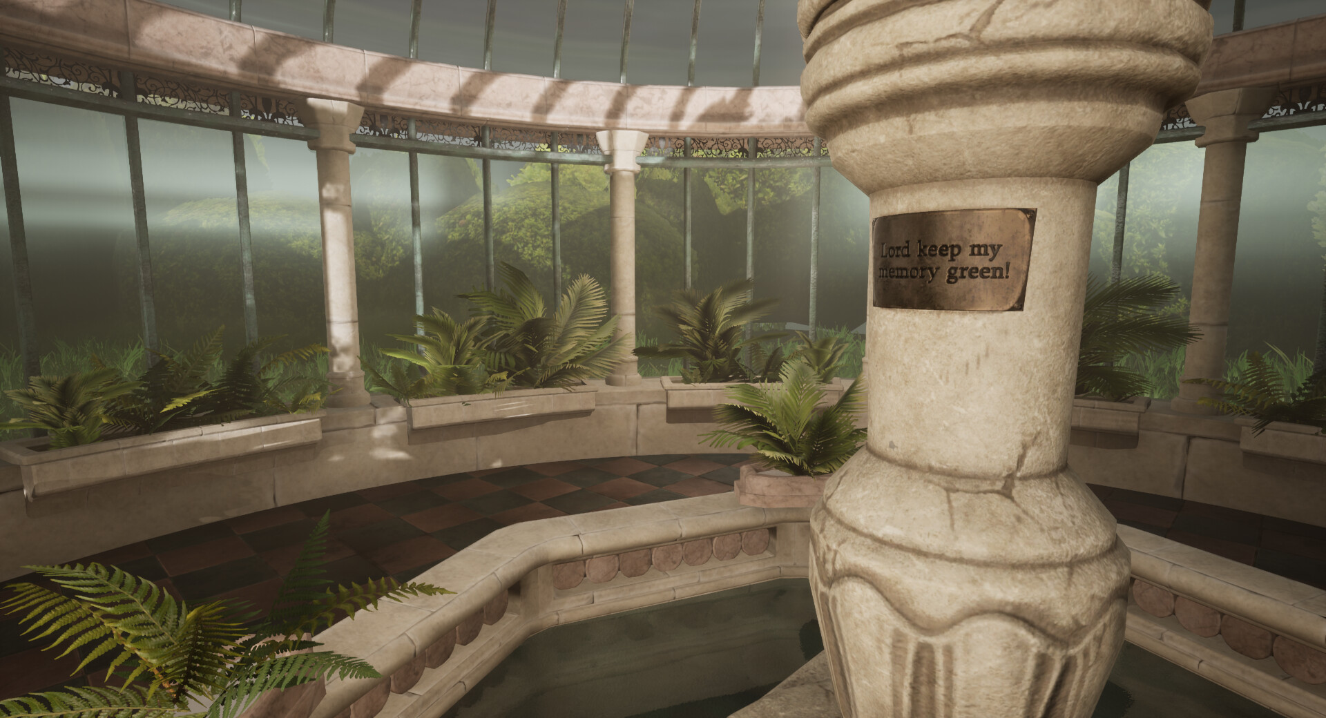
I chose an inscription for the plate which reads "Lord keep my memory green!" which is from The Haunted Man, a Christmas story by Charles Dickens. A man makes a bargain with a spirit to "forget the sorrow, wrong, and trouble you have known...to cancel their remembrance...". In doing so the main character becomes extremely angry and bitter and this infects the people around him. The story concludes where everyone is back to normal and the main character has learned to become a better and more humble person.
It seemed fitting as this was a project I largely worked on over the Christmas period and I wanted to hone in on this being a shrine to remembrance, as if some individual has been coming here frequently in their old age to pay respects to their past. As this will be surrounded by green it's taking the quote quite literally as well!

It's been a while since I have done water so I used this tutorial  to jog my memory. I created my own water normals from an old reference trip I took last year. But I think I'm going to have to make a designer material for this to get the look I want as I do want some thick algae floating on the top. This current water doesn't really fit but it will have to do for now. 

Textured pond using the trim sheet.  As you can see it will be much prettier if I can get those sculpts done in the centre.  

 
Finally this week I implement some foliage. Creating some quick flower pots to go around the pond and the base wall of my conservatory, once again textured using my trim sheet. I also grabbed the two types of fern leaves, parlour fern and a sword fern from texture.com and make a texture for the leaves from this, I use quixel suite for the normal and make my SSS map by hand. Taking the texture into maya and making planes and then deforming the leaves for some variety. In total there are 3 plants, 3 sword ferns and 2 parlour palms.
 
I'm really happy with the progress this week and I really hope I can keep this up for one more week. I want to focus next on cleaning up the vista with some square trim bushes and a ground material. Originally I wanted some artificial lights but I am probably going to focus instead on the chair and table, although they were stretch goals I think they are more important to the storytelling than the light fixtures. After that it will be about cleaning up the scene, fine tuning and making sure my lighting is on point!


Search for a Star: Trim Sheets and Errors

Work In Progress / 05 January 2020

An eventful start to my 2020. It all started with a mountain of error messages in Unreal, followed by a 3 day migraine and as soon as I recovered from that... I got a cold... I'm surrounded by tissues and lemsip.

All of this set me back hugely on my project schedule. I was so frustrated. Although 3 days doesn't seem like a lot, because of my long commute to college getting as much done before we go back was really important as I can't guarantee I'll be able to put the hours in after college. (Especially since we have a deadline for our group project coming up too!)

Regardless I did make some exciting progress this week. As always you can see my live updates as I work on things with screenshots on Trello.

Trim Sheets

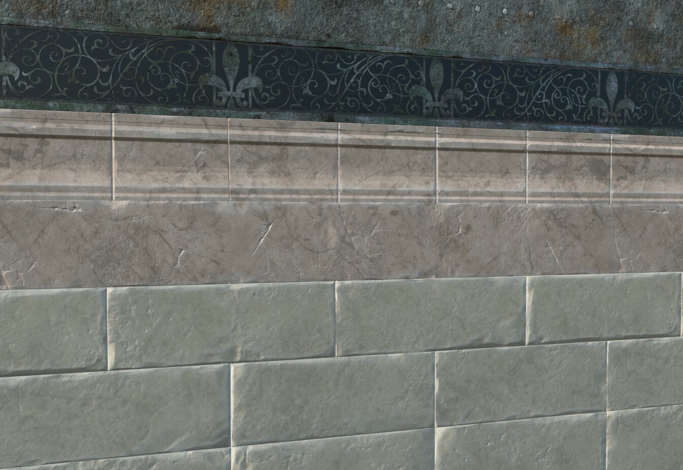
The first major milestone was my trim sheet! Sculpted in zbrush using some great free for use brushes by Fredo and Andrew Averkin and then textured in substance painter. I used some base materials and material shaders to set me off and then edited/removed/added layers to get the look I wanted. Currently I'm not liking how the metal has turned out so I am planning to push the oxidisation further by making it a lot greener and not as noisy. 

I got some advice from Viktor Pecsi on how to do some intricate Iron work, and he suggested using an Alpha on my trim-sheet. Although I would have loved to have sculpted something for myself, I really wanted to get this trim sheet finished before going back to college. So I found an alpha stencil online which would fit into the Victorian aesthetic. I jazzed this up a bit and slightly altered the design in substance painter and now I have this simple iron work design which I can re-use throughout my scene. 

Then the fun started.... 

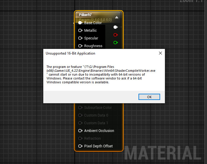
When trying to test out this new material in Unreal I got these two fun errors...


It seemed to be an issue with Unreal and the way it was processing anything to do with shaders. As soon as I opened anything to do with Materials this would happen and it would shut down. So new years eve I spent uninstalling and re-installing unreal and this fixed the issue! But if anyone knows what else this could have been I would love to know in case it happens again!

Once in I could finally test my trim sheet! 


Revisiting the Mesh

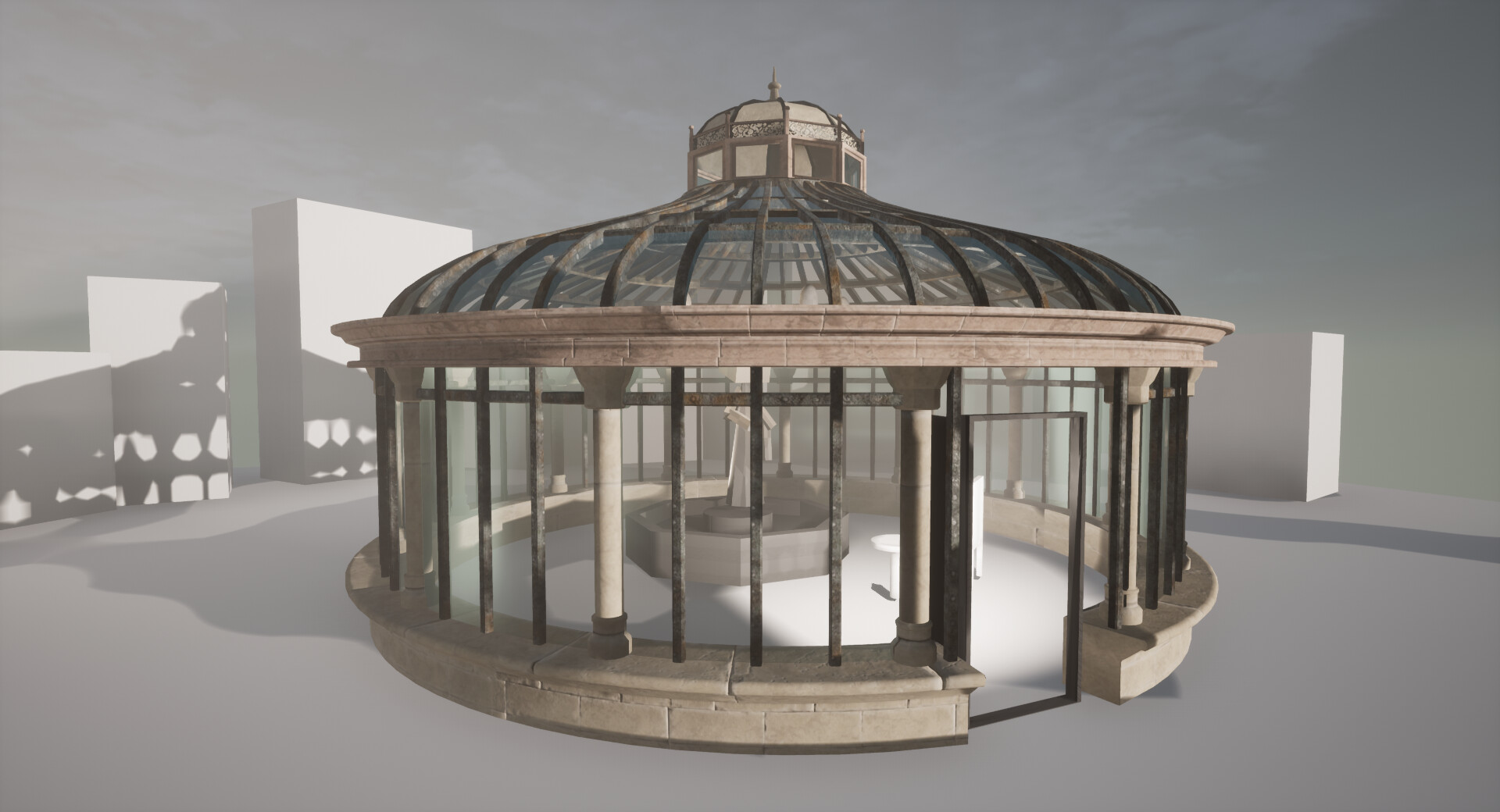
When testing the trim sheet it was important to see how things looked from the inside as this is the focus of my environment. However when looking up the metal bars just looked really weird and messy. I decided to try and make all of these much narrower to see if it would give the more delicate look I was aiming for. 

I generally wasn't happy with the over all look and I was still getting some baking errors. I guessed this was because my light map UVs were too small. Going back in to maya I added some extra decoration using my trim sheet where I could and separated the mesh out into different pieces to help the light maps. To save on time for the moment I also UV'd the pillars to the trim sheet as well, however I would like to do their own texture if I get the time. 

I also made a start on the door which makes a huge difference!

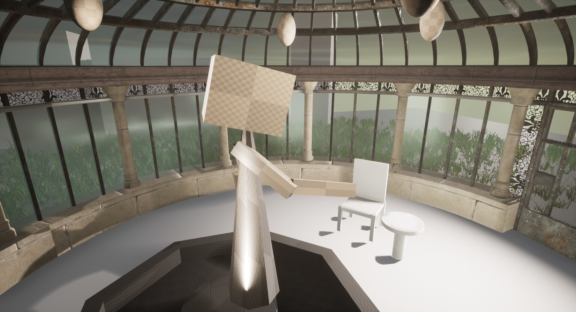
Just noticed I have a missing texture on my bar here! There are also some strange seams showing up which I think is where I have struggled to UV spherical shapes. I can go back and fix this at a later date but I really feel like I need to move on with other objects at the moment. So most likely I will try and hide these with strategically placed flower pots. 

I've also added some of my grass I created for my advanced specialism to help visualise my intention whilst I'm placing these assets. 

Revising the Project

A bit deflated because of being sick I am suddenly very aware of my lack of time. Although I am not giving up on my over all look of the project in the long run, for the competition deadline I'm going to have downgrade what I want to achieve. As much as I want my statue I think I'm going to have to do the Armillary instead, which I can use the trim sheet to texture some of it. But I am not giving up yet! The bulk of the hard work is done and now I can focus on the smaller props to build up a narrative in the scene. I'm also excited to work on a new tile material in designer!


Search for a Star: Blocking out Lighting

Work In Progress / 30 December 2019

You can follow my live progress on my Trello page.

Its been a hectic Christmas break... for some reason I volunteered to host the family this year! Now things have calmed down a bit and the stock pile of turkey and stuffing is finally down to it's last mouthfuls its back to the grind. 

Initial Lighting Pass

Just before Christmas week I was visited by Willow Sorour who not only is a good friend but also becoming a bit of a wizard in lighting. She gave me a crash course in what all the buttons do in lighting, what things I should focus on to get the look I wanted and some other tips and tricks. I struggle with knowing how I want things to look but not knowing how to execute it, so Willows visit and 4 pages of notes later I feel a bit more confident!

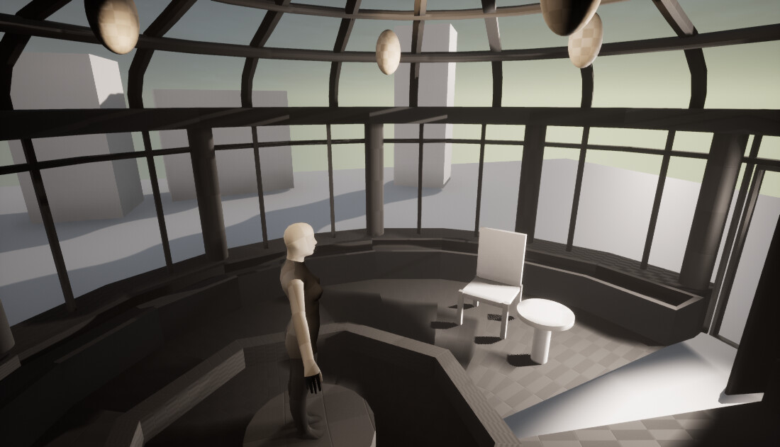
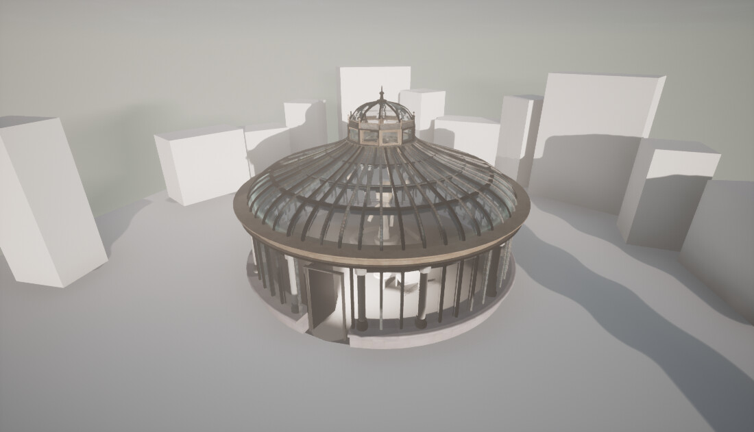
Here's how the scene is looking now with an initial lighting pass!

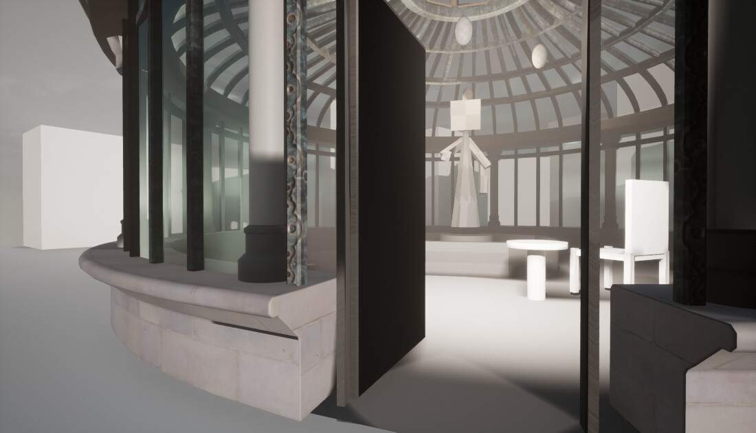
This is still just the block out so everything is pretty ugly, however the mood change of the whole scene just by tweaking some lights and getting the atmospheric fog in place make such a huge difference! The lighting set up is currently very simple.

My sky light has been replaced with Good Sky a blueprint for unreal which replaces the default sky dome and makes it a million times prettier. As I want to go for this foggy slightly eerie light the time of day has been set to early morning and the green channels jacked up a bit to push those foliage values I want to capture as most of this environment is to be experienced inside the conservatory itself. At the moment most of the other lights are still white as I want to see how the foliage affects the scene before pushing anymore colour value into the lighting.

I have a large point light where the outer boundary has been pushed as far as it can to mimic sunlight and put this in front of the door. This along with the atmospheric fog will help mimic god rays through the windows and make the statue a focal point as it will be nicely lit up. 

There are 4 little point lights around where my lighting fixtures will be, to simulate the fake warm lights above the statue. Finally surrounded by a couple of reflection captures. I was advised that I might need to add 1 more as its a spherical space depending how my textures go. 

Before

After

This change has helped immensely affect the mood and I feel more spurred on because of it, I can't wait to get the textures in place now so I can do more with the lighting. 

Meshes and Shaders

Inspired after the lighting pass I thought it was important to make sure I had something that mimicked glass to see how those god rays might work. Not having done glass in a little while I set up a really quick shader in Unreal just for now. In the below screenshot you can see I updated my conservatory mesh to have more posts, but unfortunately my refraction is a bit high so it still looks very weird. As I re-imported my mesh I had to re-do a quick statue block out as well. 

The glass isn't how I want it to look in the end but its a passable place holder. I will need to do a lot of research into how to make convincing looking condensation.
 

Trim Sheet Test

Finally I wanted to test how my trim sheet would work. I made a very quick base colour trim sheet using images from Textures.com. These gave me an idea of what I needed, what works and doesn't work so that I can move forward and make something more ideal in zbrush. 

From this experiment I know that my base blocks for the most part work fine but I would like to do a base lip to ground it. The iron for the posts is probably too busy with too much detail so just stick with the iron and rivets without the design work. Because of how I've uv'd the posts I should think about a wrap around design as well.
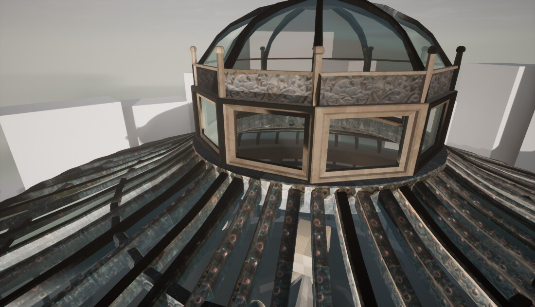
The middle stone section could be a bigger and take up some of the base stone. It should be the same material as the base stone and have a bit of detail in regards to more strips and segments rather than a solid block of stone. The iron work section was hard to tell if this worked or not as its so high up it's not really seen, so I am thinking of making this a relief rather than transparent iron work. However I could keep this as iron work and use it as a trim around the flower beds inside. 

I have actually gone and done goofed here and made the dome glass instead of stone at the very top too!


Base Mannequin

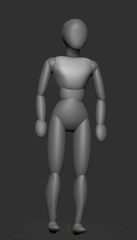
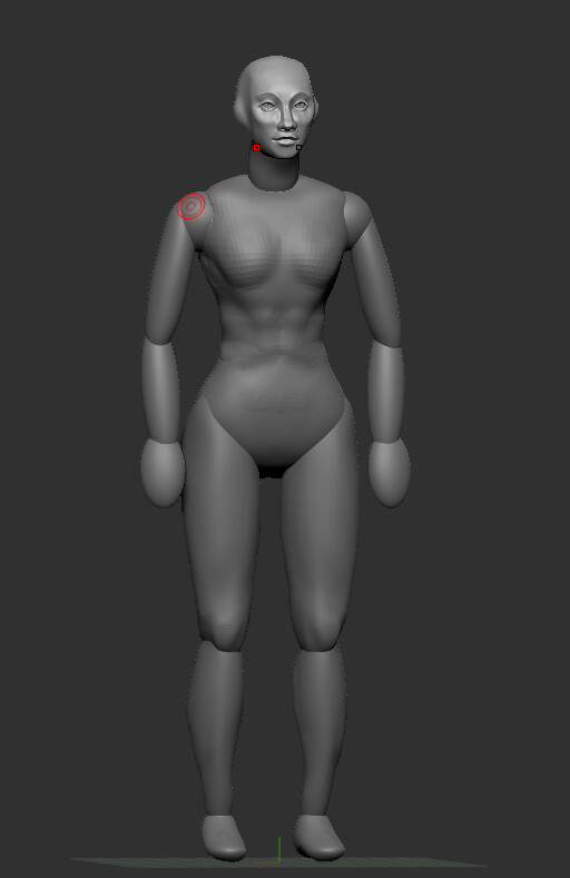
Finally I also began on my statue sculpt. Fully aware this is probably going to take some time I thought I'd make a crack at it whilst I'm still home. Usually when i have created figurative sculpts like this I'll use Zspheres to make the base, however I do tend to make a mess of this down the line. I found the work of Follygon and saw that he uses spheres to build up his own base character mesh which he then poses as he needs to further down the line and then adds extra detail to. i thought this method might help me a lot so I started my own.   

Bare with me here it's still a bit of a monstrosity. However as I started to sculpt on bits I can see how this method is probably going to be best for me as I can focus on each body part without worrying I'm going to stuff something else up. I'm also keeping symmetry on to make sure it's replicated both sides and saves time. 

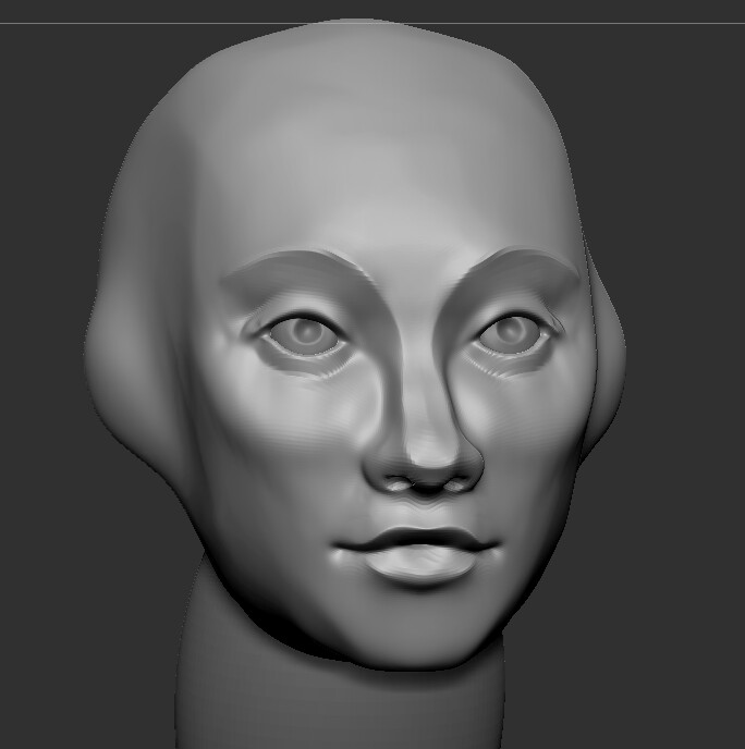
Using reference I can see my proportions are off but I am hoping to fix this as I keep working through the body parts. As you can see I've already made the head a bit smaller. After getting a little frustrated with the torso I went to my comfort zone which was the head. 

Keeping everything still quite low the head sculpt actually came along faster than I thought it would. Using my sculpture references I'm going for quite smooth and hard edges to build the structure, like the centre reference photo below. Keeping the expression serene.


I've got a week at home a head of me and there's a lot that can be done within this time! Once I get those materials sorted on the conservatory itself I think things will really start to come together fast! This week I am going to focus on my trim sheet and maybe even look at the floor material as well. However I would like to get the majority of my sculpture done so that it's ready for posing and texturing, I am assuming I am going to need to retopologise this in Maya when I am done too!
Once I get this more complex stuff done I will be able to focus on the smaller assets such as foliage, light fixtures and the pond after class leading up to the end of January. 
Search for a Star: The Architecture

Work In Progress / 18 December 2019

You can keep track of my progress and see the full artbible over on Trello!

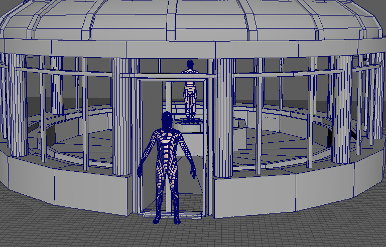
I'm ready to start production and immediately I realise a massive error! I've not been careful with my scaling. Pulling a content browser bi-ped into my maya scene as a scale reference shows that I have blocked out this structured about 2-3 times bigger than it needs to be! 

Whoops!

Re-sizing this so that the door height is now at 230cm. This is a little taller than average door spaces but I felt like it was a little cramped so boosted this by about 10cm which helps aid the impression of a grand structure without being too over the top!

The adjusted scale to a more sensible size!

This change effectively makes my environment scale around 10m2 which is a nice smaller space to work within. Although my vista will still reach around the 20m2 area. 

Scale figured out now to the building itself. I watched Polygon Academy tutorial ages ago for trim sheets and have been itching to actually use this technique. As this is such a large piece I will definitely need to use trim sheets and I'm trying to think about how to use modularity to build the pieces. Being a sphere is proving a bit troublesome!

I know I will need at least the following:

  • Base Wall - Trim sheet 
  • Pillars - Unique 
  • Door - Unique
  • Lower Window/Walls with frames - Trim Sheet
  • Roof Window with frame - Trim Sheet
  • Roof Topper - Trim Sheet

Based on this, I believe my trim sheet will need to include: 

  • Limestone Wall/Brick
  • Metal
  • Glass? - Most likely Unreal Shader
  • Decorative Metal Pattern
  • Decorative Stone Pattern
I've begun with the basics, getting the basic large shapes done and beginning on the iron framework.  
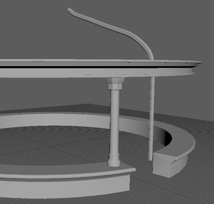
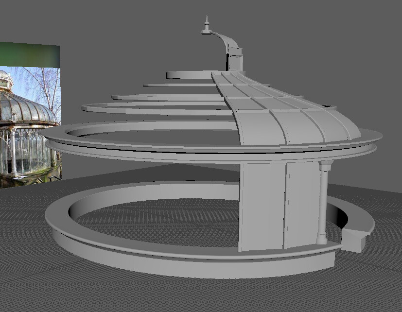
A look at all the final separate pieces I used to make up the shape.
I spent as much time as I could building up the skeleton of the conservatory. The pieces that are closer to the ground I used more polygons to get a smooth round shape and then was a bit more conservative the higher I went up the dome. Creating separate pieces like this and making a centre pivot means I can go in and adjust things easily if I need to. Then I just duplicate it around the circle without too much hassle.
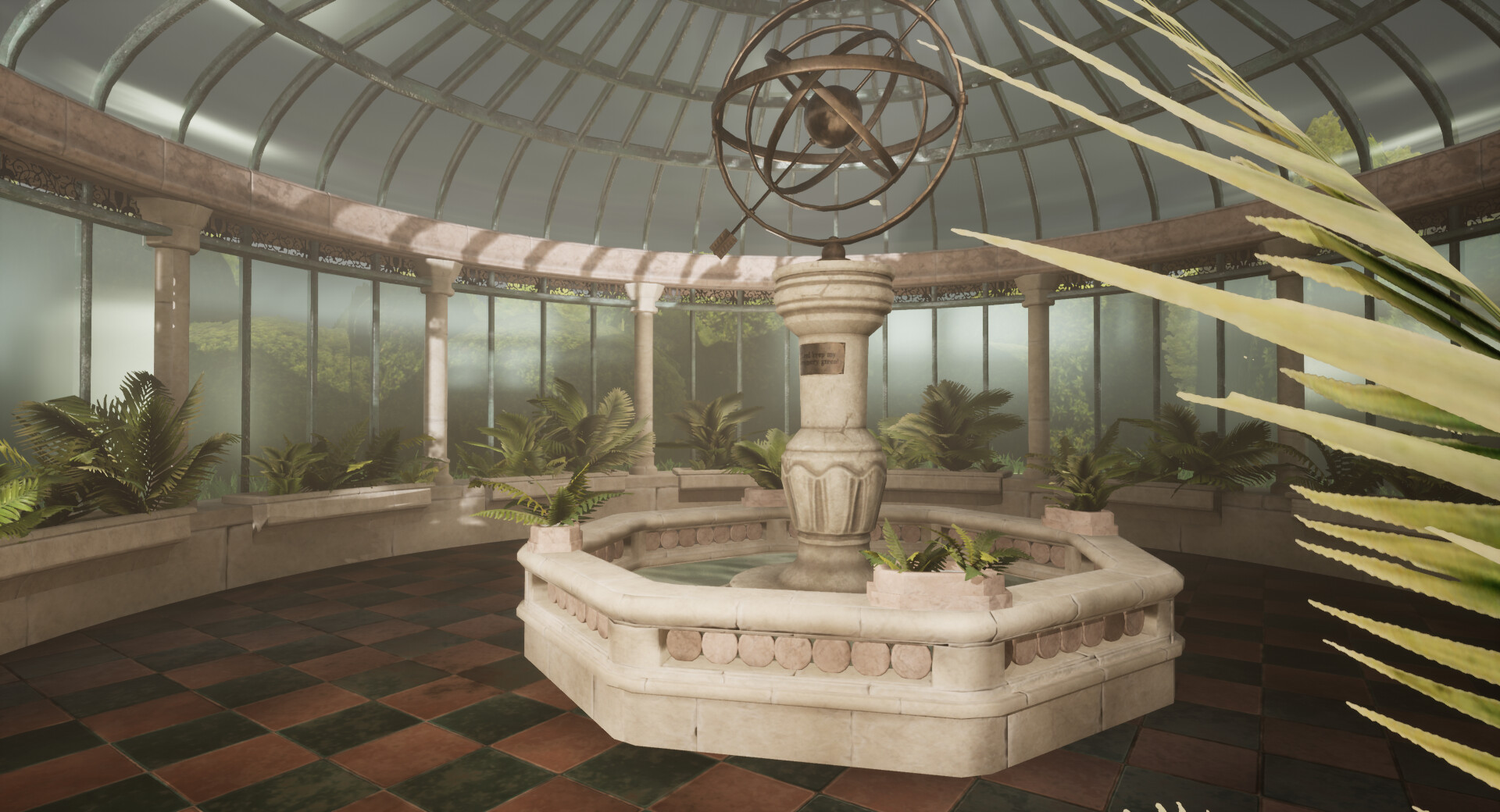
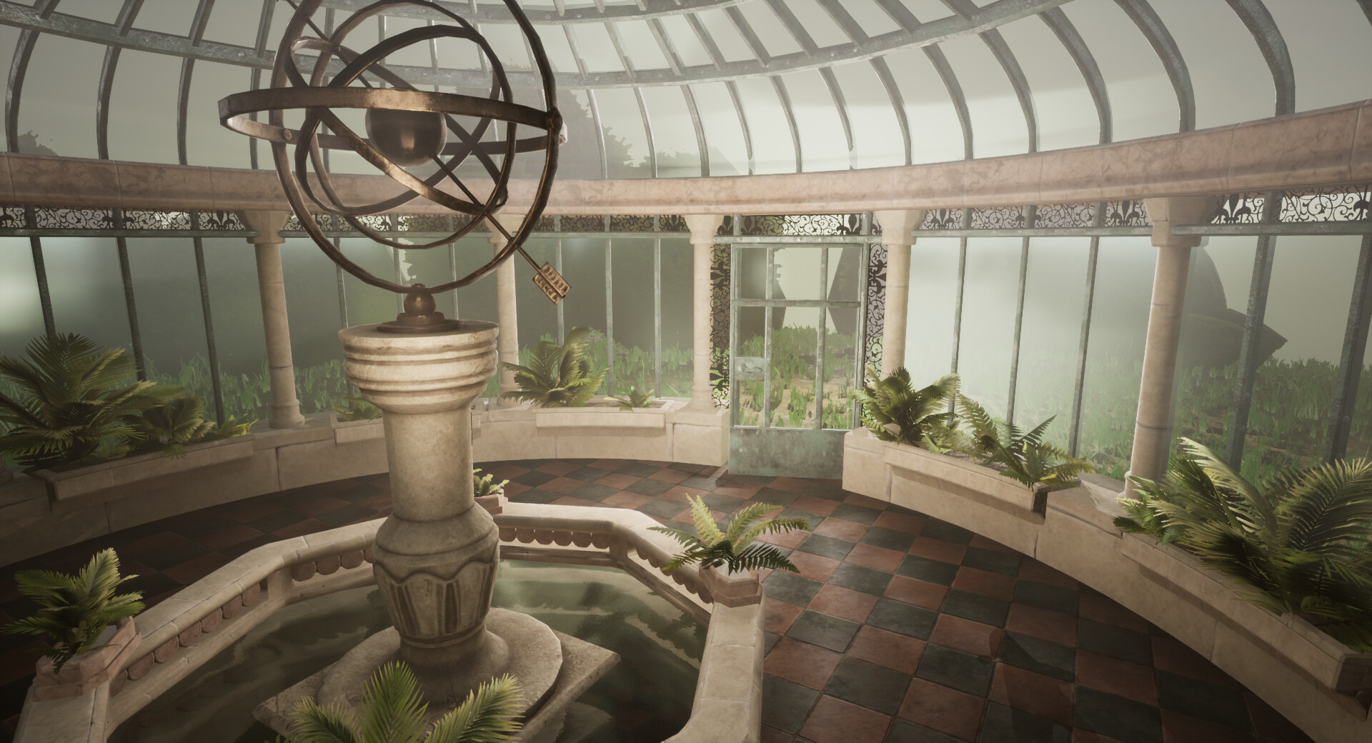
Once it's UV'd I'll merge it all together and import it into unreal.

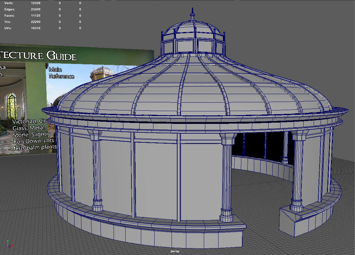
The pieces all assembled come to just over 11k polys.

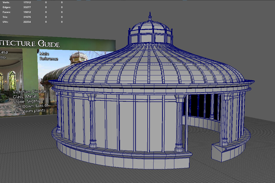
I've deliberately made the window panes as planes and hope to use an unreal shader to get some interesting glass and condensation effect. In relation to my reference I thought something still didn't look quite right. Thats when I realised I didn't have enough beam supports. Duplicating what I had I made a mesh that looked closer to the source. 

My poly count has now jumped up to about 16k. It's also hard for me to tell whether I like this version better or the older one. I quite like the openness of the previous version, however this one is more accurate. I think it will be hard to tell which is best until it's in game and has a glass material in place. However with this version in place it will be easier to implement the delicate domed pattern in the metal work along the base window. 

For now I just need to figure out how to make the door panel and apply one big floor piece!